Miniature World
My idea for this project is to use miniature figures to create a scene using everyday objects. I chose this idea because I thought it was different/original to anything I have seen before. I will experiment with different types of figures until I find a type that I prefer to work with.
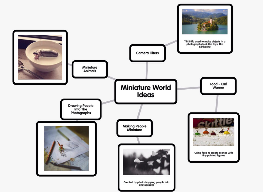
Mindmap Of Ideas:-
Mood Board:-
Experimental Shoots:-
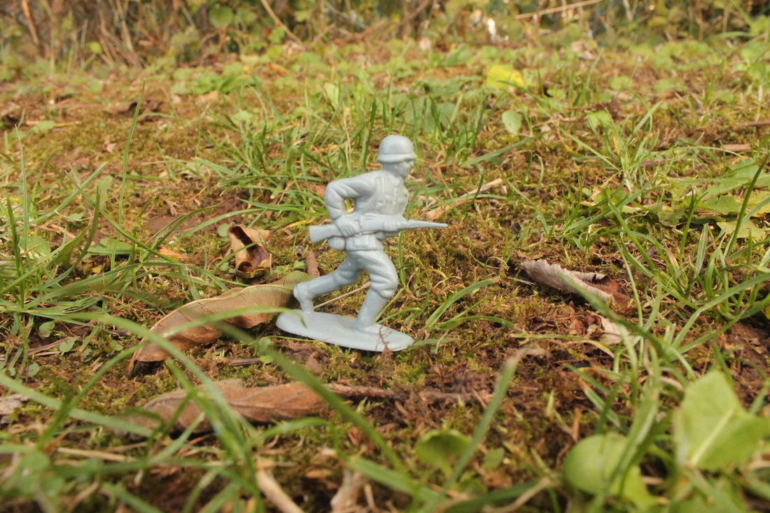
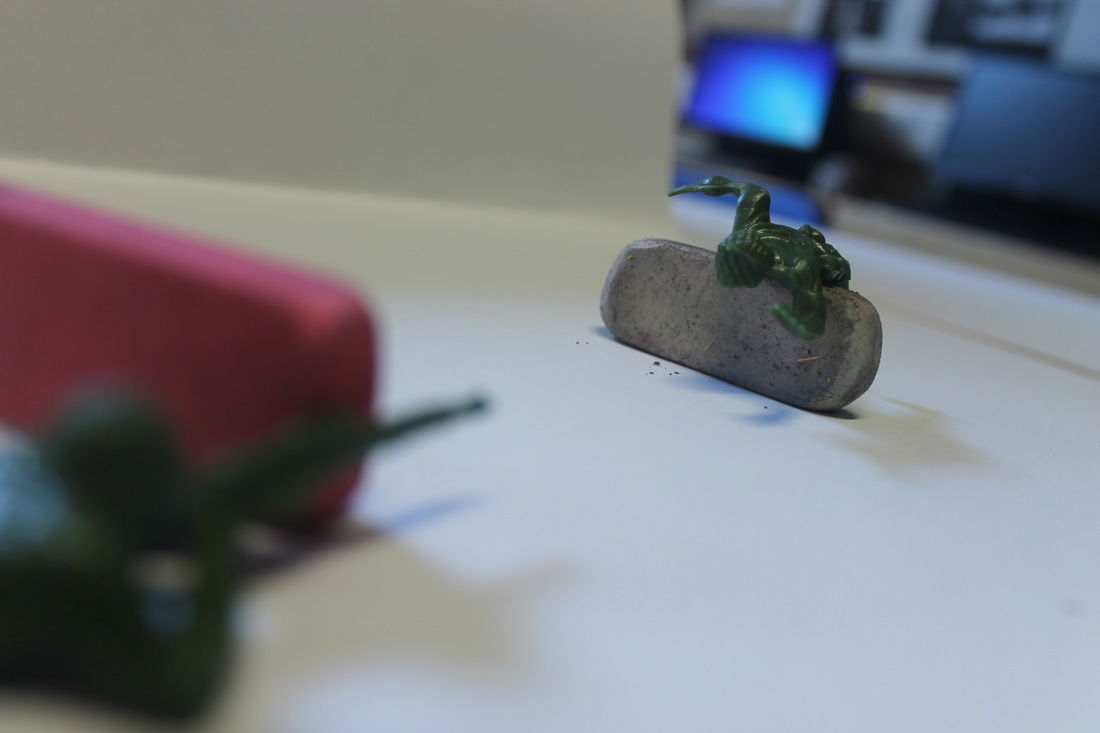
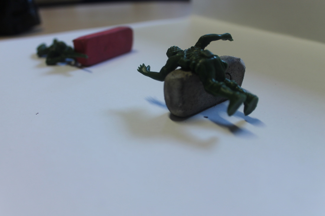
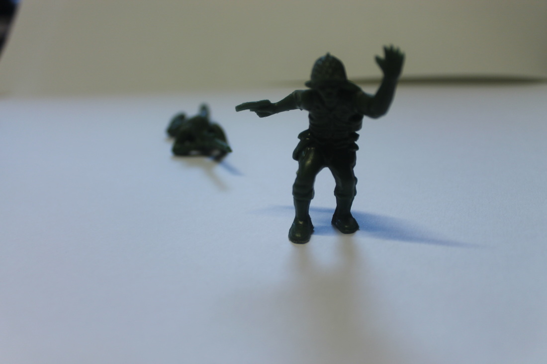
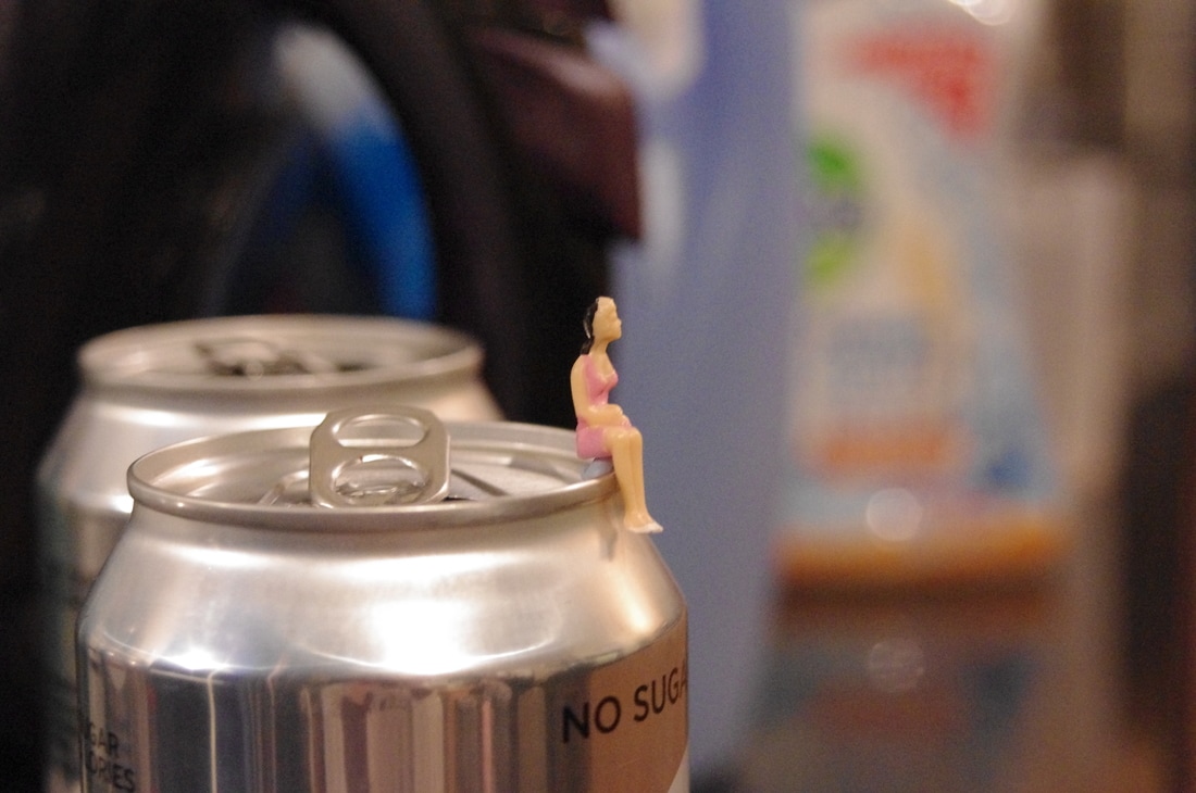
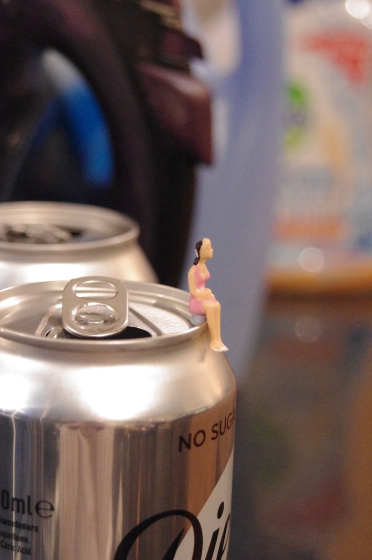
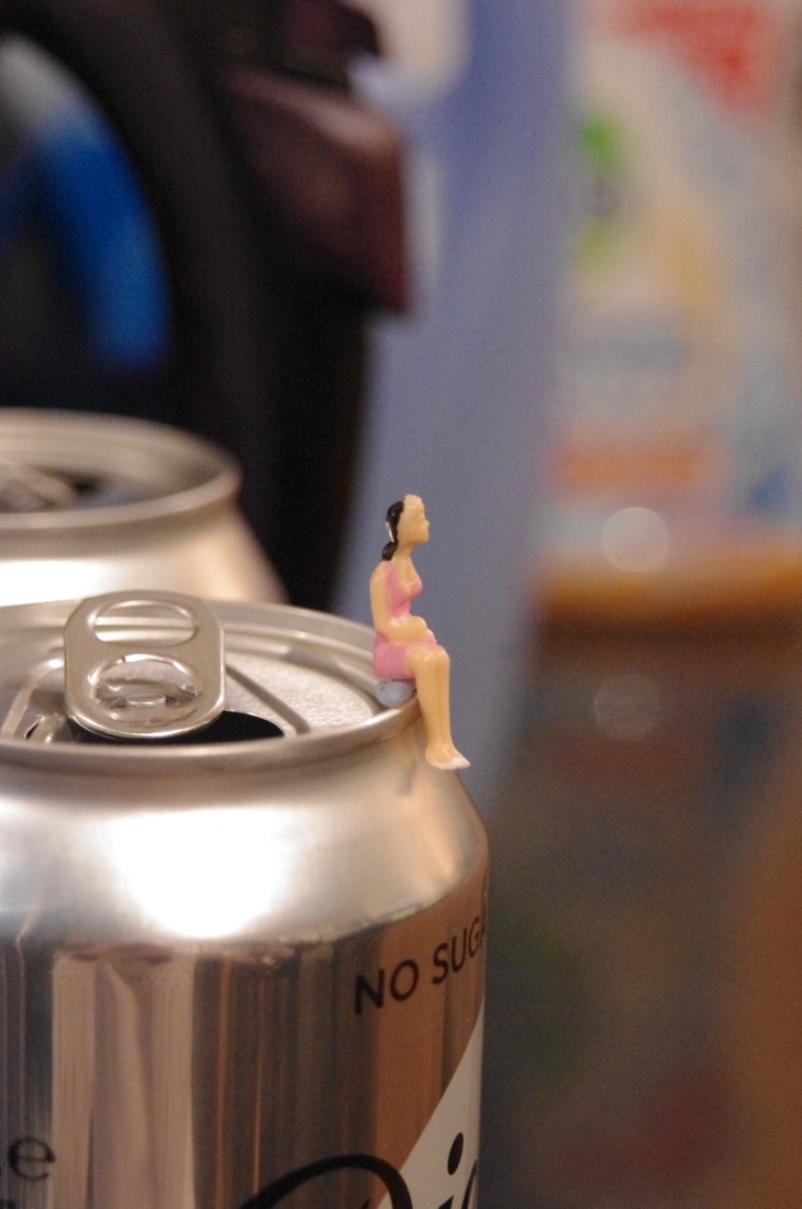
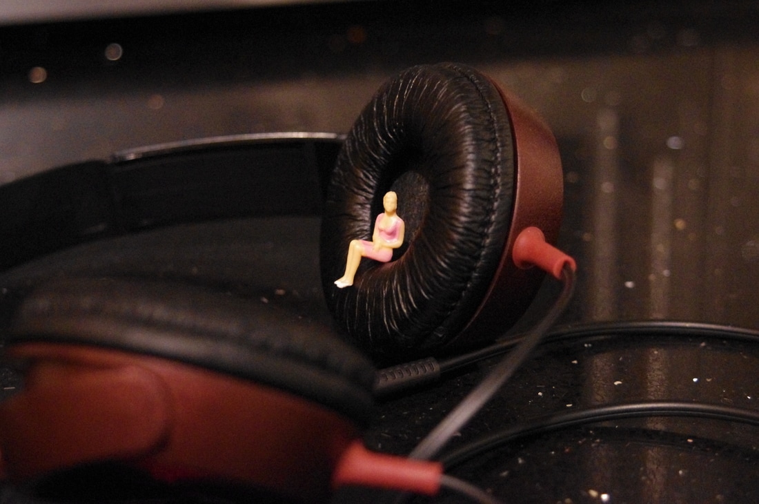
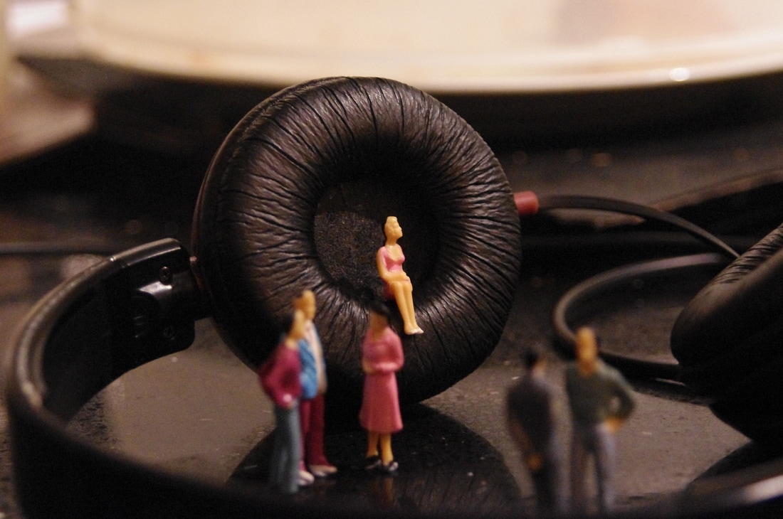
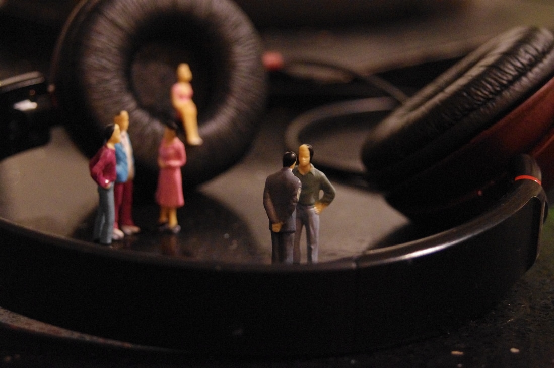
SHOOT 1
SHOOT 1
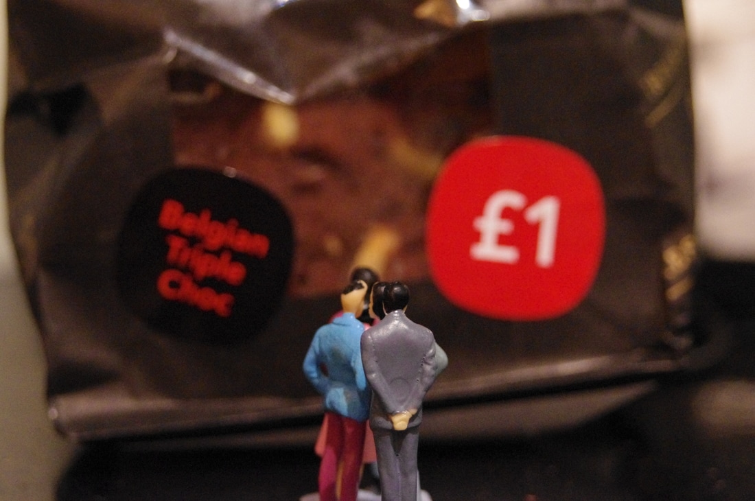
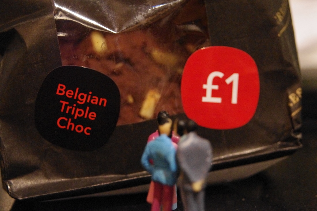
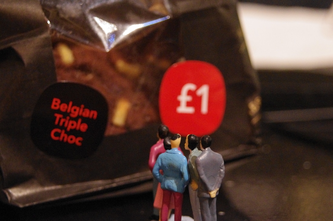
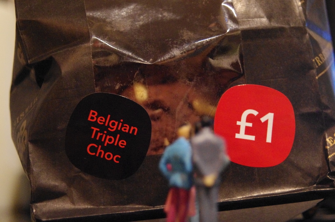
I experimented with miniature figures while briefly looking at Slinkachu's work. I created this shoot using miniature, green army men. I also used a camera, rubbers, a white background (A3 Paper) and outside. I used a depth of field of f/5.6 to achieve the blurred affect behind the focused soldier. I used the light of the window to use the shadows to my advantage to add contrast to the images.
WWW:- The photographs are focused.
EBI:- If I took more photographs.
WWW:- The photographs are focused.
EBI:- If I took more photographs.
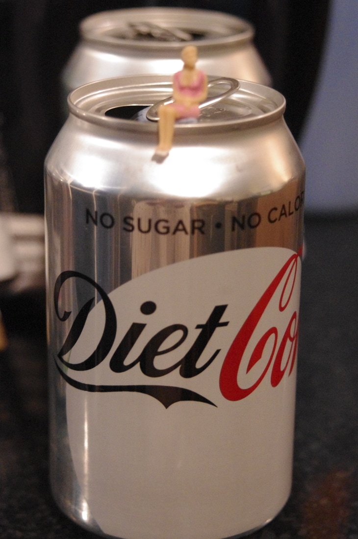
Photoshop Edit
An edited version of the first image using Photoshop, making the image brighter and more vibrant. I created this by clicking on Image -> Adjustments -> Brightness/Contrast and then increased the intensity.
Researching Photographers For Ideas:-
Slinkachu
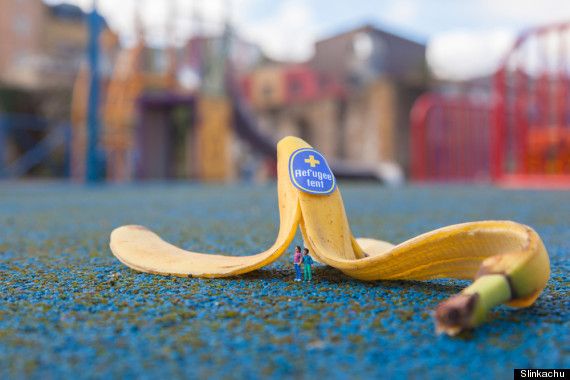
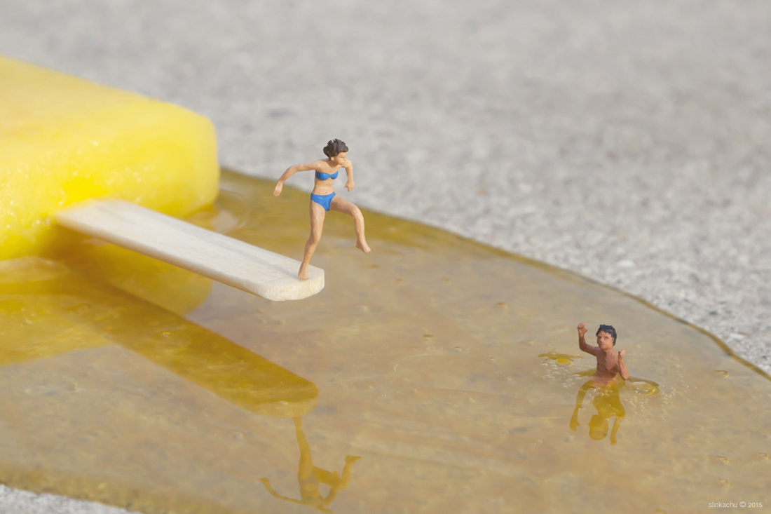
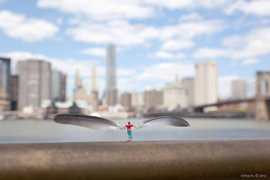
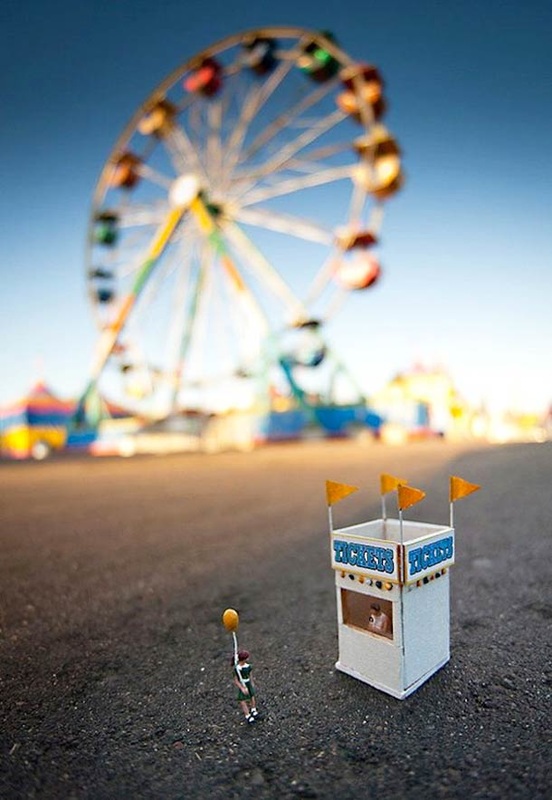
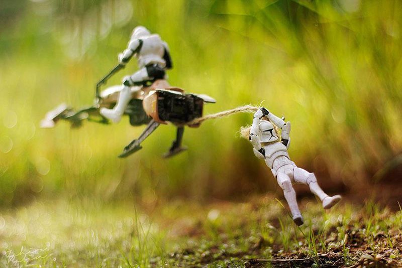
Slinkachu is a London-Based photographer who creates images of small illustrations involving miniature figurines, objects and insects. He was born in 1979 in Devon, England. To create his work the photographer modifies tiny human figures from model train sets to place them in real life situations. He captures the figurines in situations such as sight seeing, swimming, playing and more. His photographs are most commonly taken at close up view. Slinkachu gets all of his imaginative ideas from himself and sits in coffee shops sketching them out.
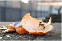
On the left is an example of Slinkachu's work. The image features an orange peel with a miniature man skateboarding on it. The colours featured are orange, red, green, blue, black, white and grey. The formal elements used colour, shape, form, line and composition. The perspective of the photograph makes the figurine seem as if it is alive.
I like the image above because it is creative, unique and colourful. I like the photographer's use of miniature figurines to make real life object appear larger. To improve the photograph Slinkachu could have featured a real life skate park in the background to show the contrast between the two.
Critical Analysis
Slinkachu Shoots:-
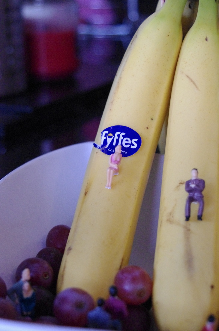
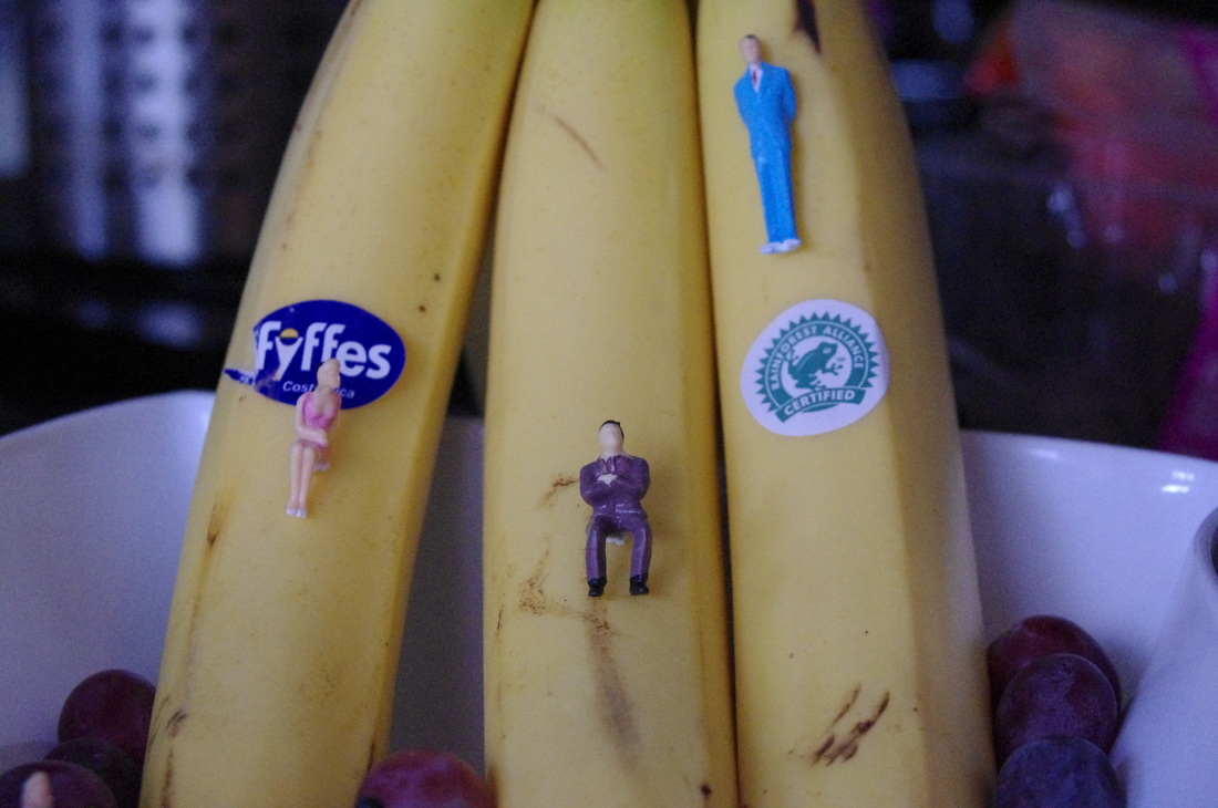
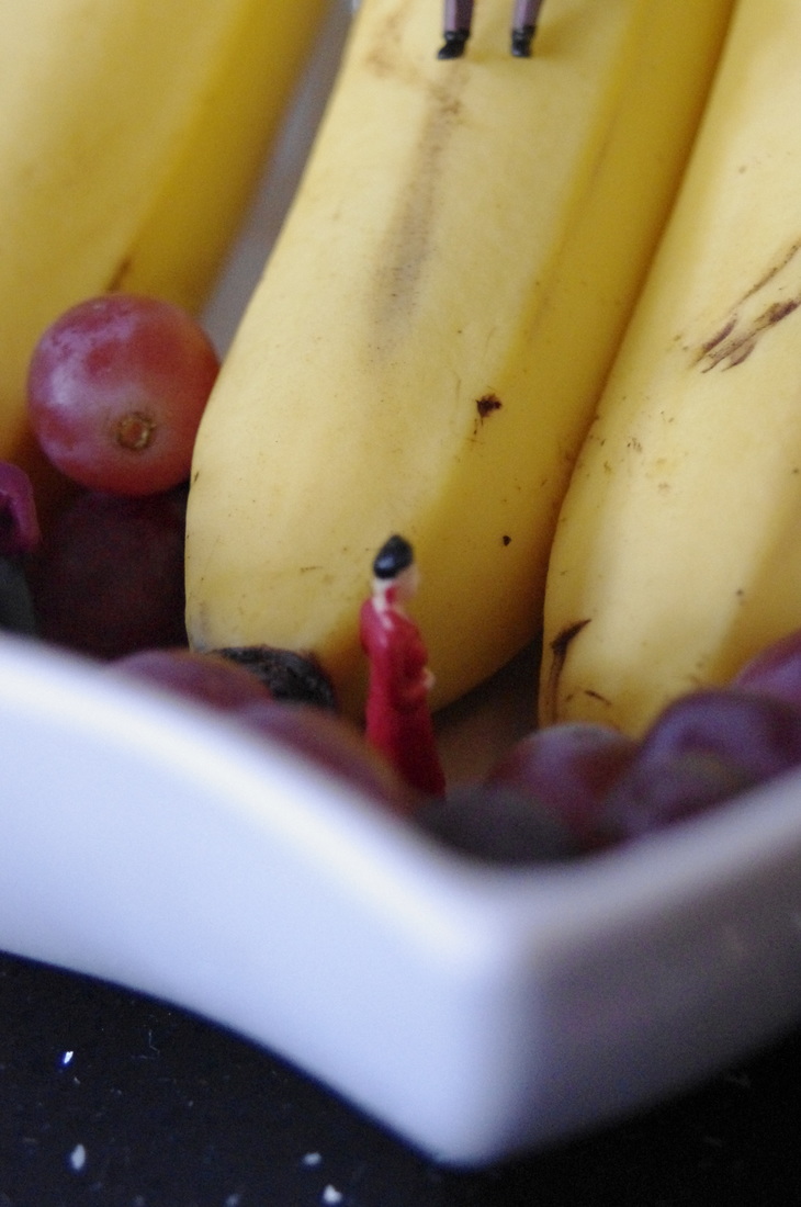
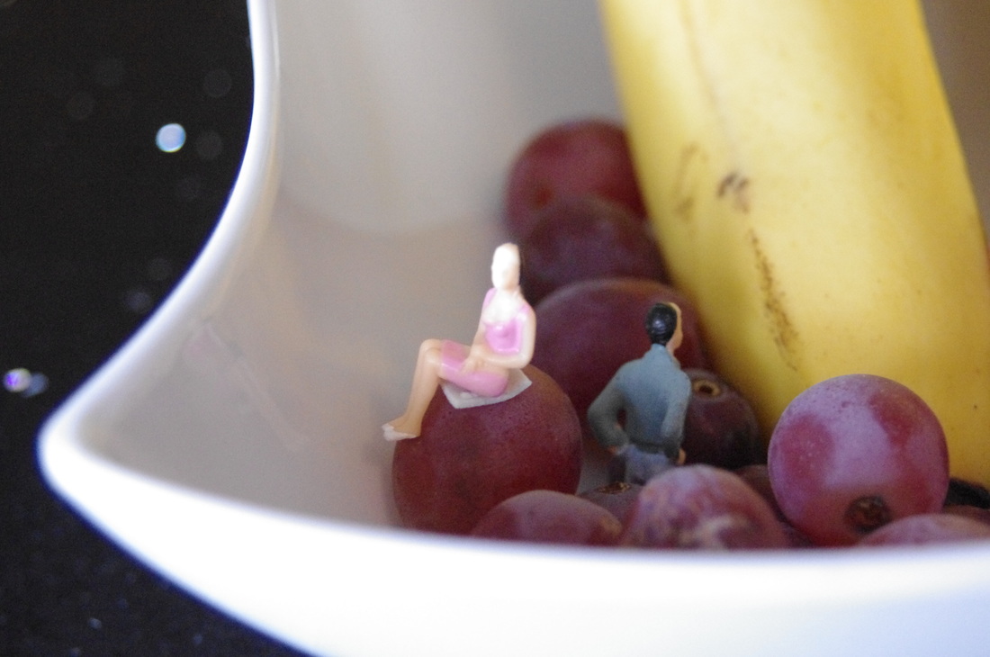
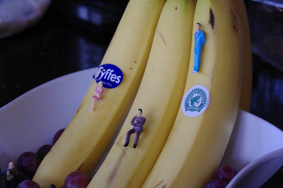
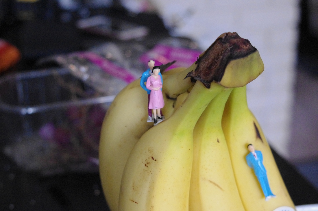
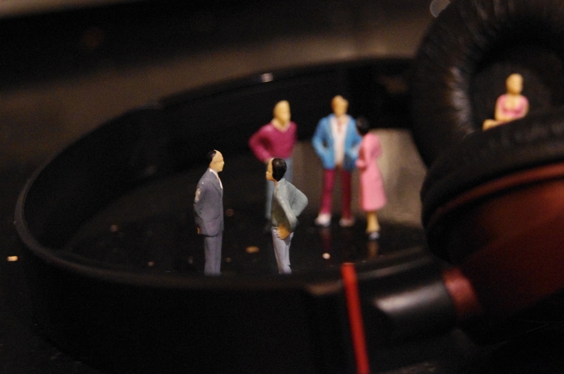
SHOOT 1
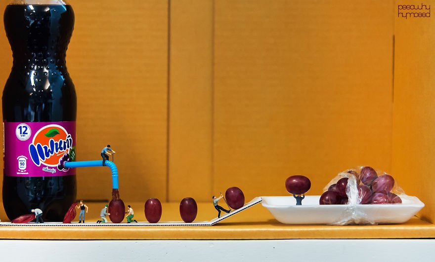
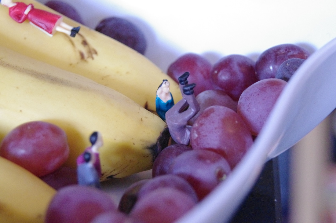
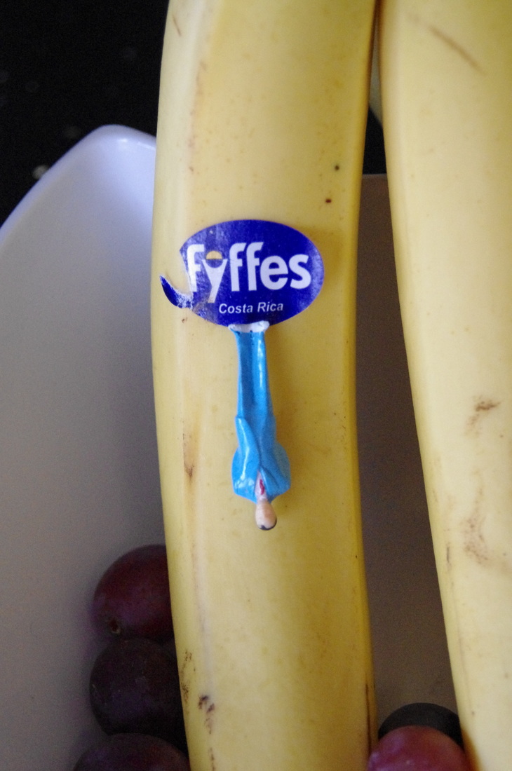
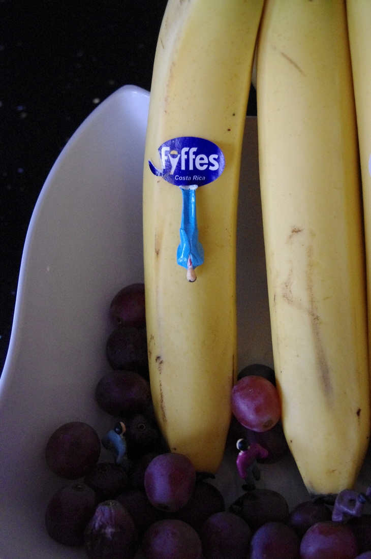
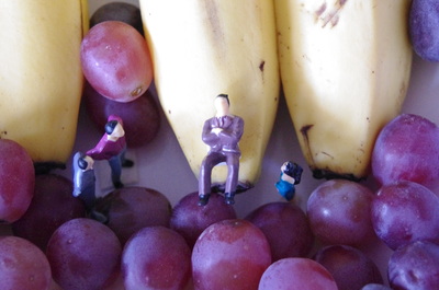
These following shoots are inspired by Slinkachu. I used small figures that I purchased online to create scenes using common objects such as fruit (bananas). For the first 13 photographs I created them using bananas, grapes, an irregular square bowl, double-sided tape and the small figures. I attached the double-sided tape to the figures at the back of them or on the bottom to keep them in place. I wanted to use fruit to link to Carl Warner's theme of using food to create scenes, 'foodscapes', that I am interested in researching further. I created a slide using the bananas and the grapes to act as a ball pit at the bottom.
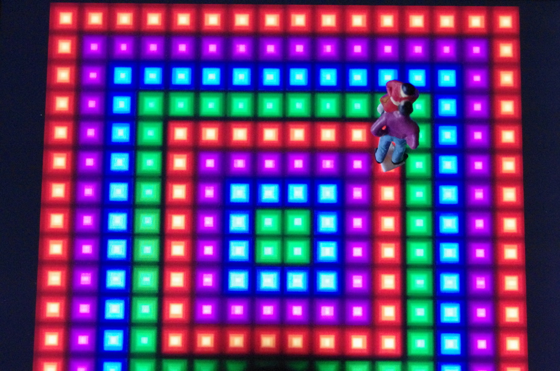
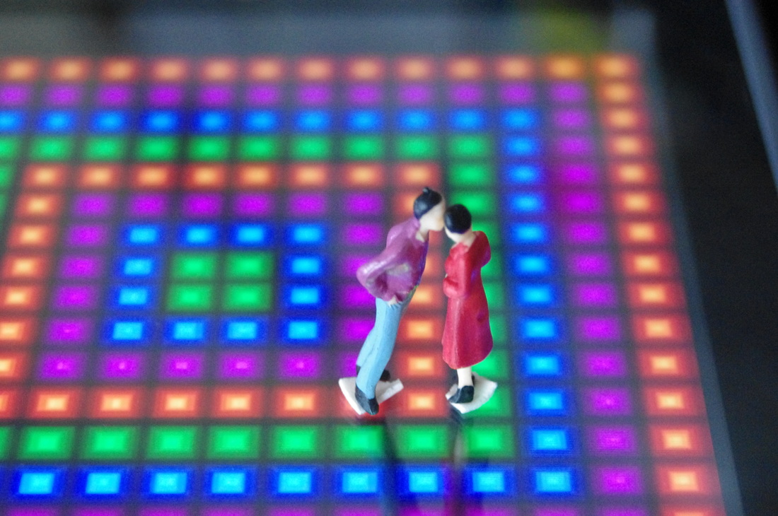
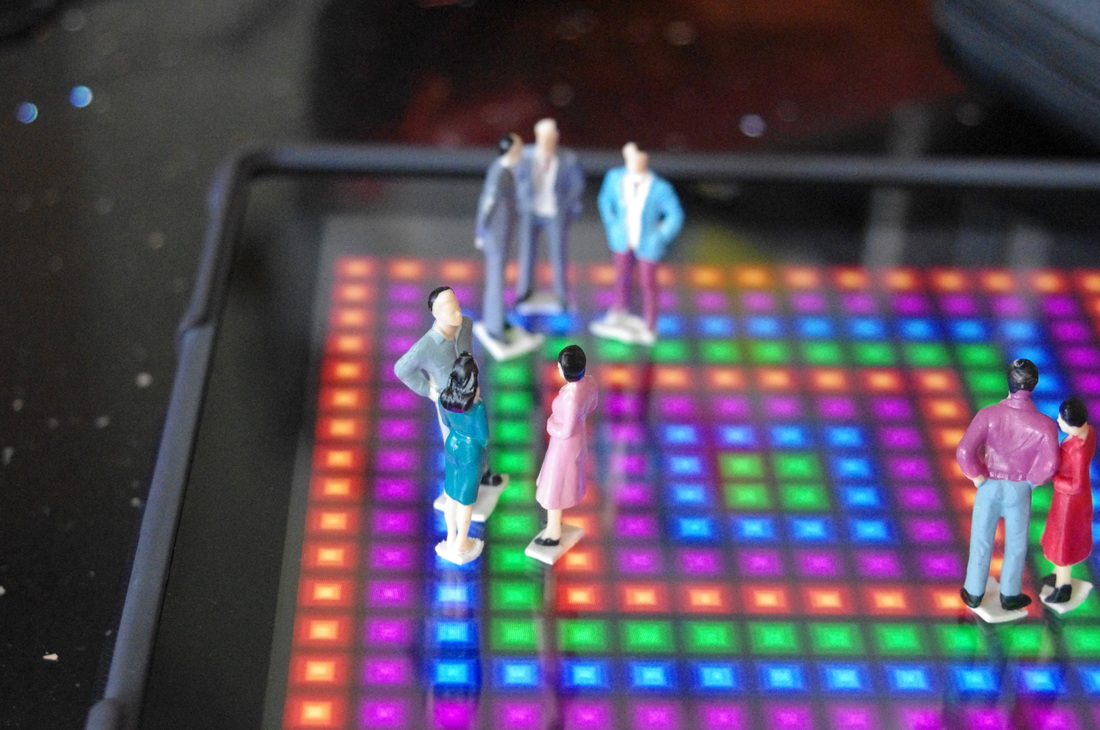
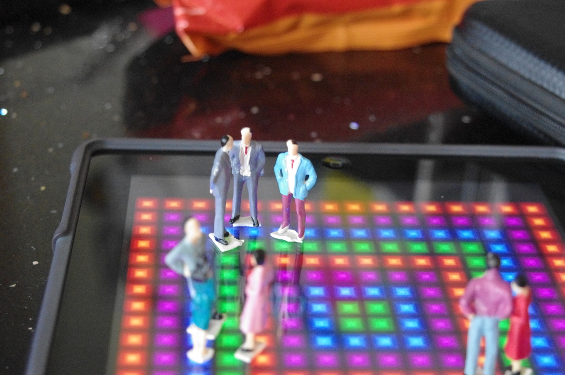
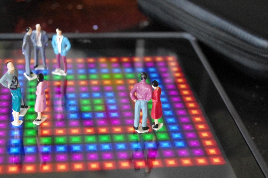
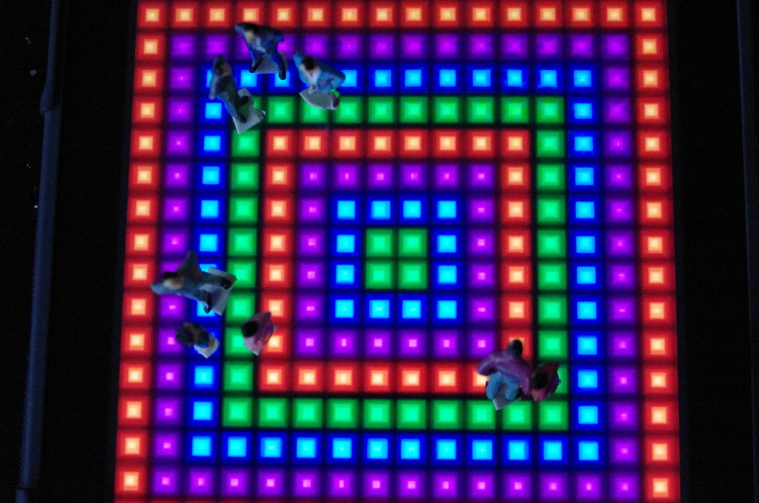
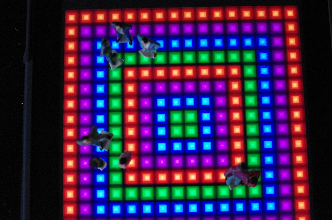
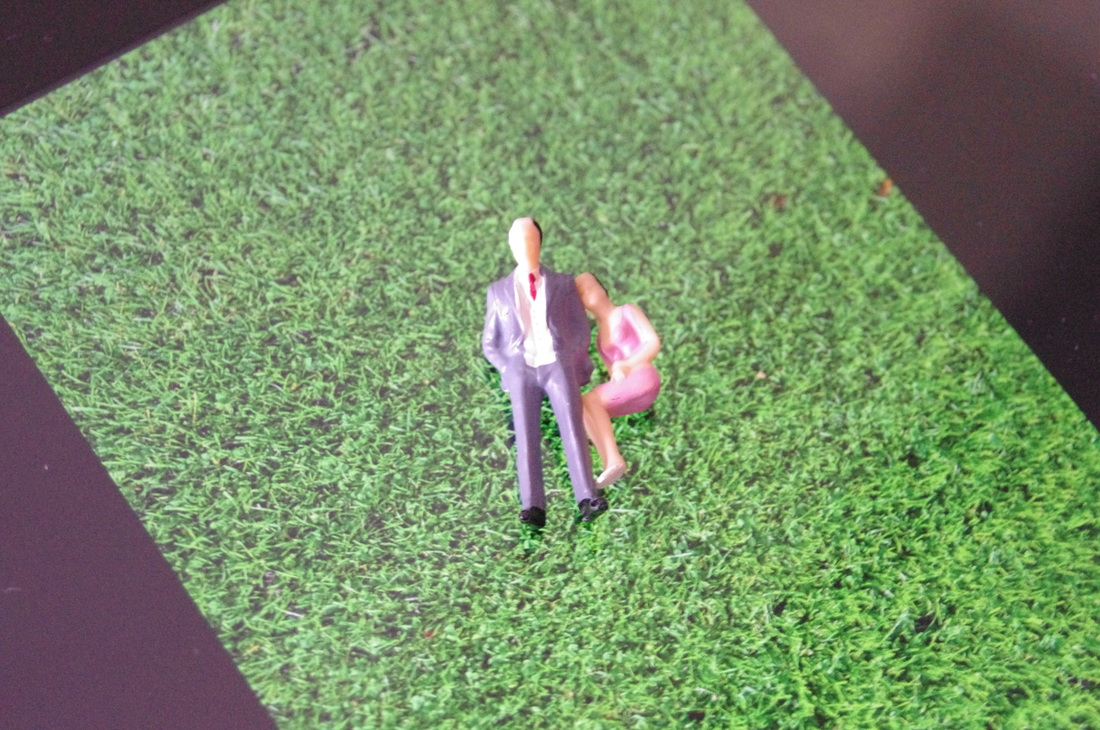
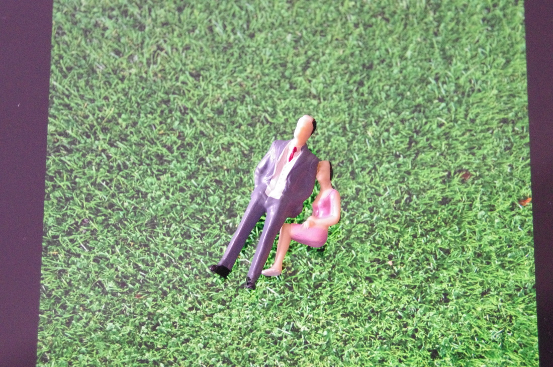
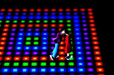
For the photographs after the first 13 I used my iPad to display an image that acted as the floor for the figures to stand on. I chose a dance floor and placed the figures on the screen using the double-sided tape again to keep the characters upright. I also chose a grass background to act as a picnic scene but it did not work out as well as I wanted with the figures I had so I only took 2 images as an experiment with different backgrounds.
WWW:- The photographs are clear and link to Slinkachu. The photographs are how I wanted them to be.
EBI:- If the double-sided tape did not show on the images or was less obvious.
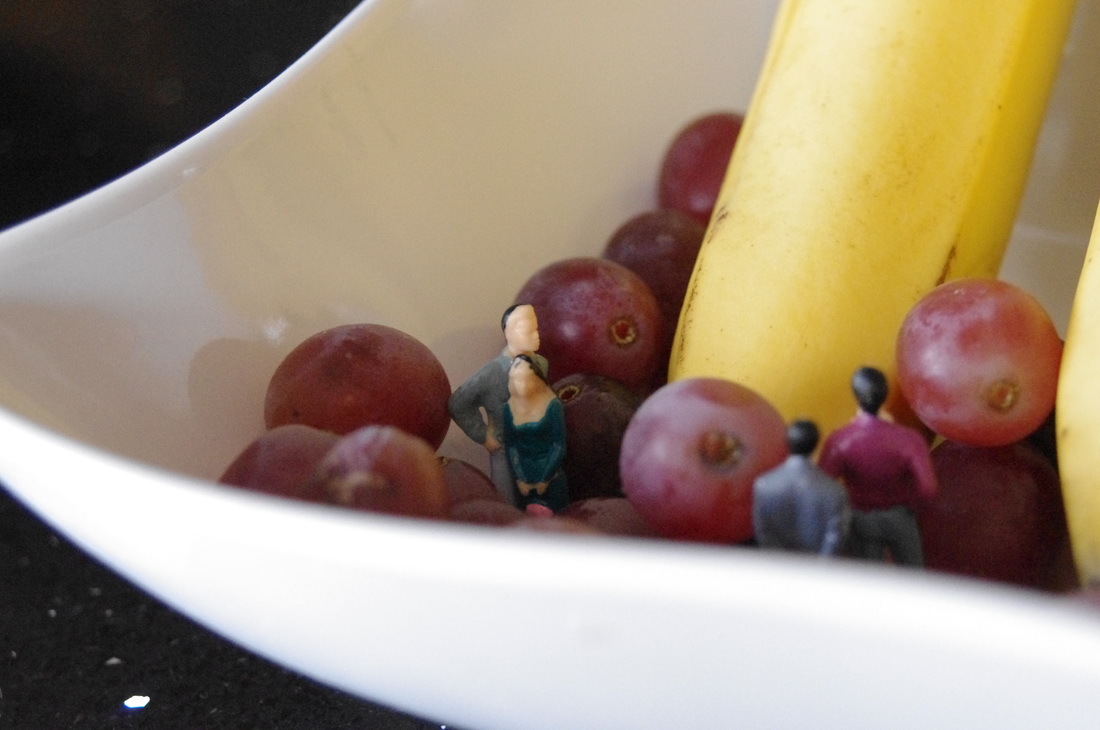

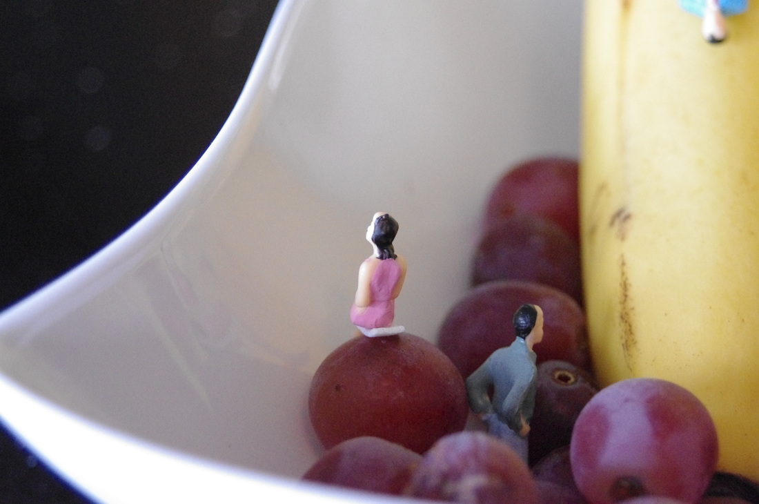
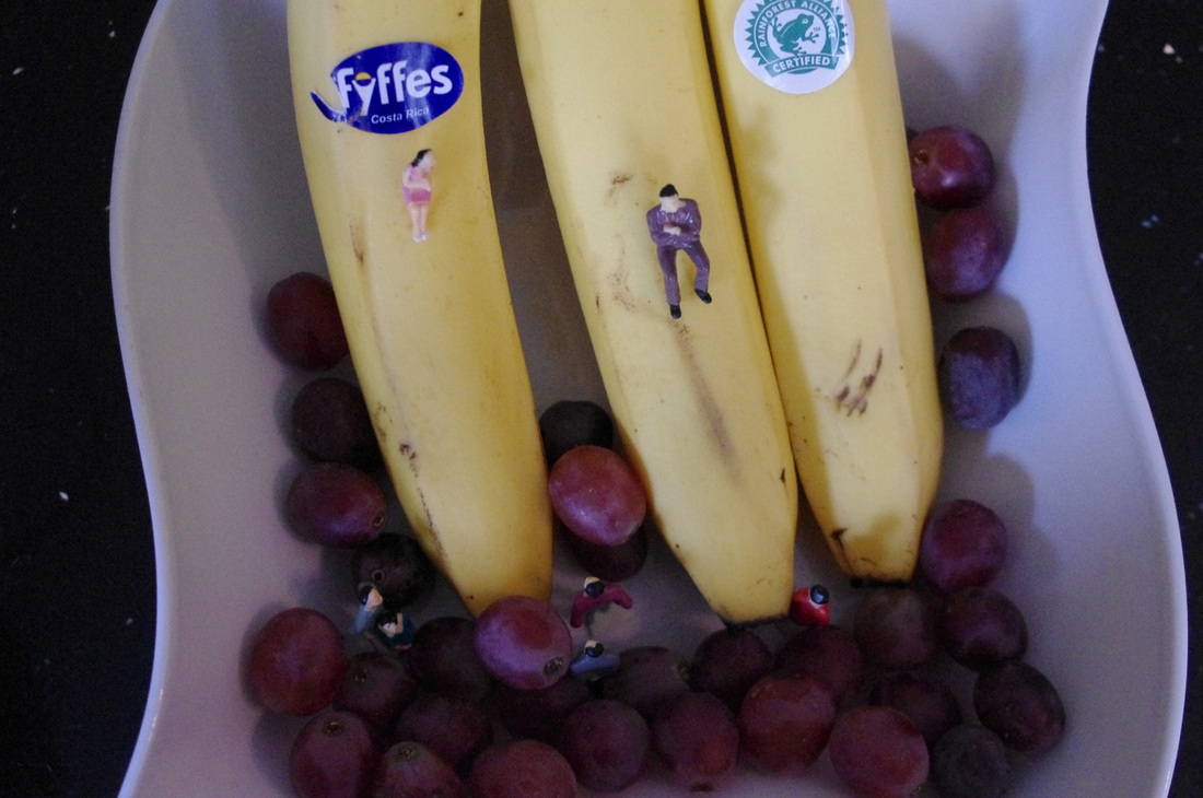
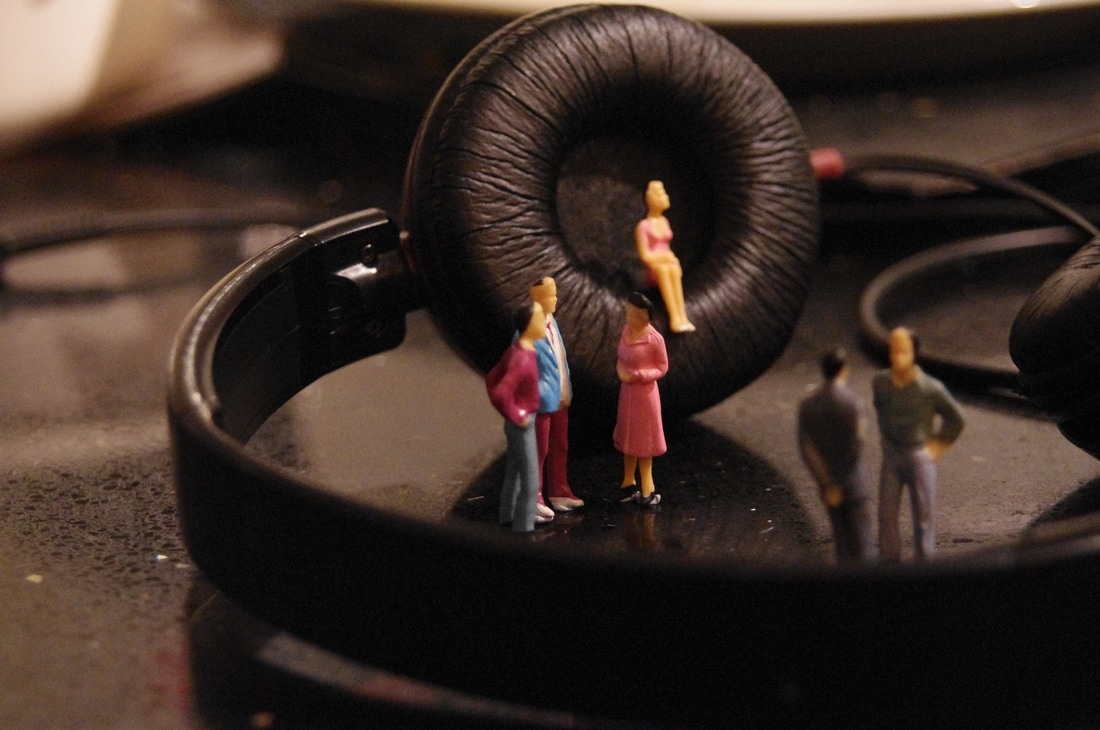
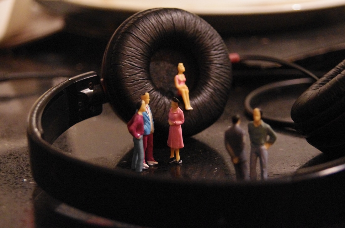
3 Best Images From This Shoot:-
I chose these 3 photographs because they have a sense of humour that Slinkachu uses in his work often. They are all clear


Photoshop Edit
I used Photoshop to edit the photograph above. First of all I clicked on Image -> Adjustments -> Brightness/Contrast and changed the brightness to -67 and the contrast to 100. Next I clicked Image -> Adjustments -> Levels and changed the numbers to 87, 1.28 and 203.
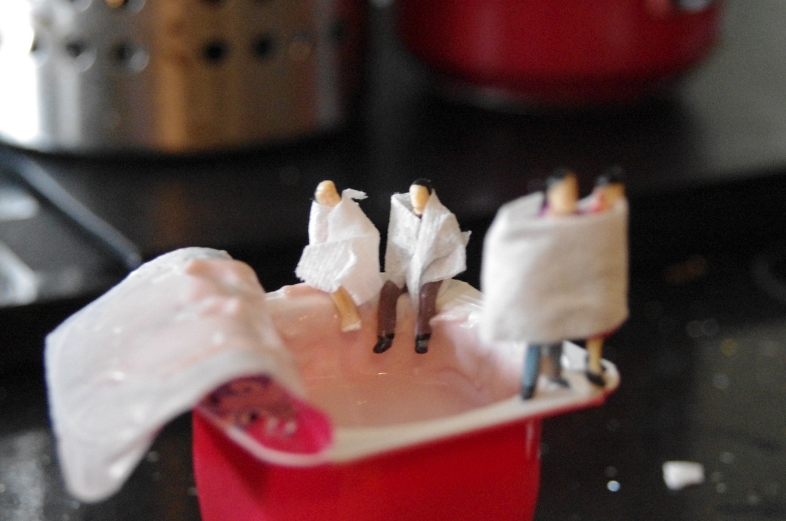
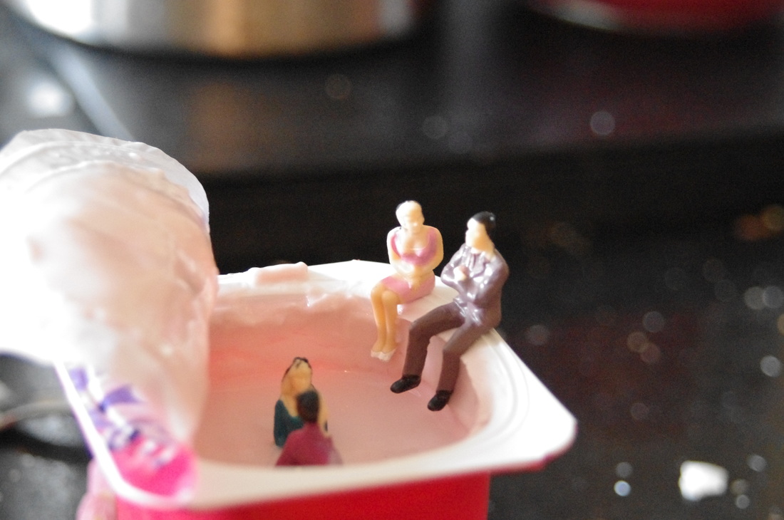
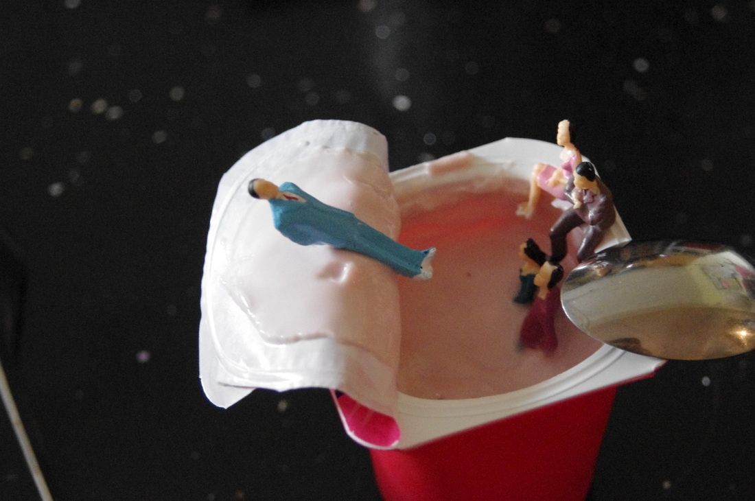
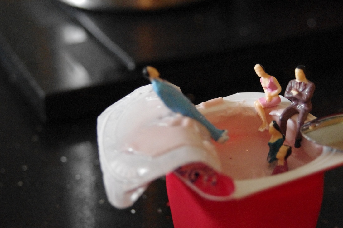
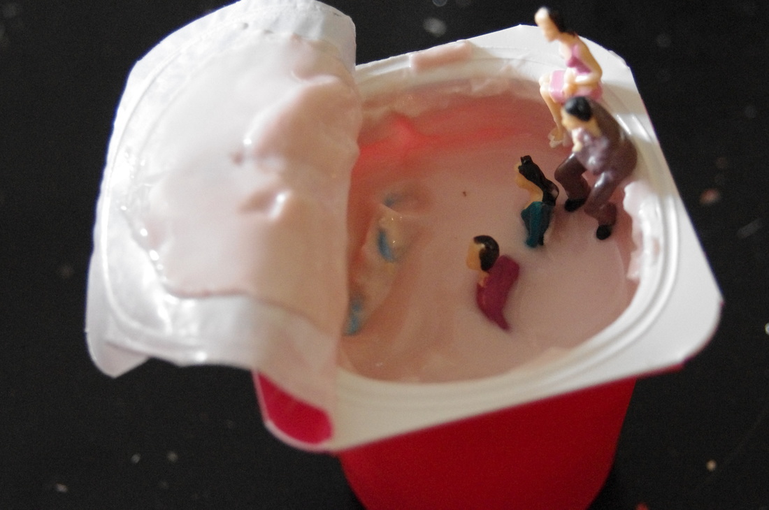
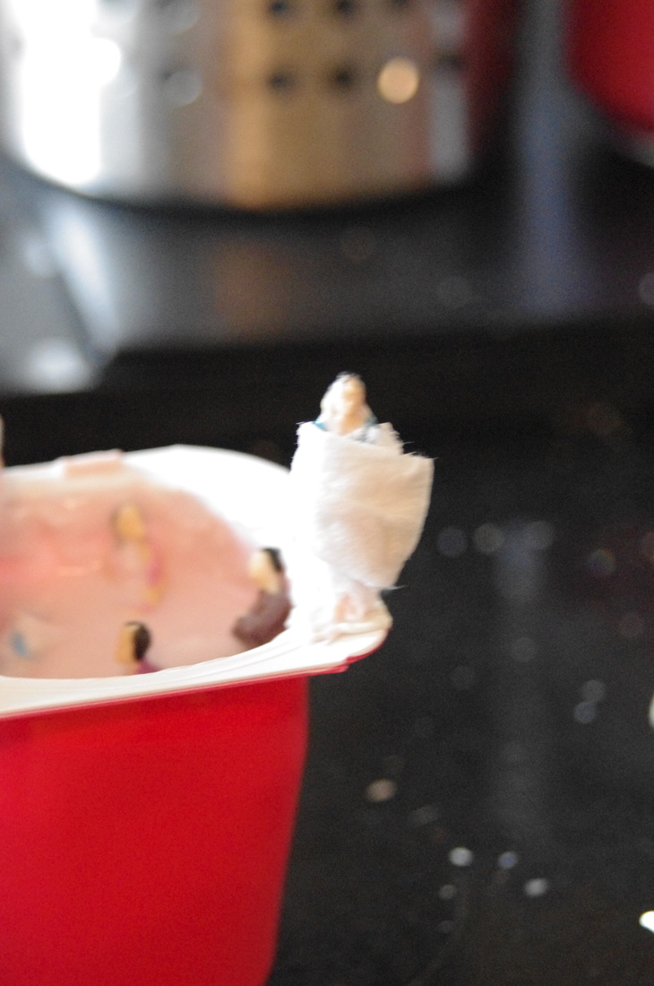
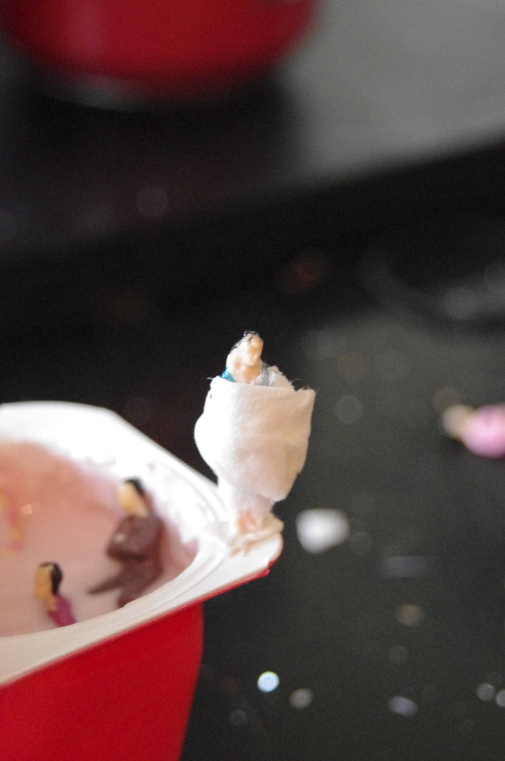
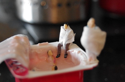
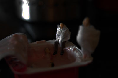
SHOOT 2
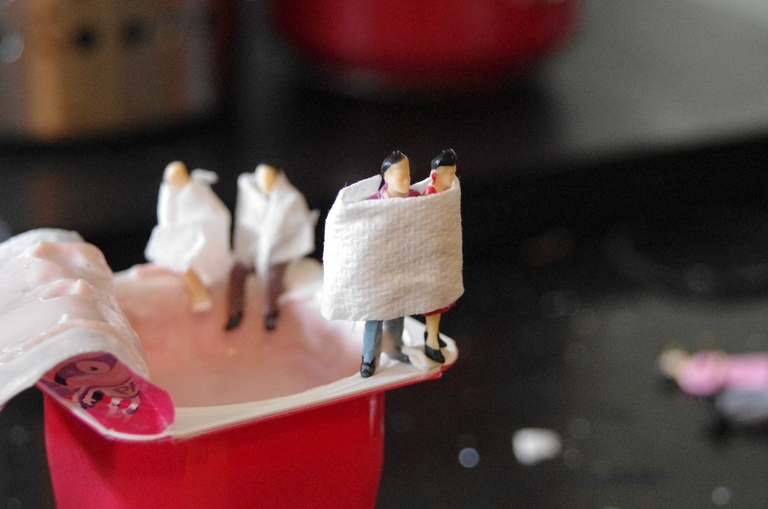
For this shoot I interpreted Carl Warner with Slinkachu by using yogurt and the small figures. I used the yogurt to act as a swimming pool/jacuzzi. I also used some kitchen towel to act as a towel for the figures.
WWW:- The photographs are all focused and I have featured the rule of thirds in some of the images too.
EBI:- If I made sure other figures and pieces of double-sided tape were out of the way before I took the picture.
WWW:- The photographs are all focused and I have featured the rule of thirds in some of the images too.
EBI:- If I made sure other figures and pieces of double-sided tape were out of the way before I took the picture.
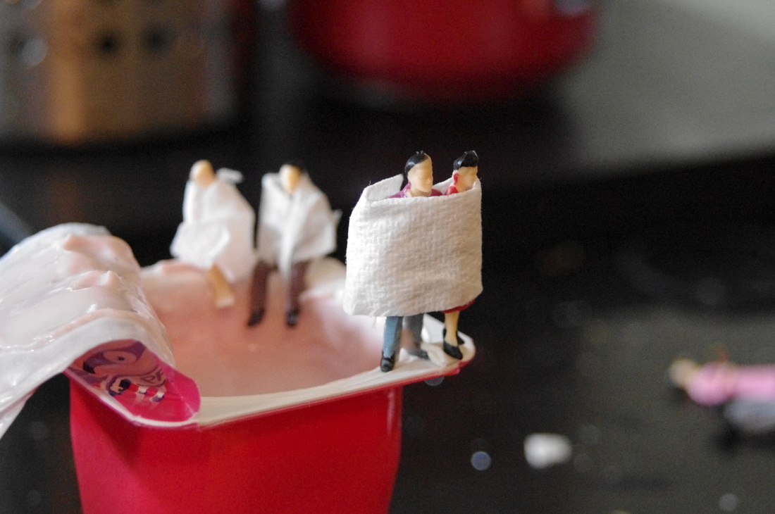
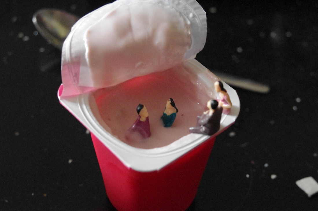
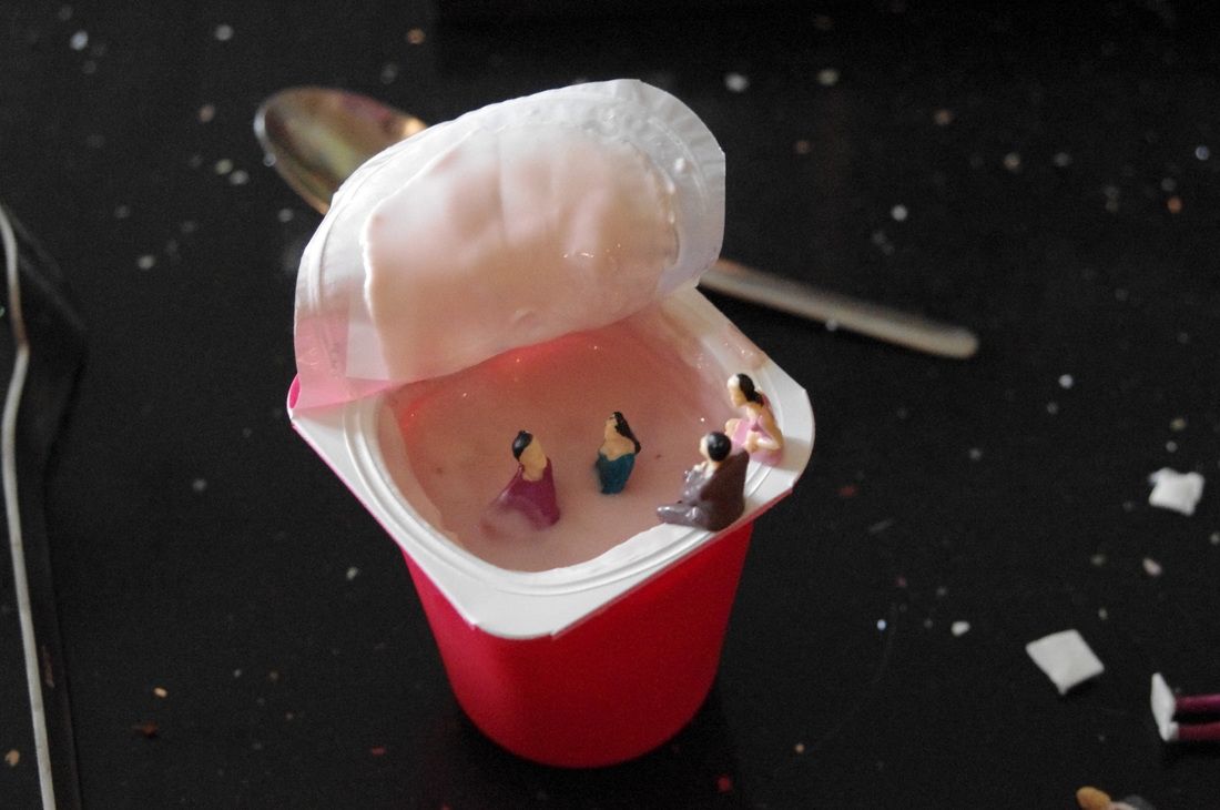
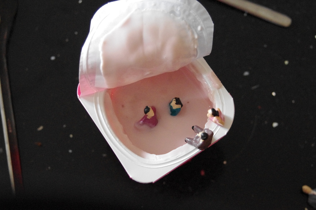
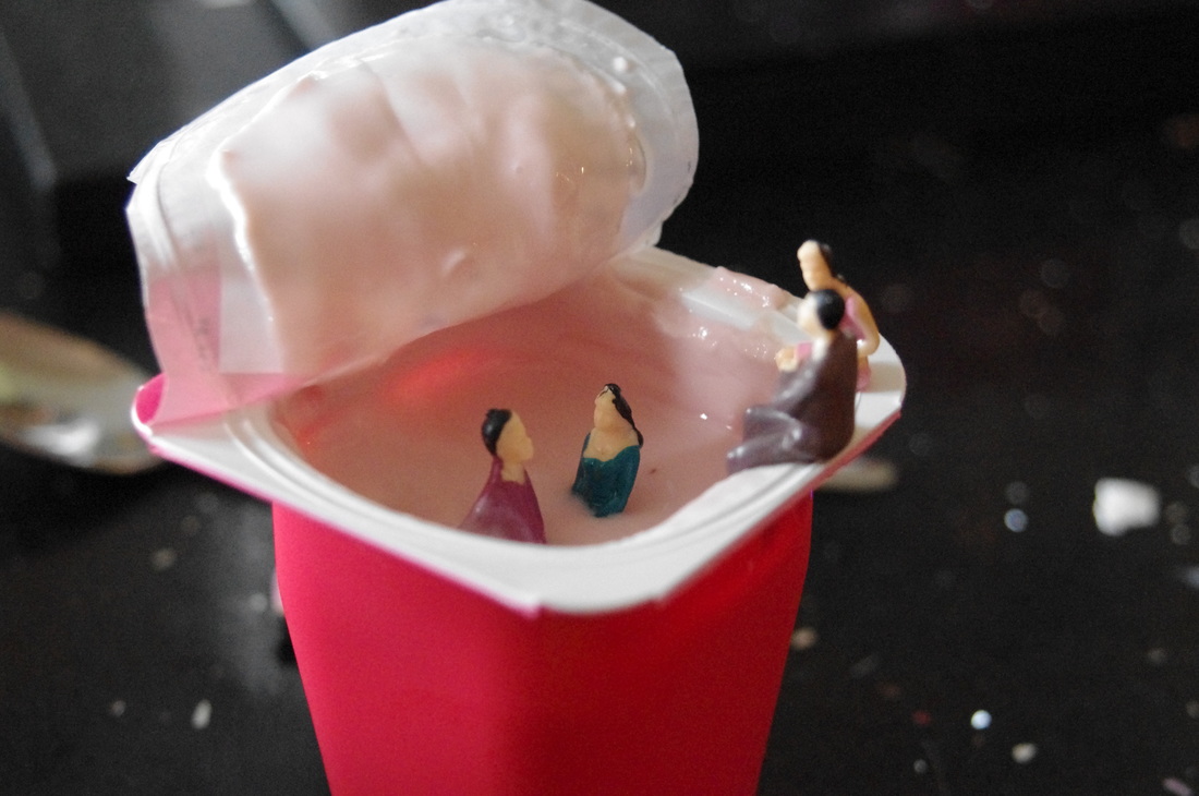
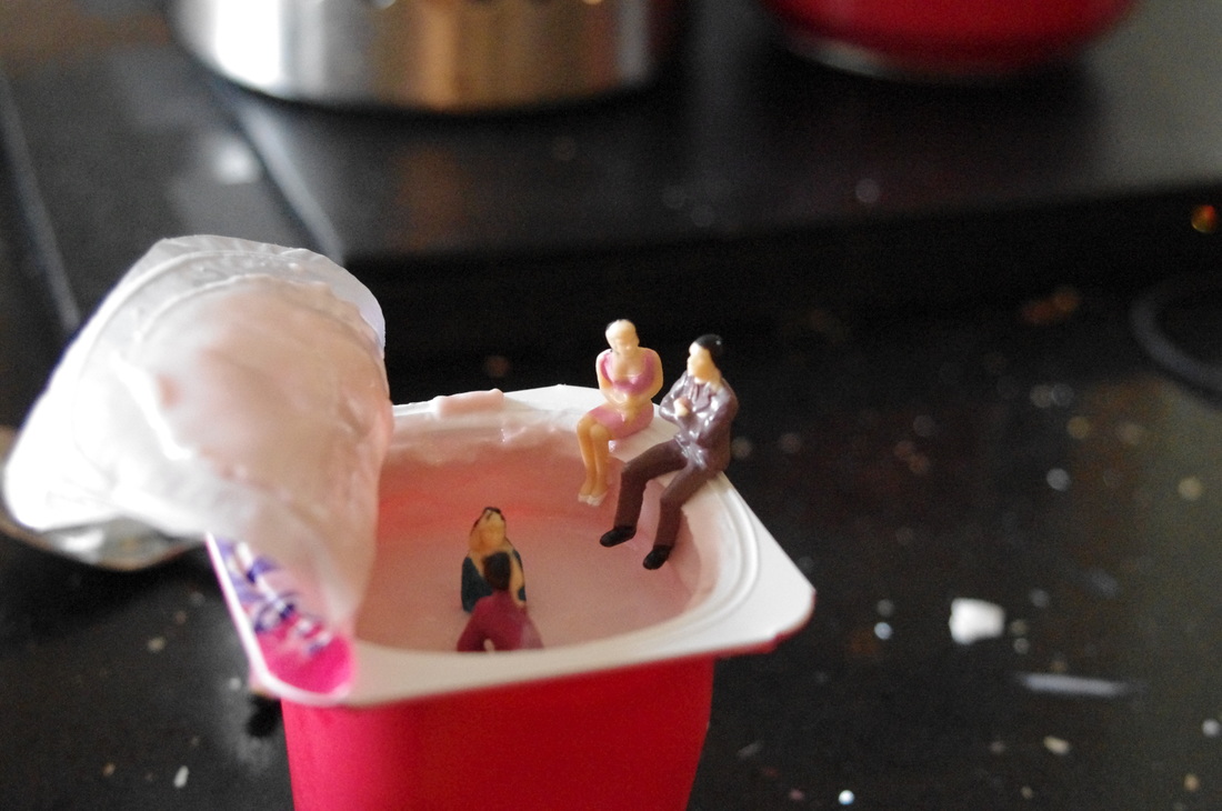
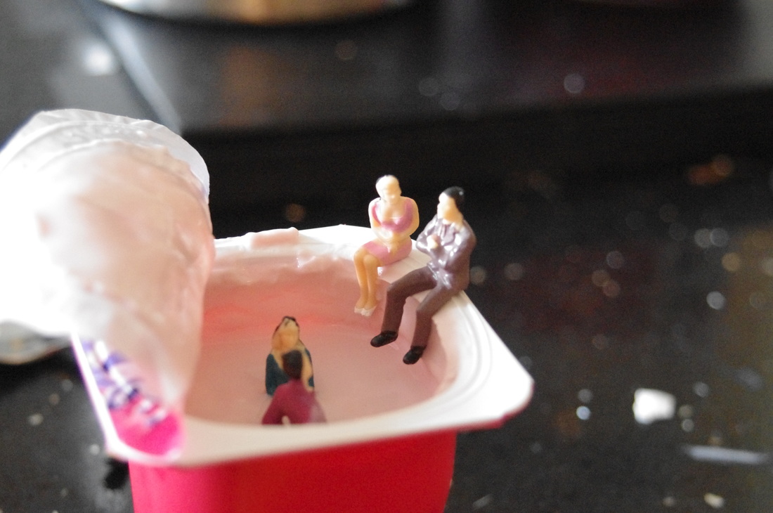
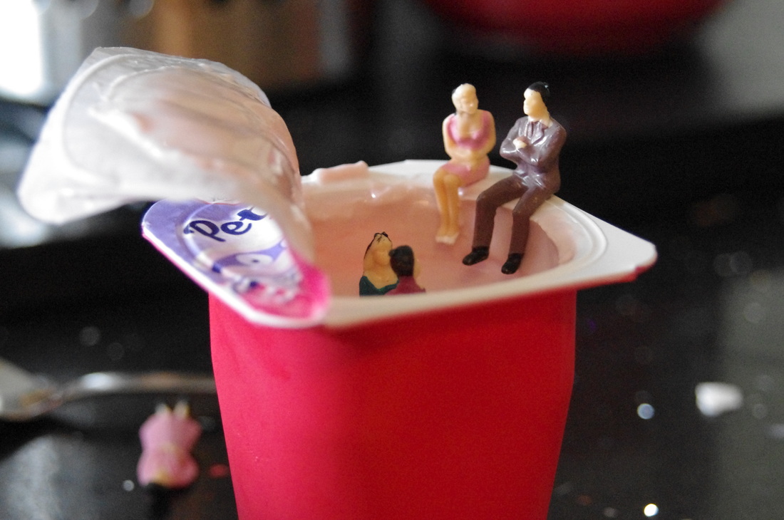
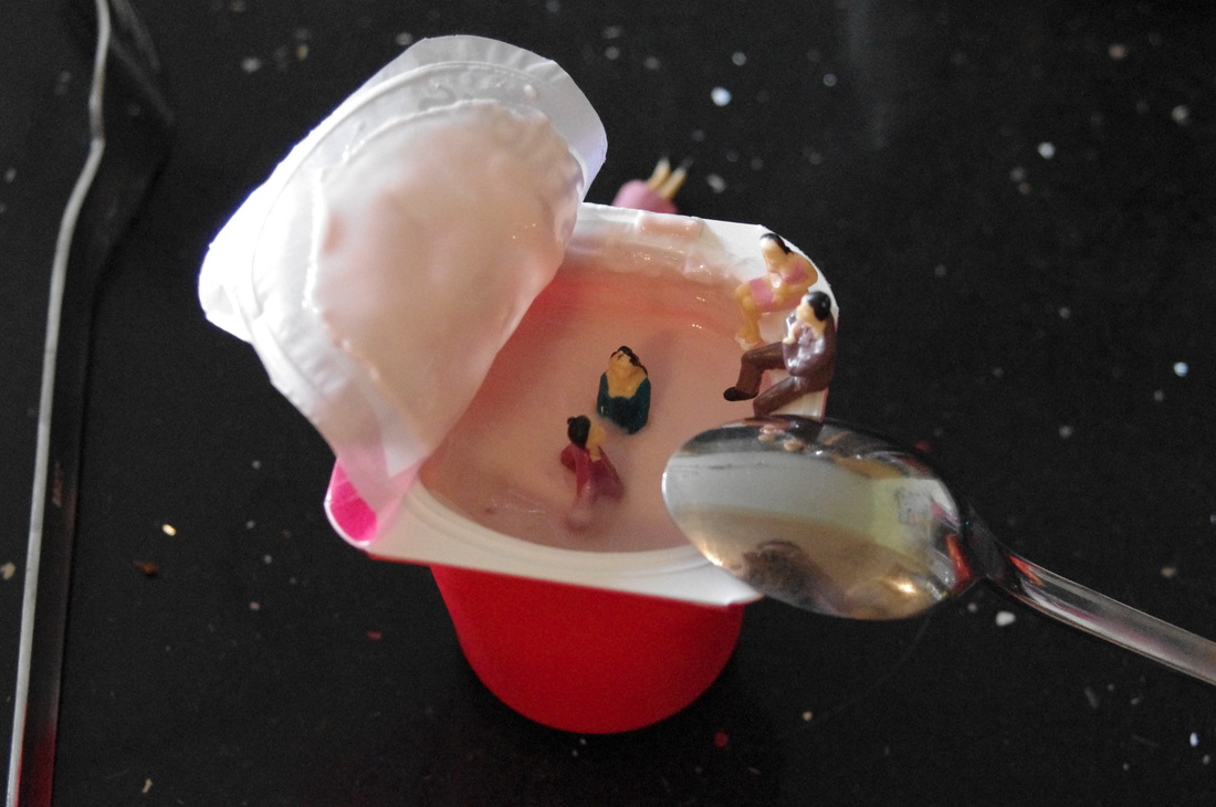
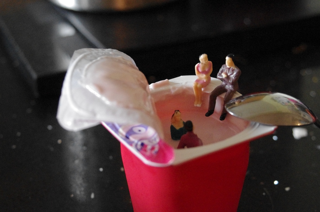
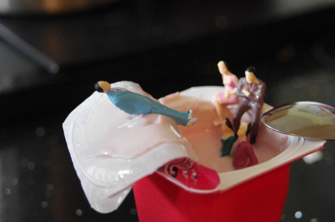
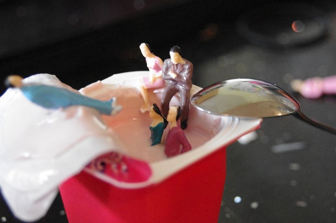
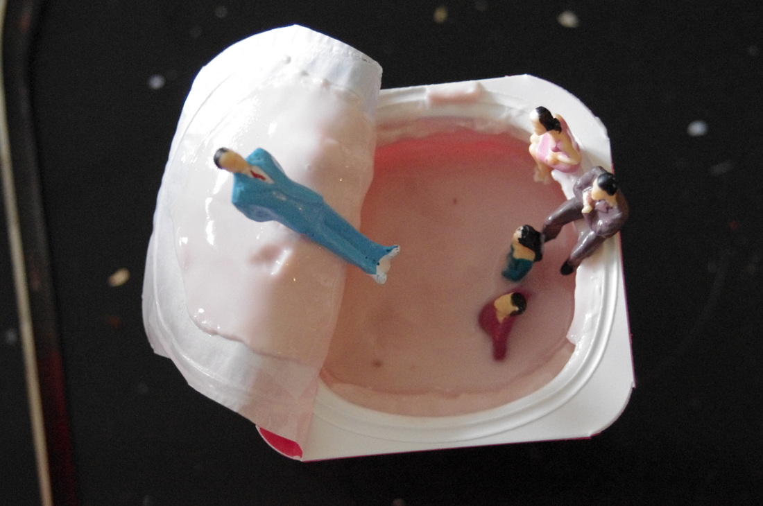
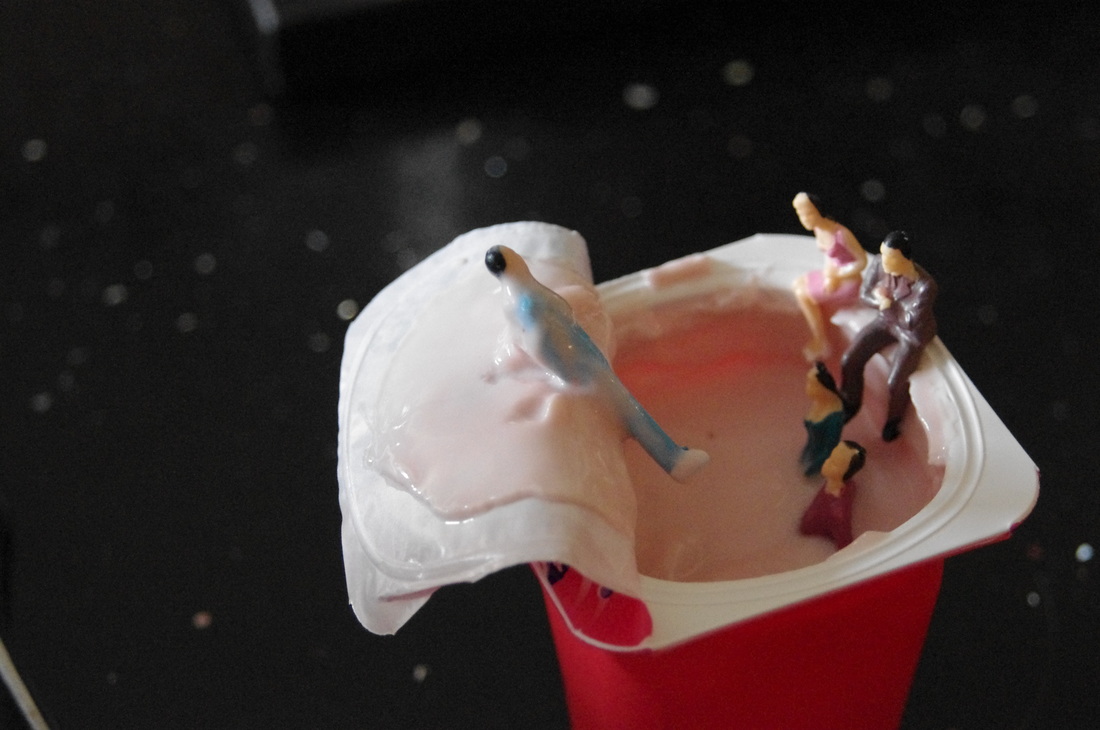
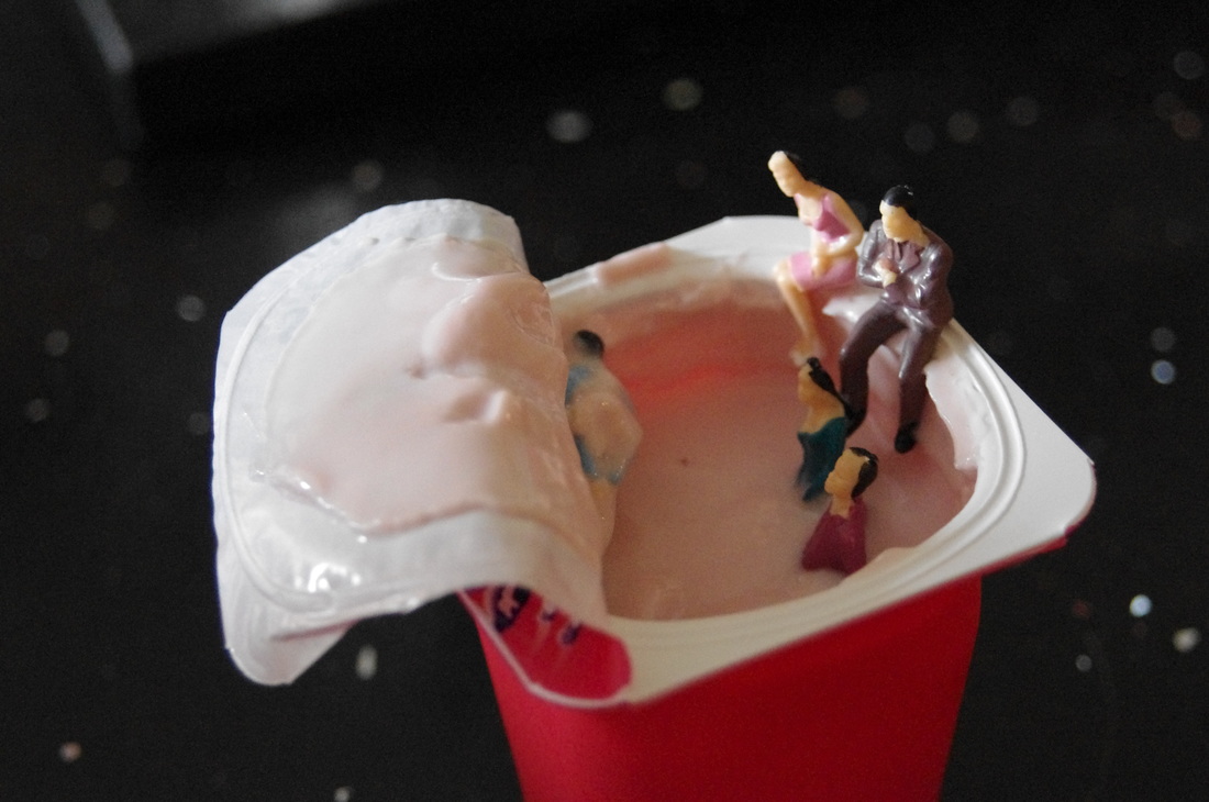
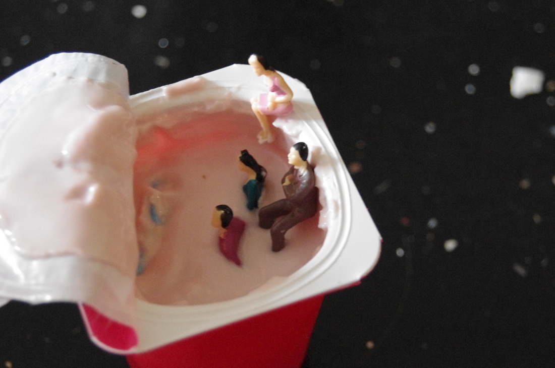
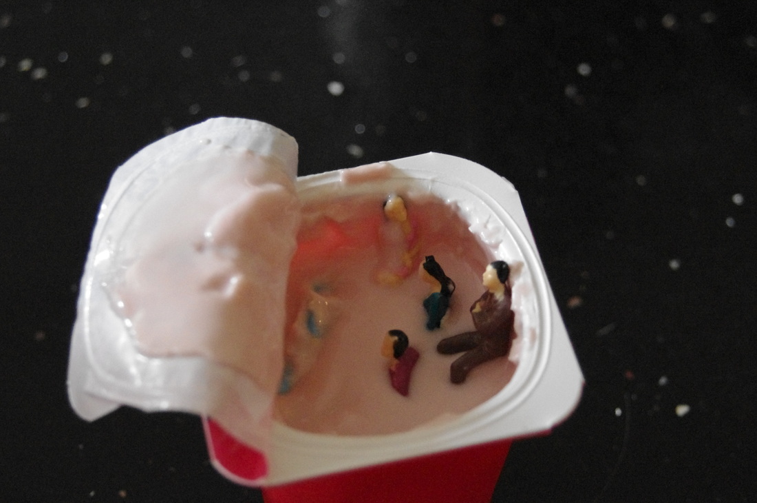
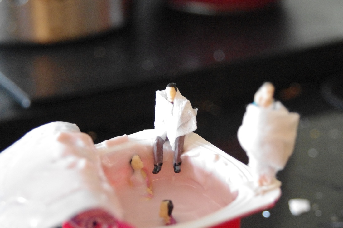

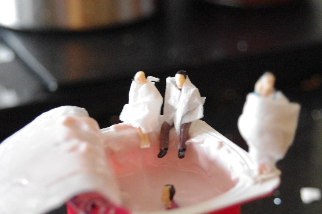
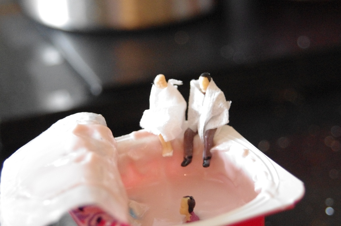
3 Best Images From This Shoot:-
I chose these 3 images as they do not contain anything that should not be in the background. I also like how the light reflects off the yogurt and the characters adding more detail.


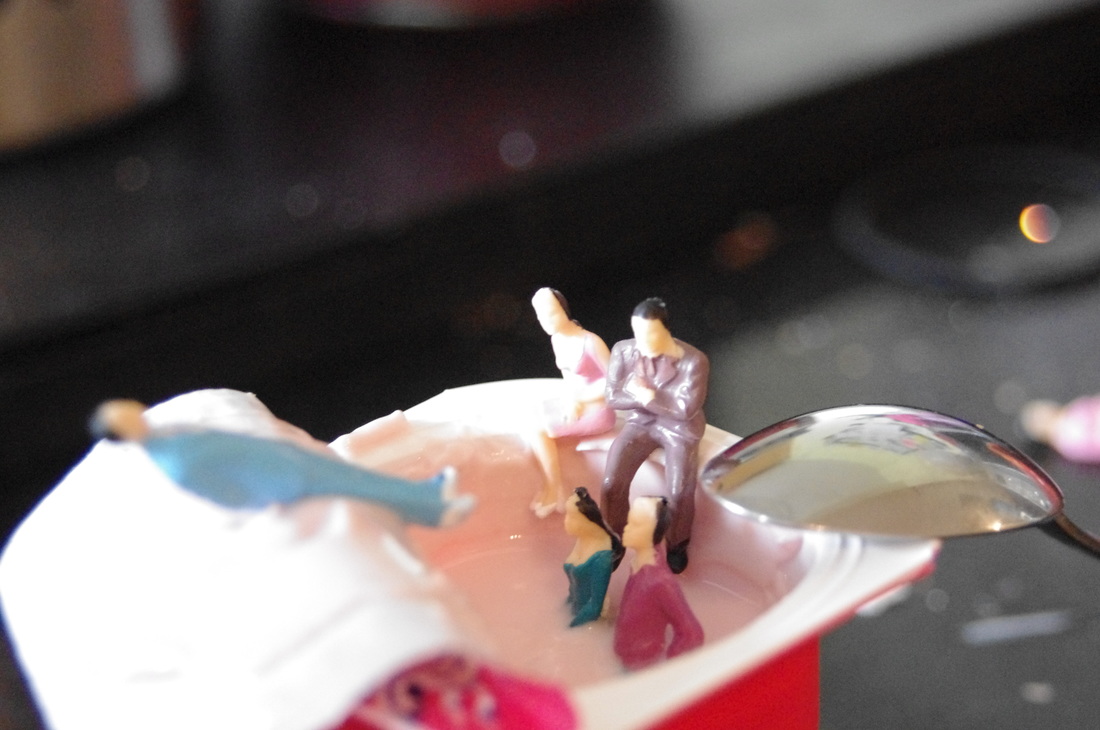
Photoshop Edit
I edited one of the images above using Photoshop. First of all I clicked Image -> Adjustments -> Brightness/Contrast and then changed the brightness to -150 and the contrast to 100.
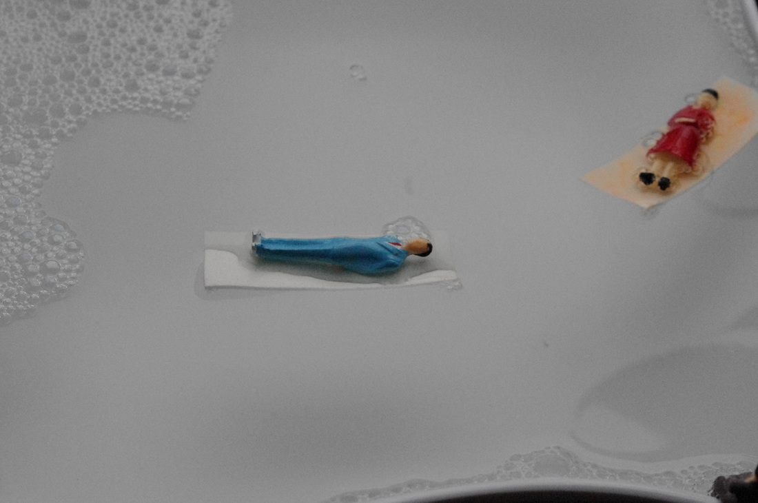
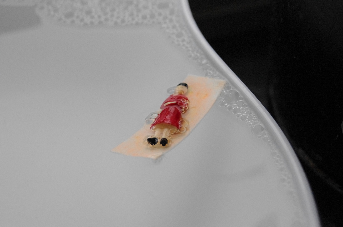
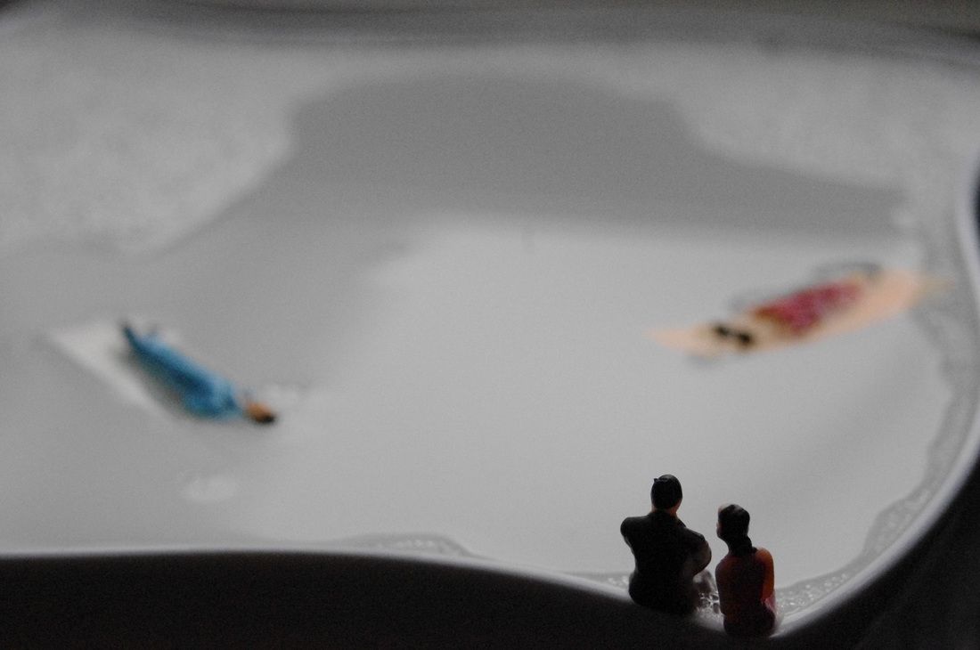
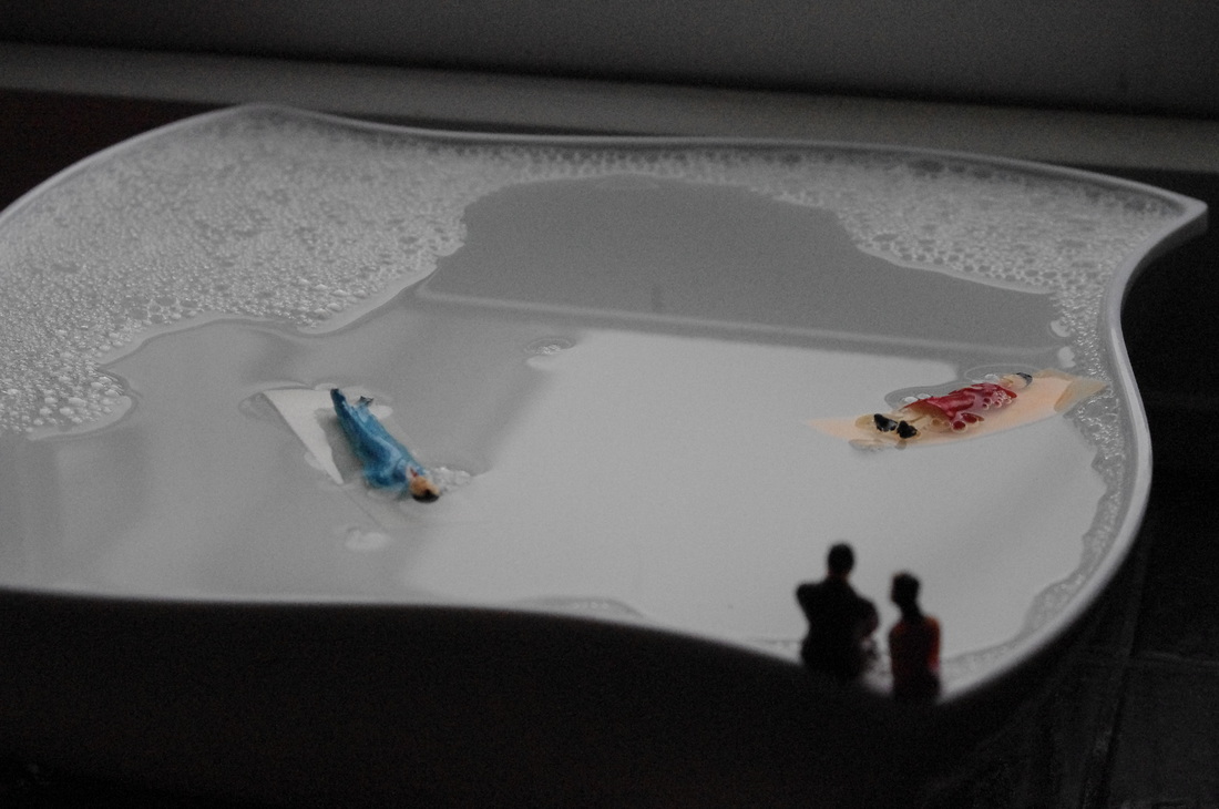
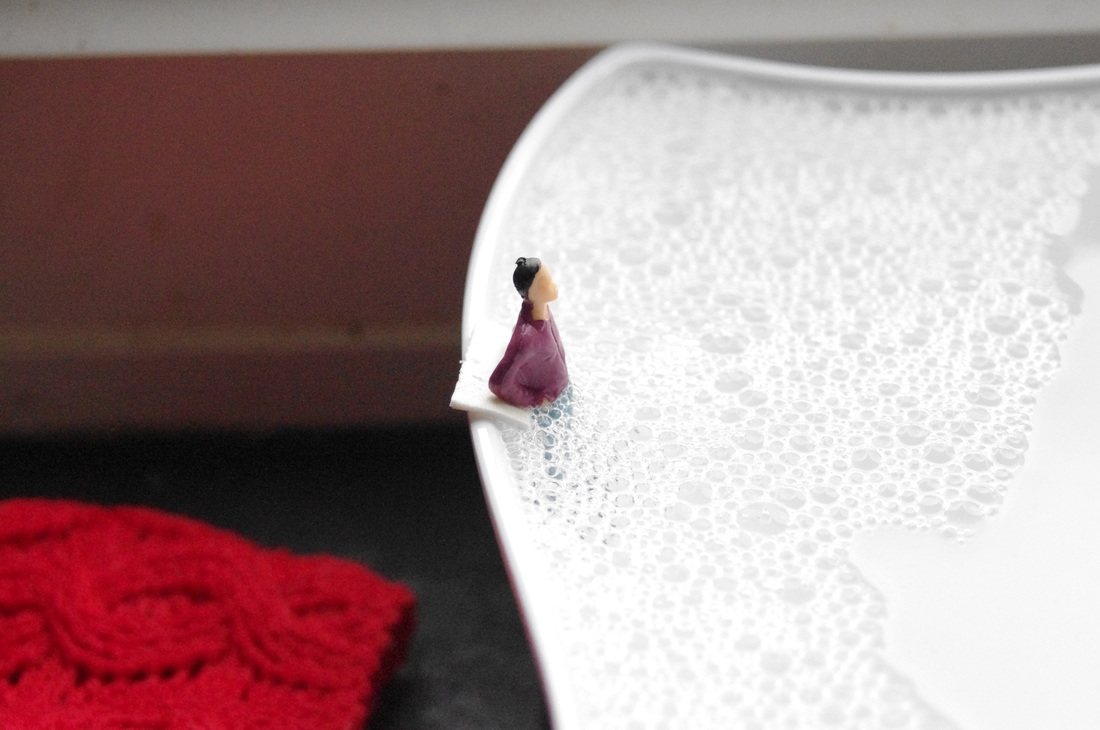
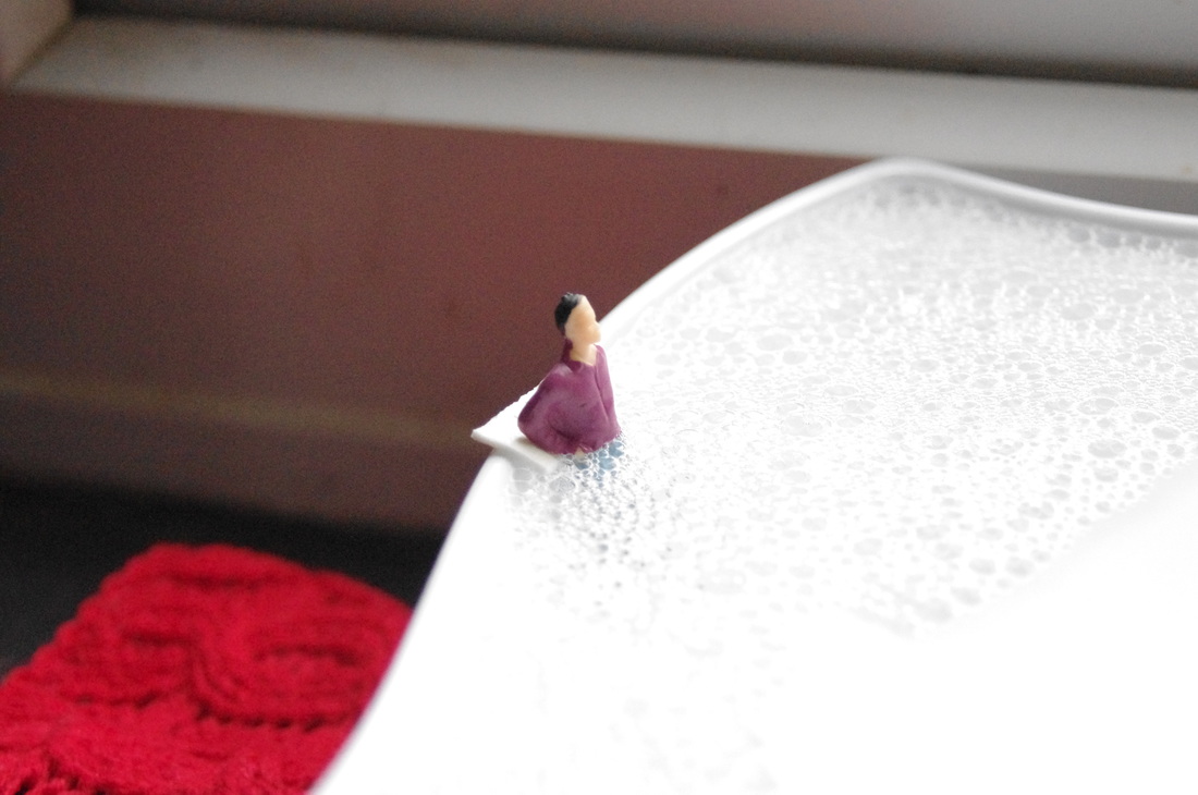
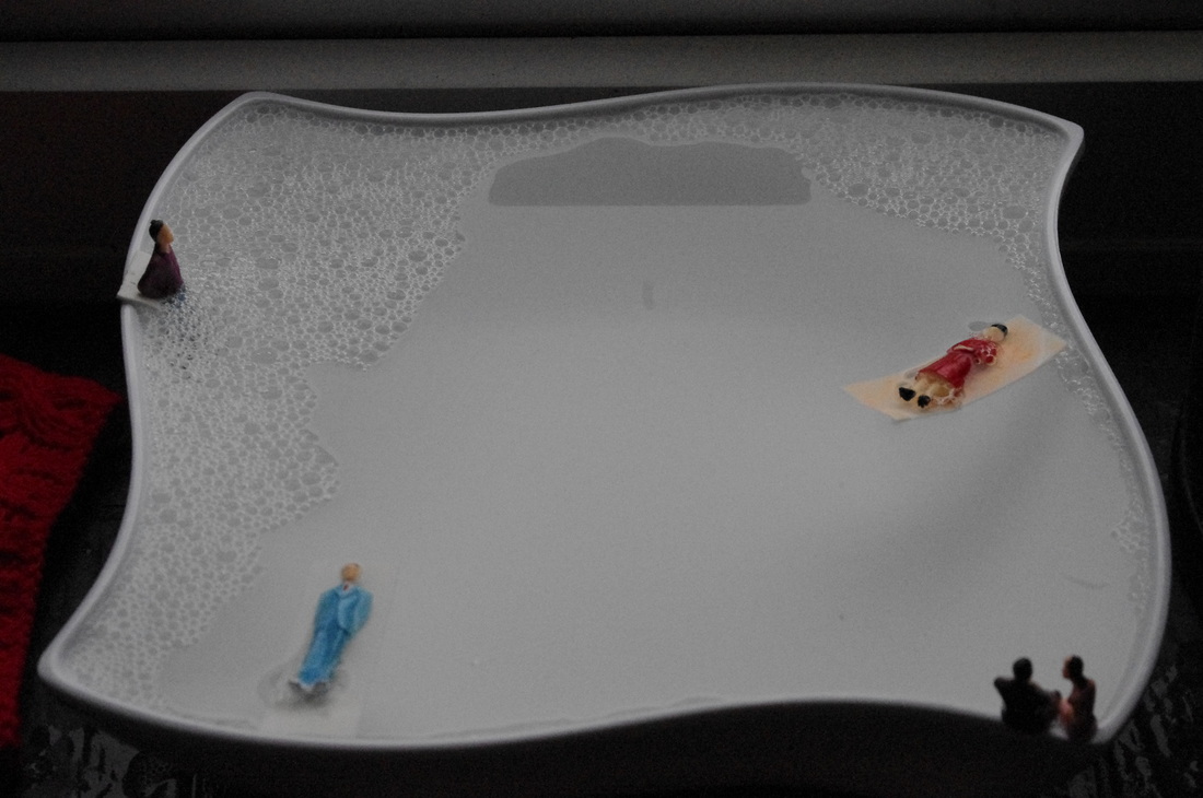
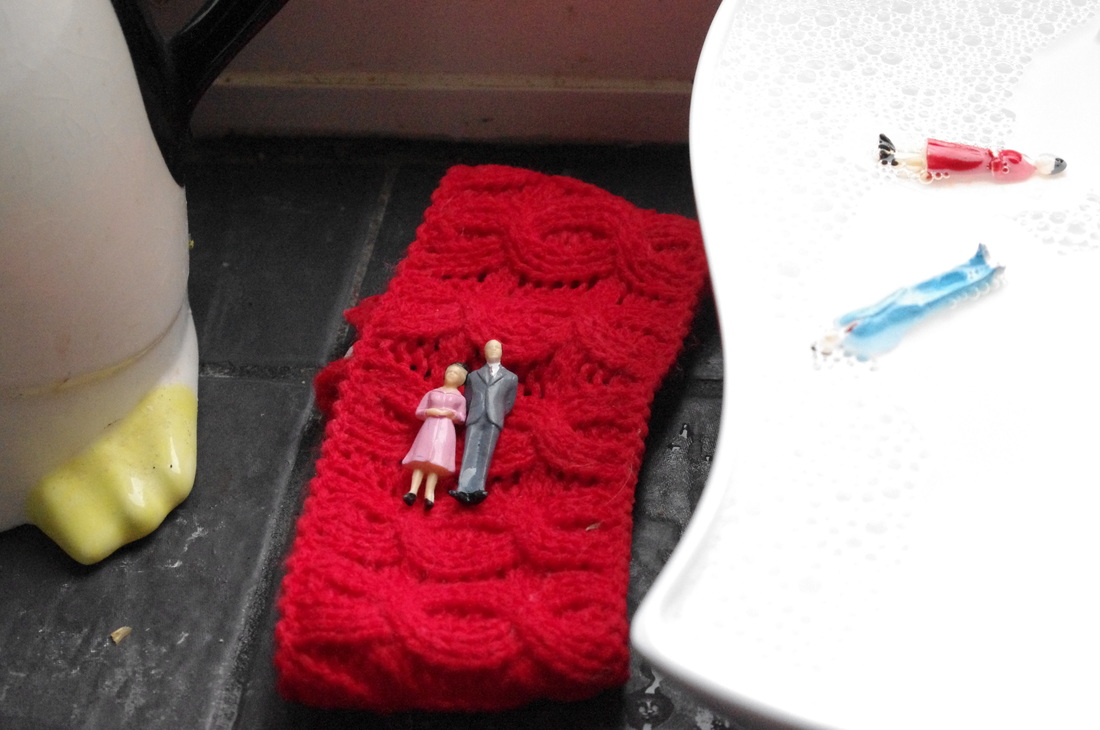
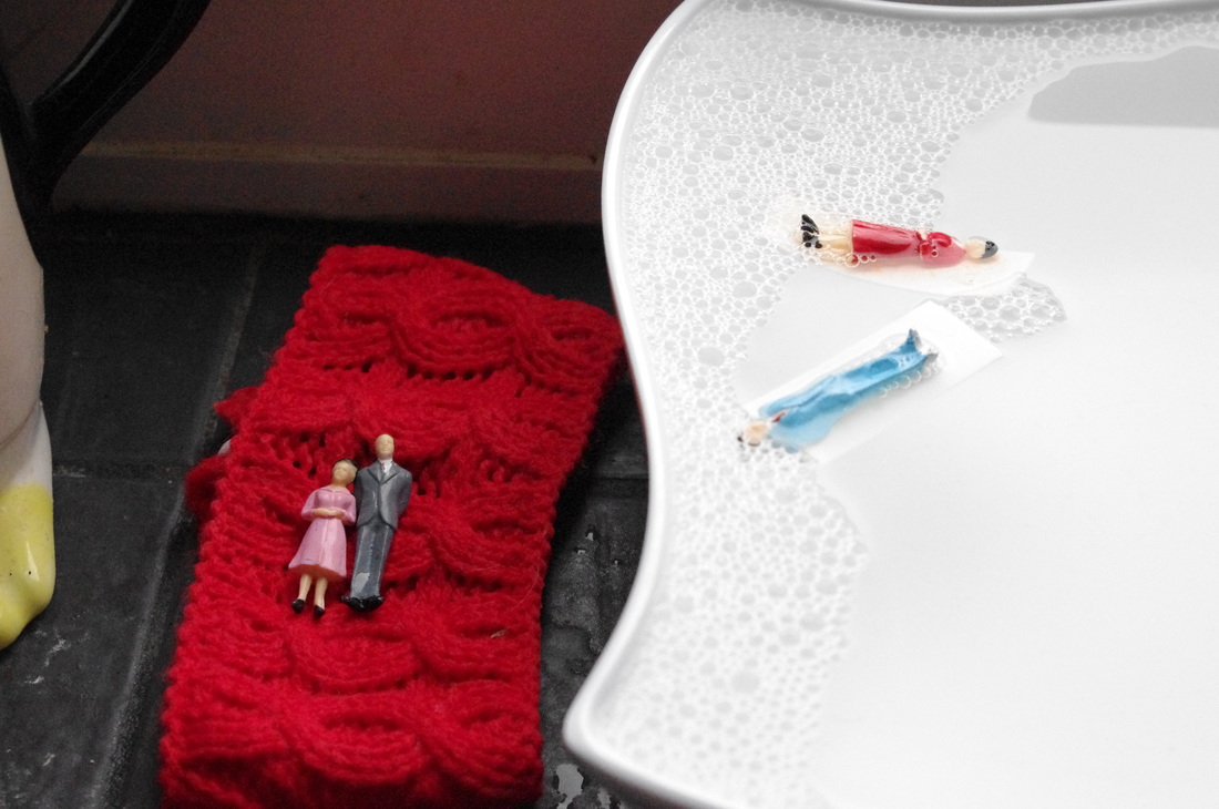
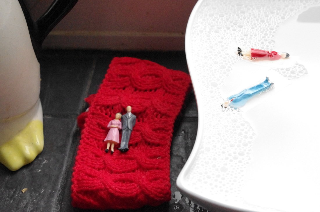
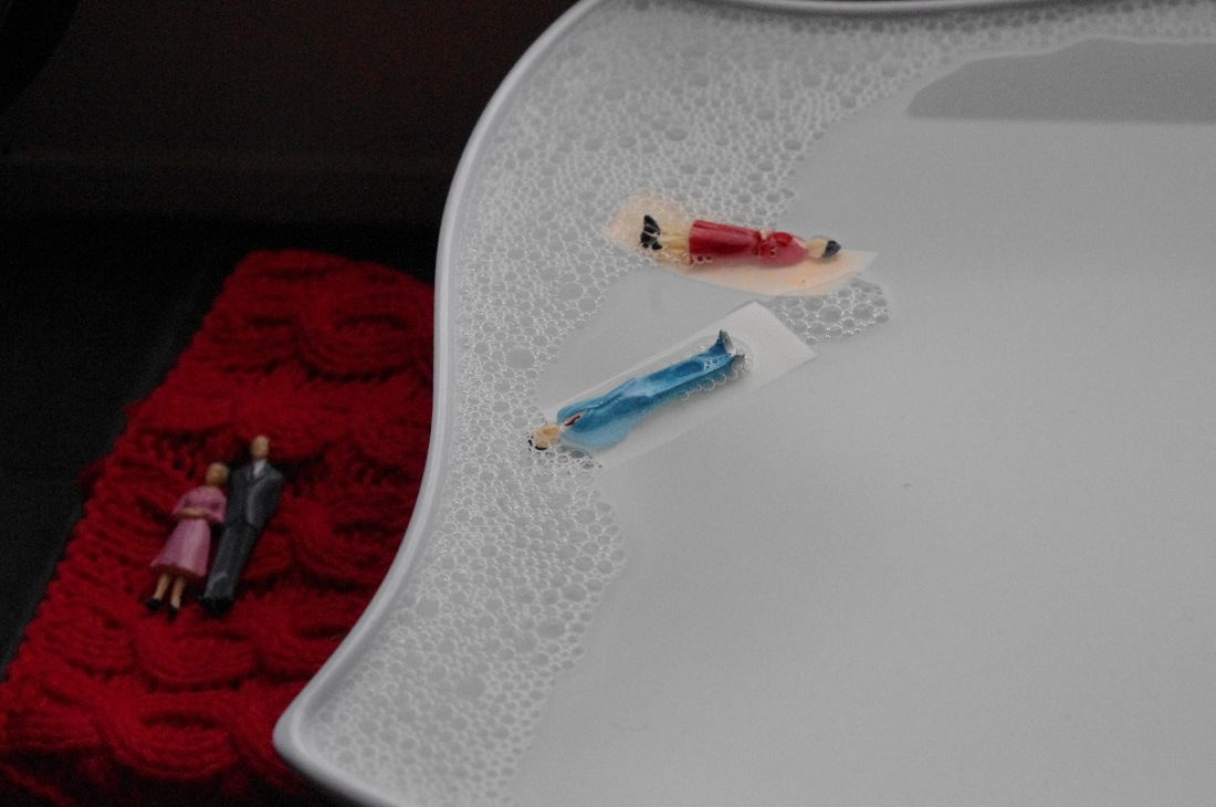
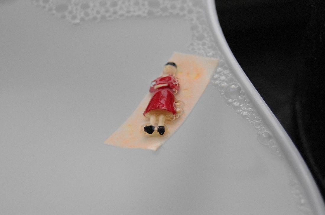
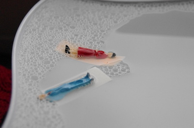
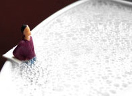
SHOOT 3
For this shoot I used hot water in an irregular square bowl and added some washing up liquid. This created some bubbles and was used to represent a swimming pool for the figures. I used some double-sided tape to act as a float too.
WWW:- I was pleased with how I managed to make the figures float on the tape. All the photographs are focused and clear.
EBI:- I would have been better if I had more objects to place in the water or if different characters were used so they looked as though they were swimming.
WWW:- I was pleased with how I managed to make the figures float on the tape. All the photographs are focused and clear.
EBI:- I would have been better if I had more objects to place in the water or if different characters were used so they looked as though they were swimming.
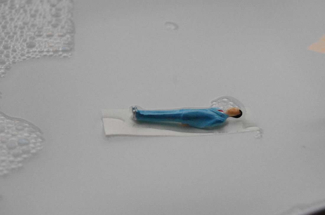

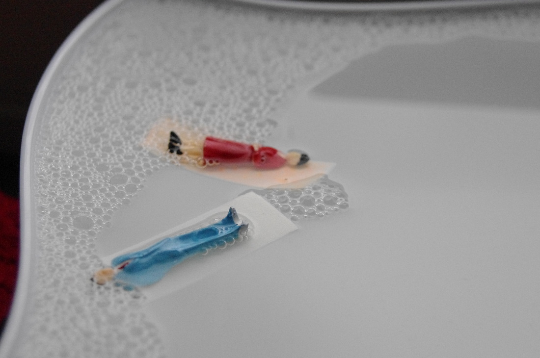
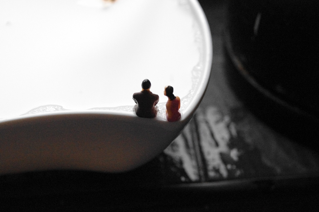
3 Best Images From This Shoot:-
I chose these photographs because they demonstrate formal elements the most. They include line, colour, shape and texture.


Photoshop Edit
I edited a photograph above using Photoshop. First I cropped the image. Then, I clicked Image -> Adjustments -> Brightness/Contrast and changed the brightness to -63 and the contrast to 100.
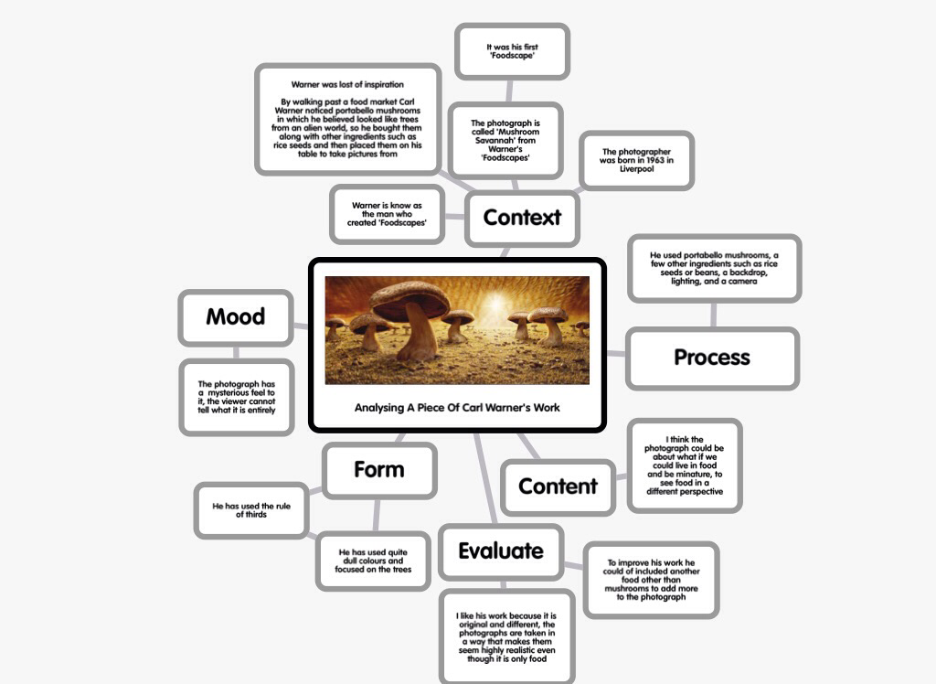
Carl Warner
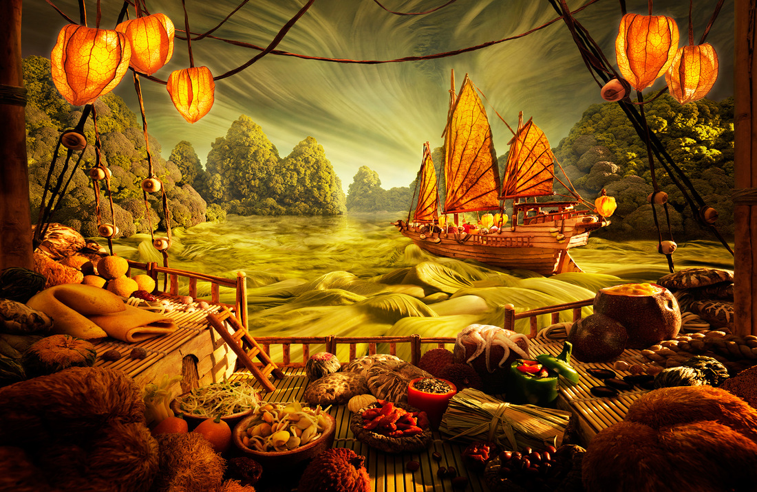
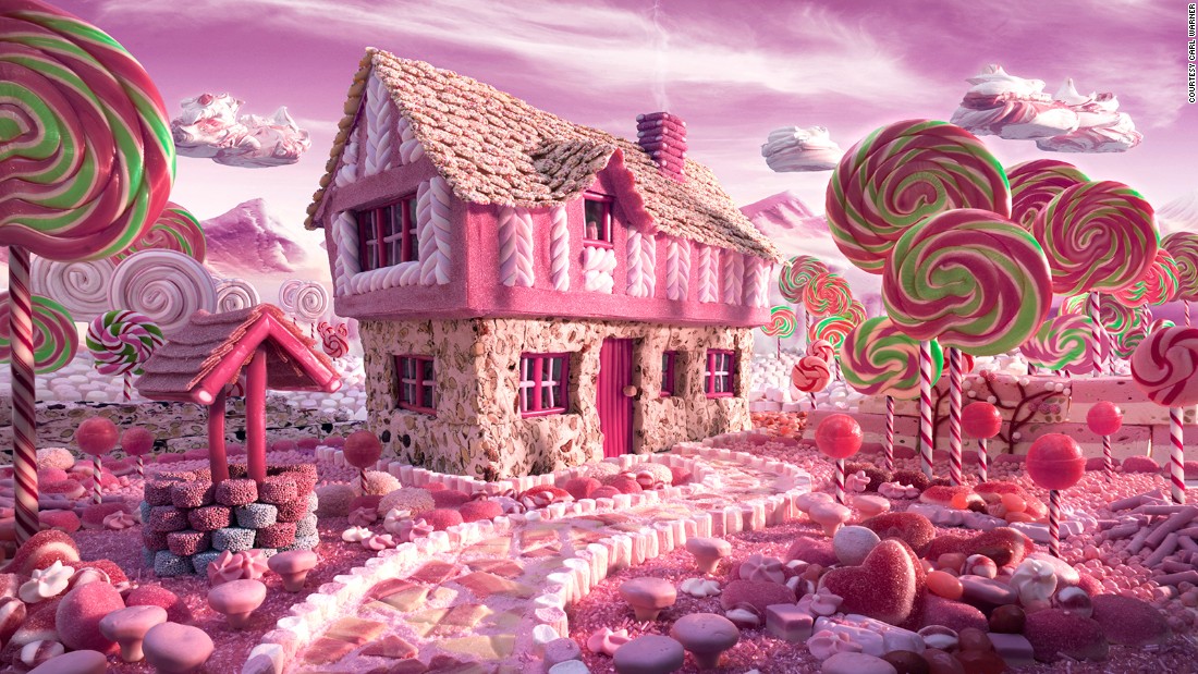
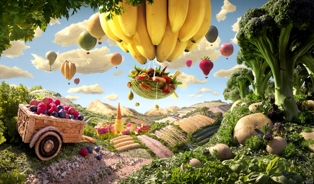
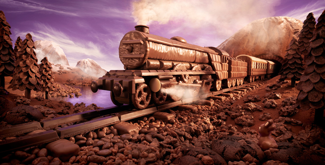
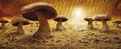
Carl Warner is a photographer who specializes in taking images of food in the form of an object. He uses food to make a landscape out of it and then using a back drop takes the photograph. To do this he uses super glue to stick down the food in place. Carl Warner wanted inspiration to create an original theme of photography. While he was walking around a food market he discovered portabello mushrooms which he thought look liked an alien formed tree. Using this idea, he bought them back to his studio with some other ingredients such as rice and beans to try and create a miniature scene on a table top. He called this 'foodscape'. Here is his first 'foodscape' image called 'The Mushroom Savanna' on the left.
Critical Analysis
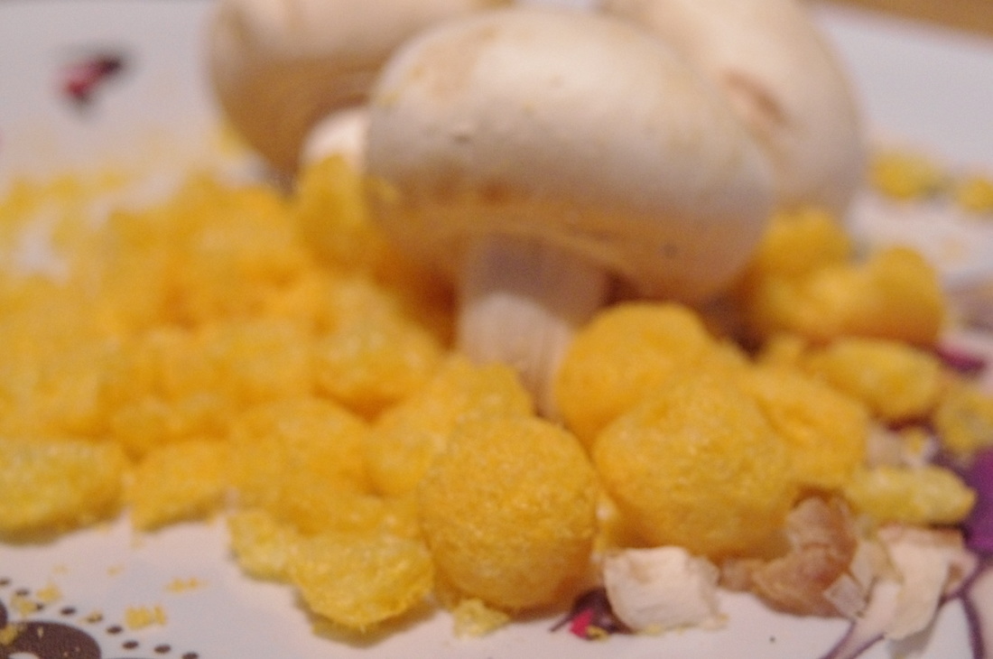
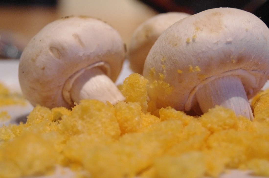
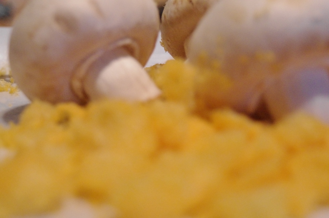
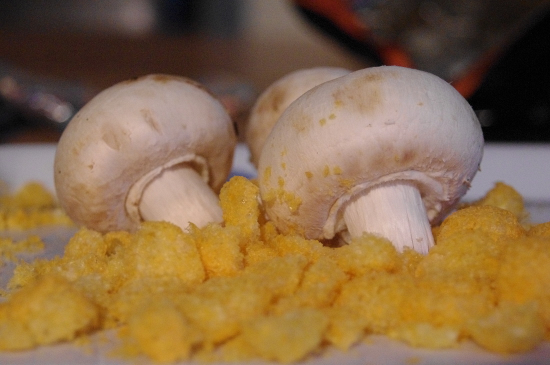
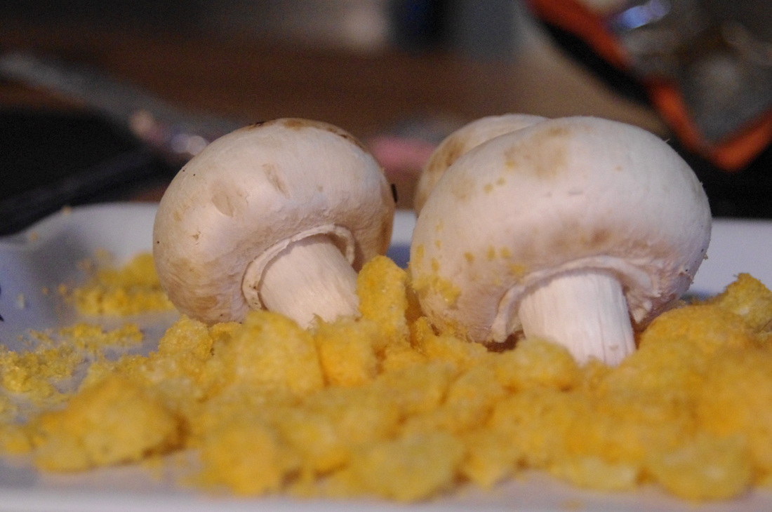
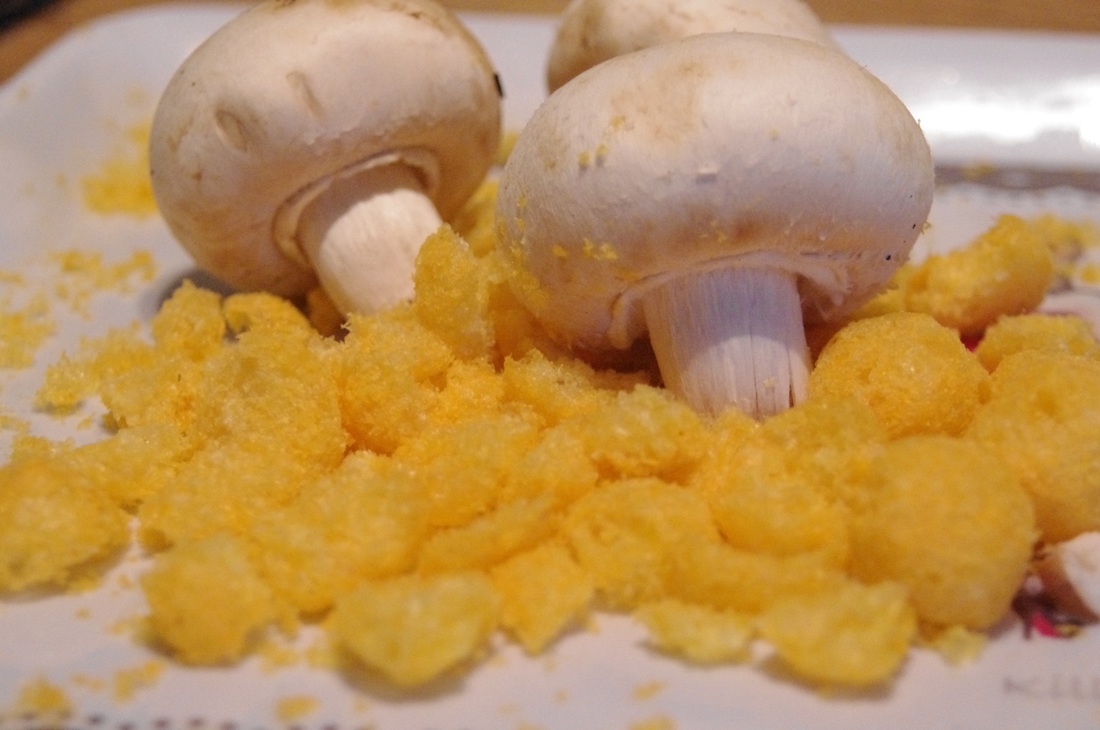
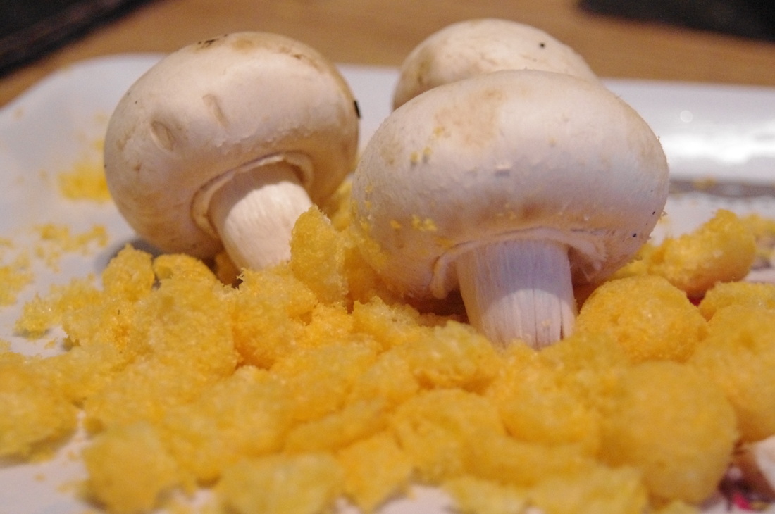
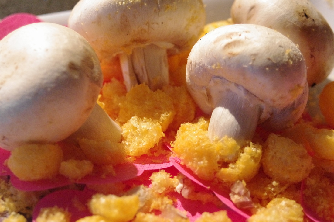
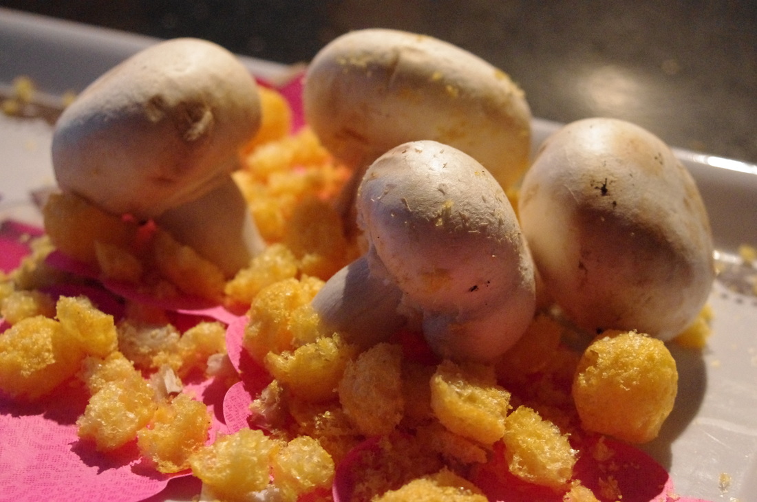
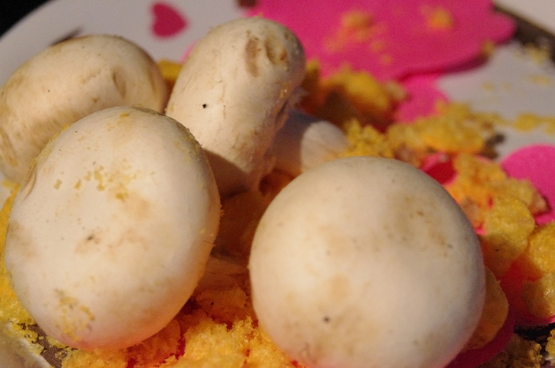
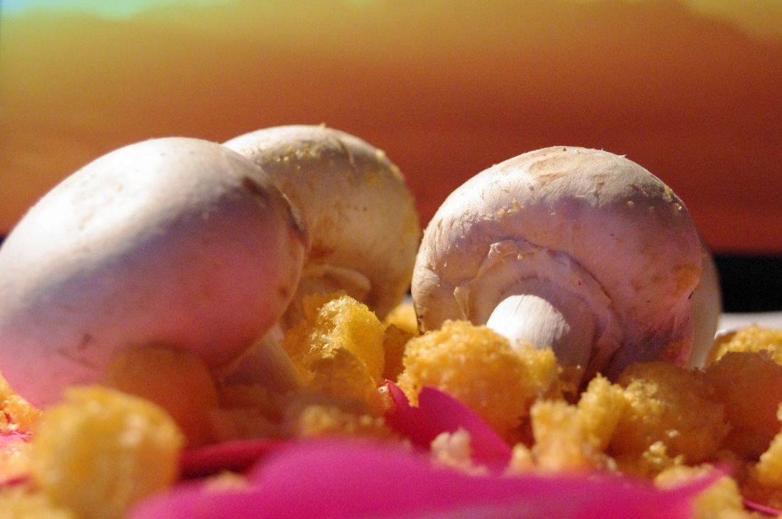
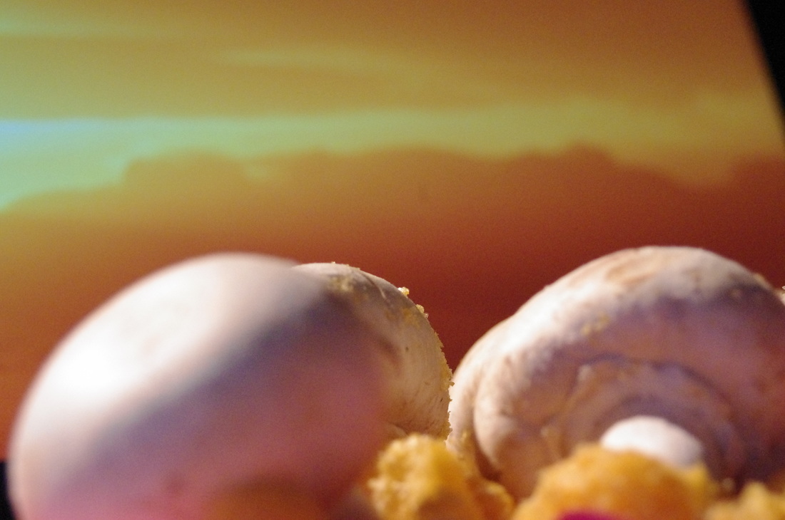
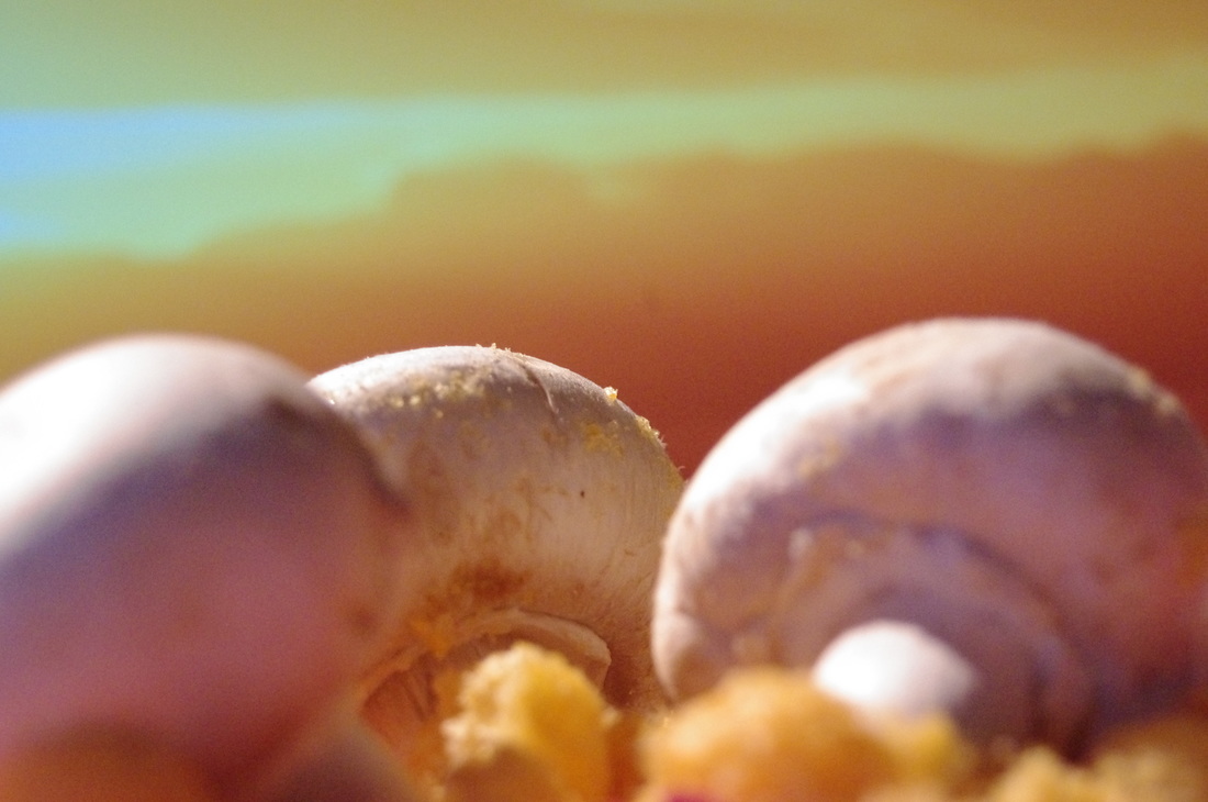
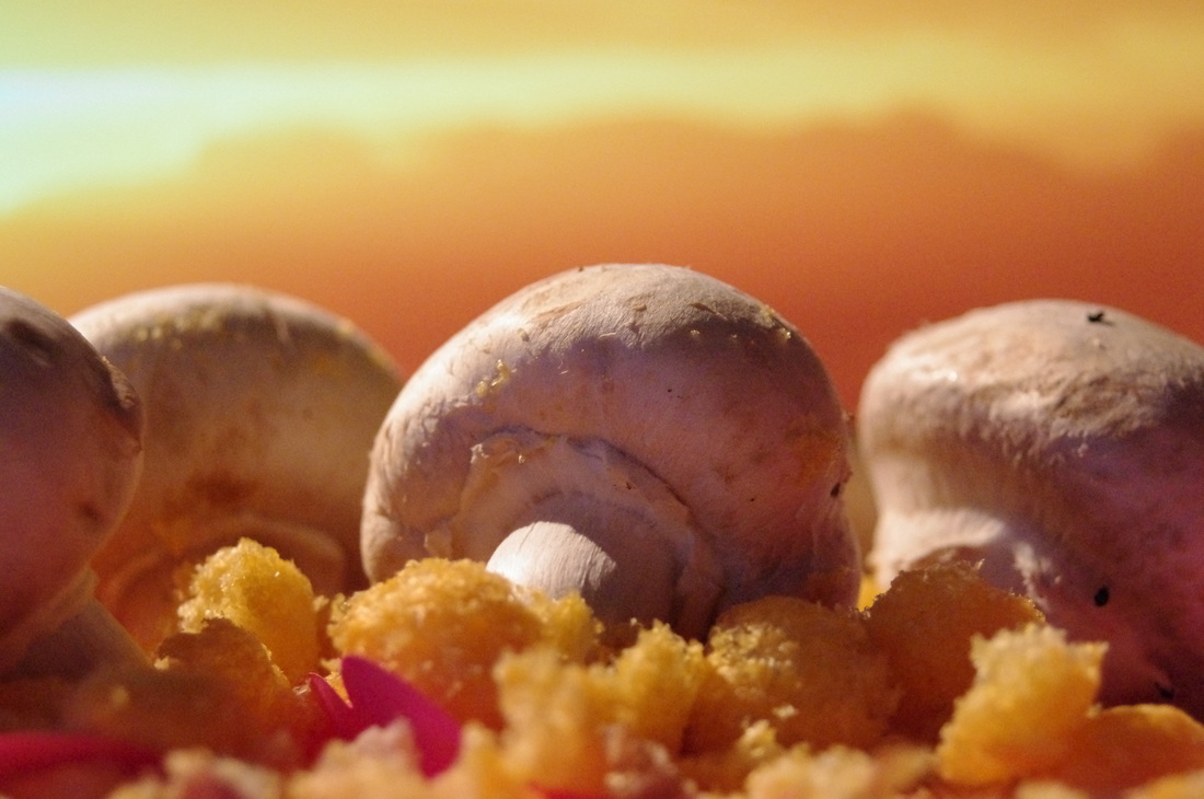
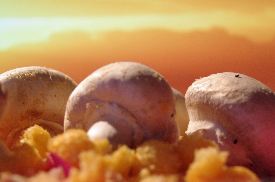
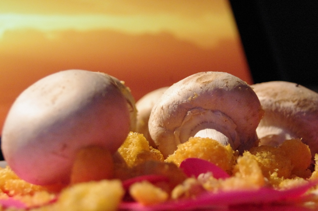
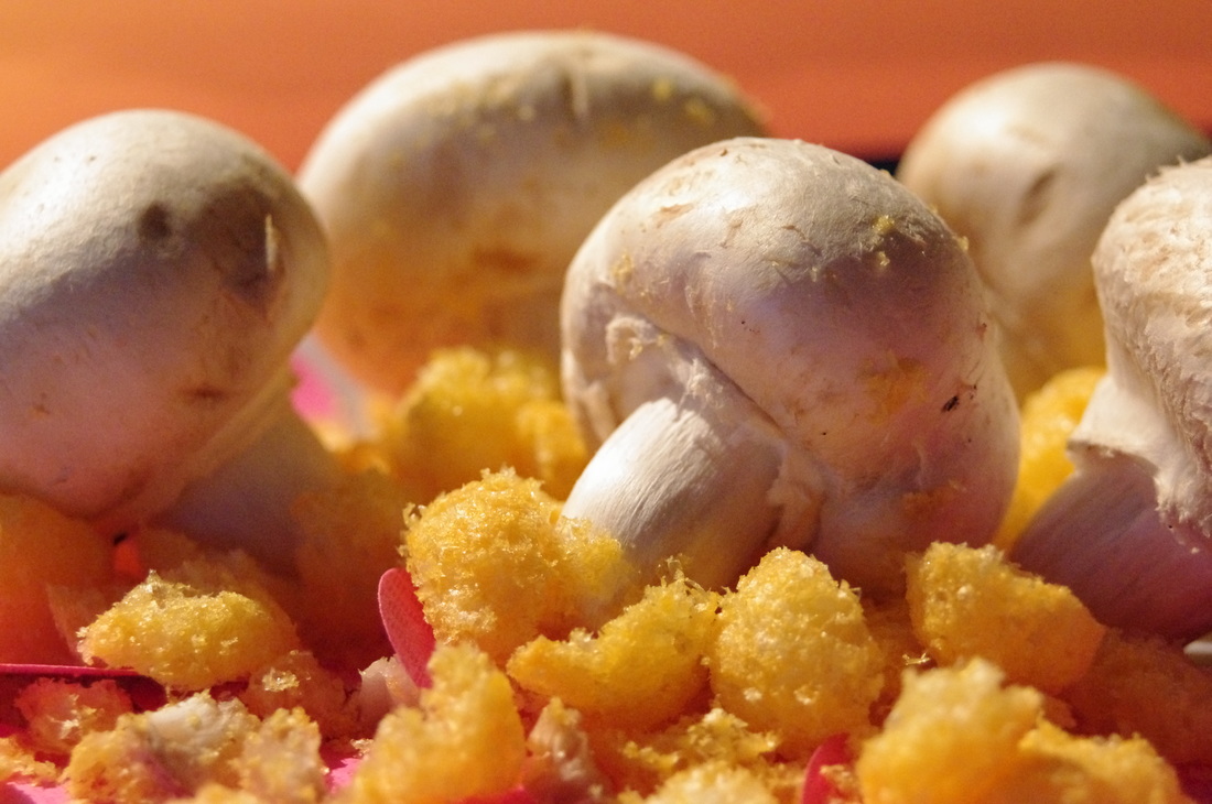
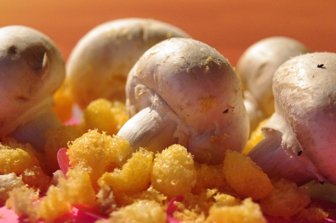
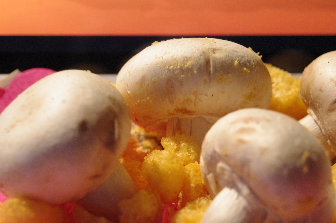
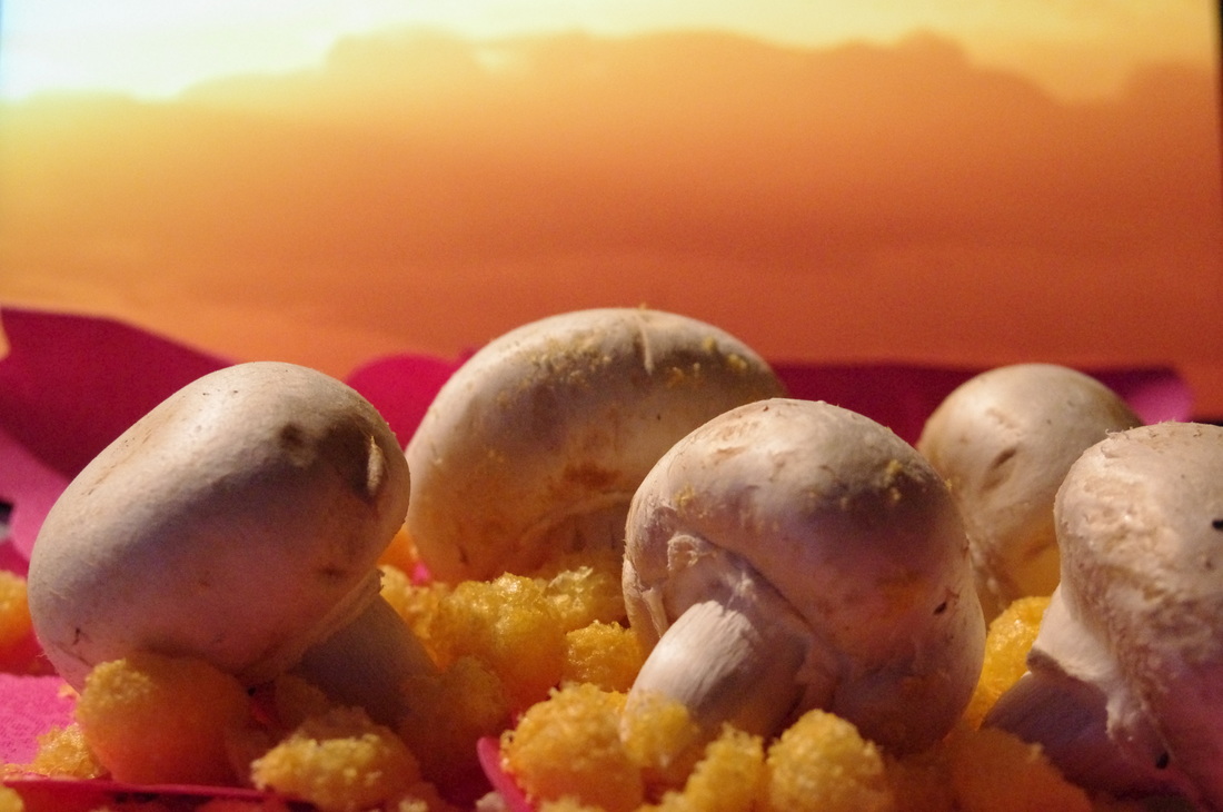
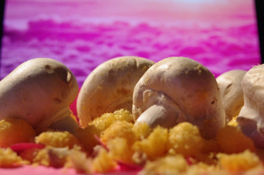
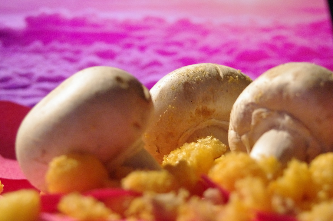
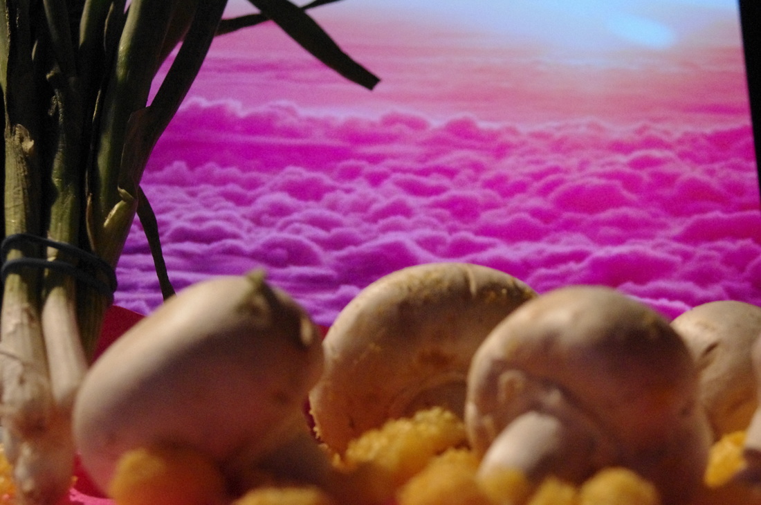
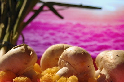
Shoot 4
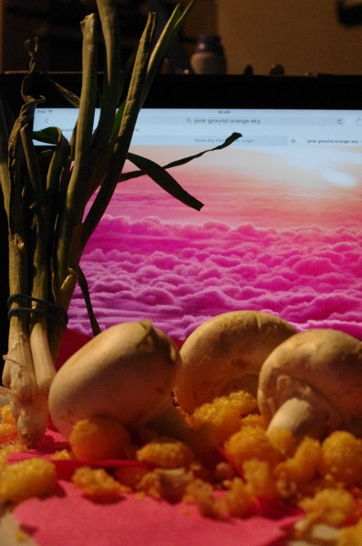
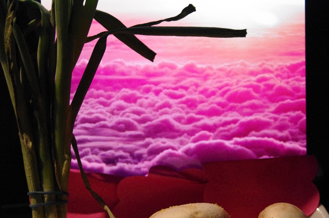
In this shoot I recreated a scene similar to Carl Warner's 'Mushroom Savannah' above to work out how Carl Warner created his photographs. In this shoot I used mushrooms, a tray (to arrange the food on), crushed cheese balls, post-it notes, thin double-sided tape, an iPad and a few spring onions. This photoshoot shows step-by-step of how I gradually improved the photographs as I thought of new ideas to add to the scene.
First of all I crushed cheese balls using cutlery to act as the ground. Next, I placed mushrooms in the crushed cheese balls to act as trees. I then thought of using post-it notes to act more colour to the image and so I used pink flowered post-it notes as they had a simple pattern on them that seemed as though it would suit being the ground/base. I then used thin, double-side tape to keep them in place. After that, I moved the food on top of the post-it notes and re-arranged the food so it was similar to what I had previously laid out. Next, I used my iPad to display an orange picture which would be used as the back ground. I experimented with another picture and found some spring onions to add more to the scene. This was the result.
WWW:- I am very happy with the outcome. It links to Carl Warner. From research I used the same method of using a background as the photographer.
EBI:- Some of the edge of the iPad are shown.
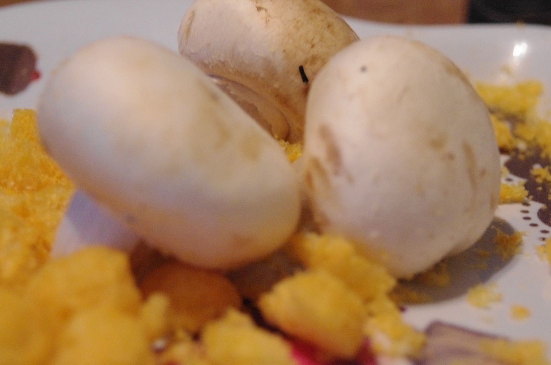
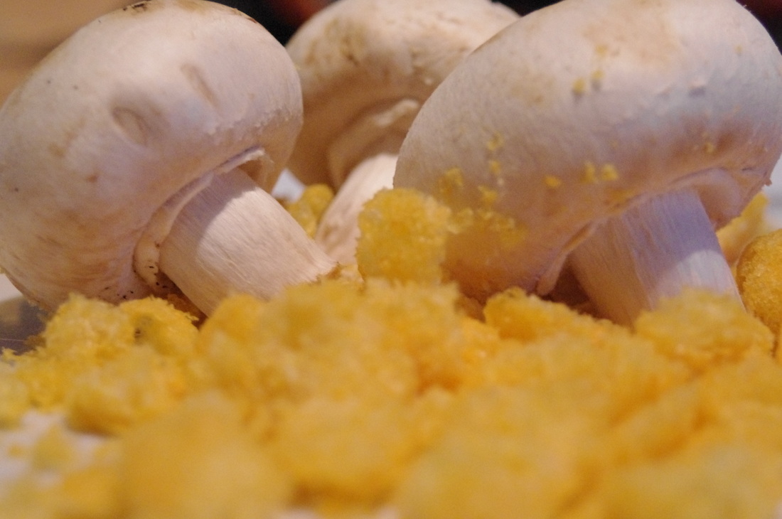
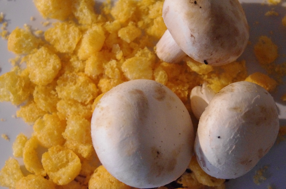
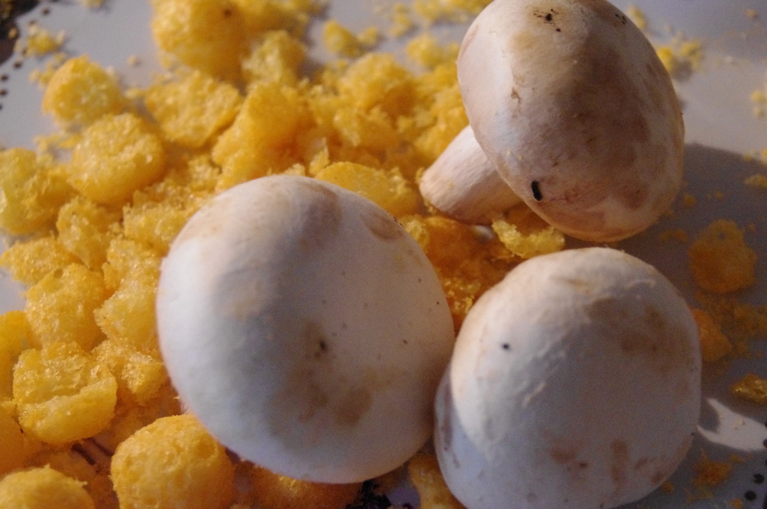
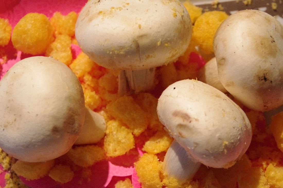
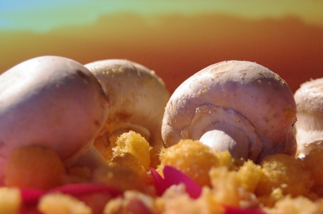
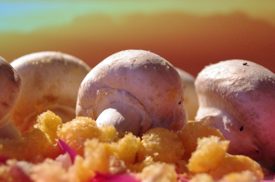
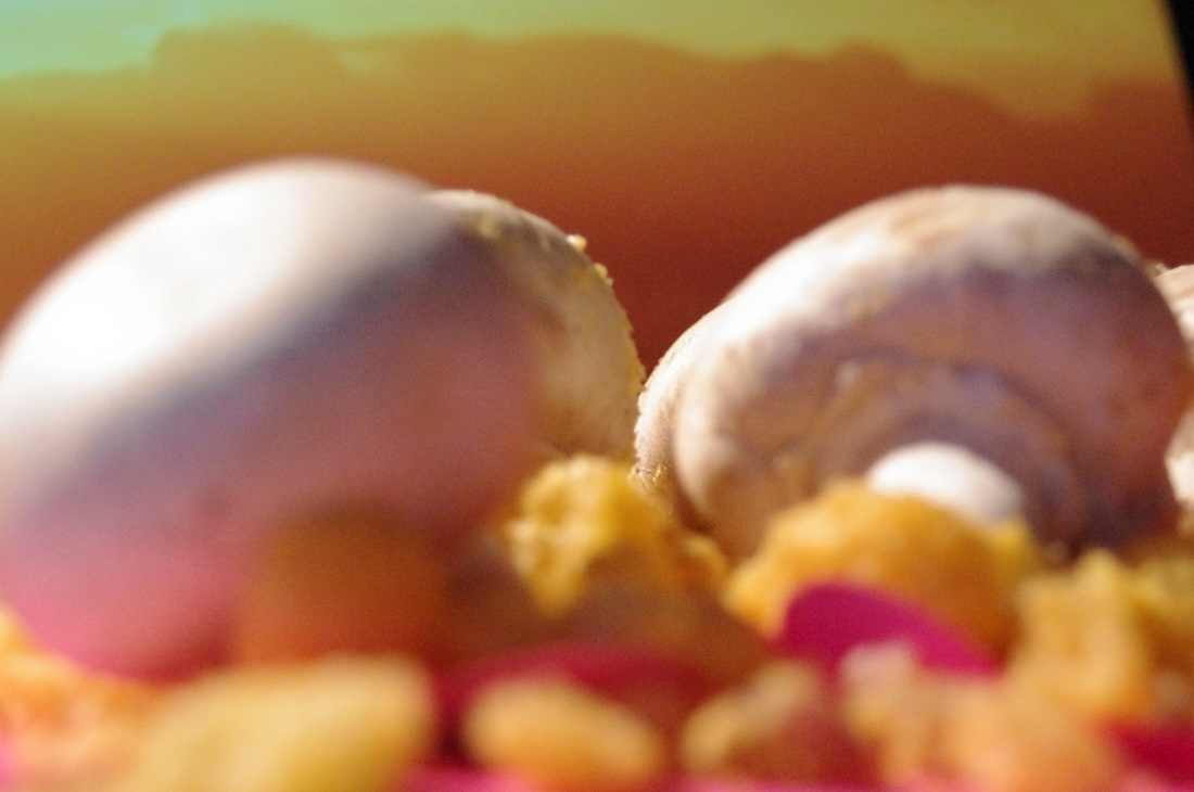
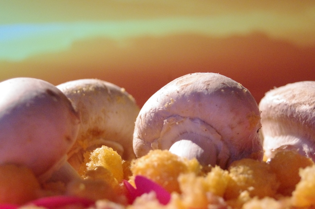
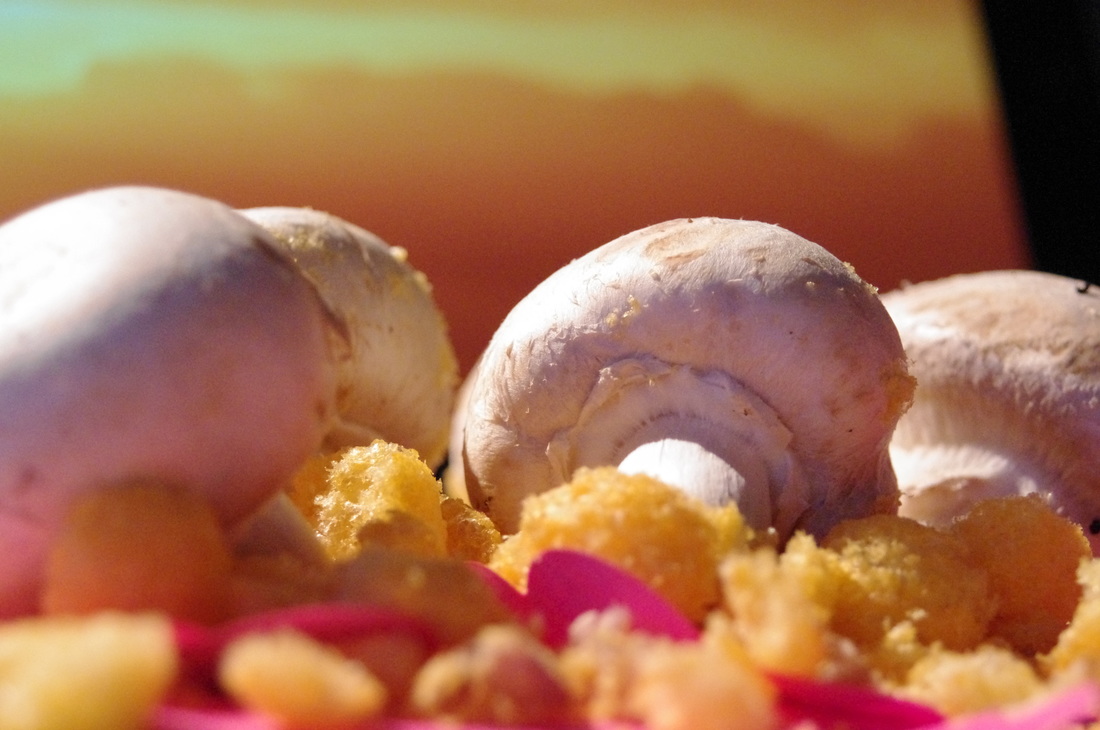
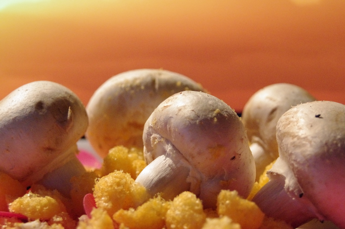
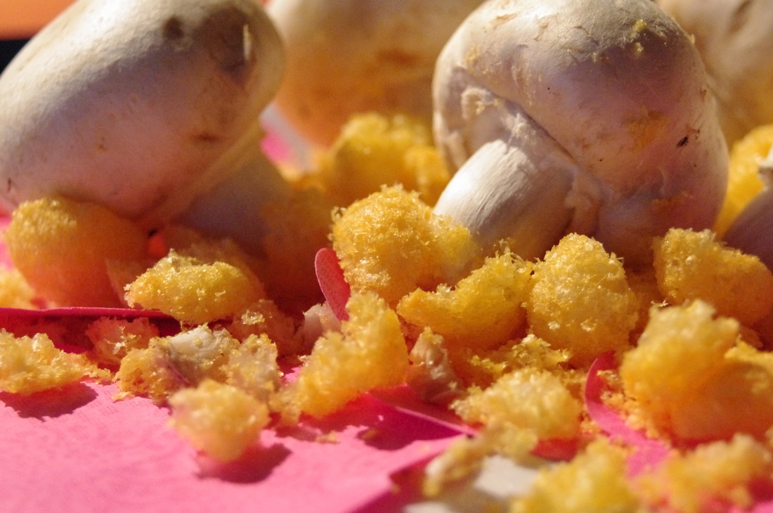
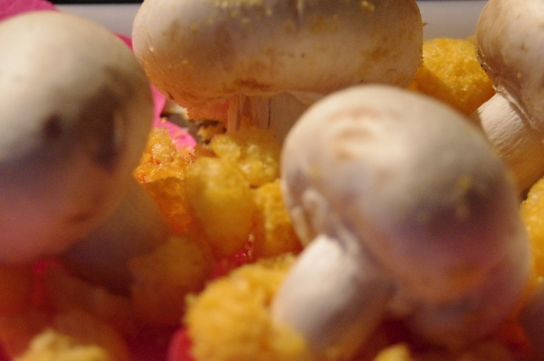
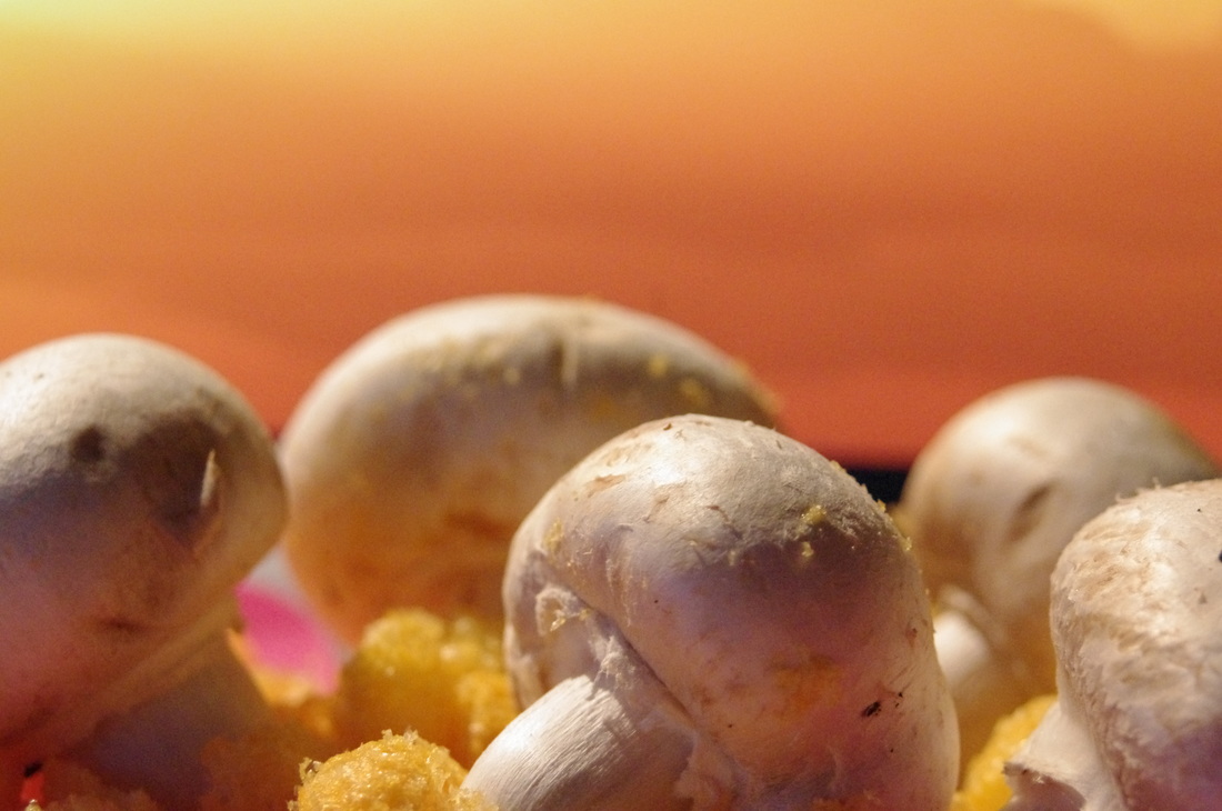
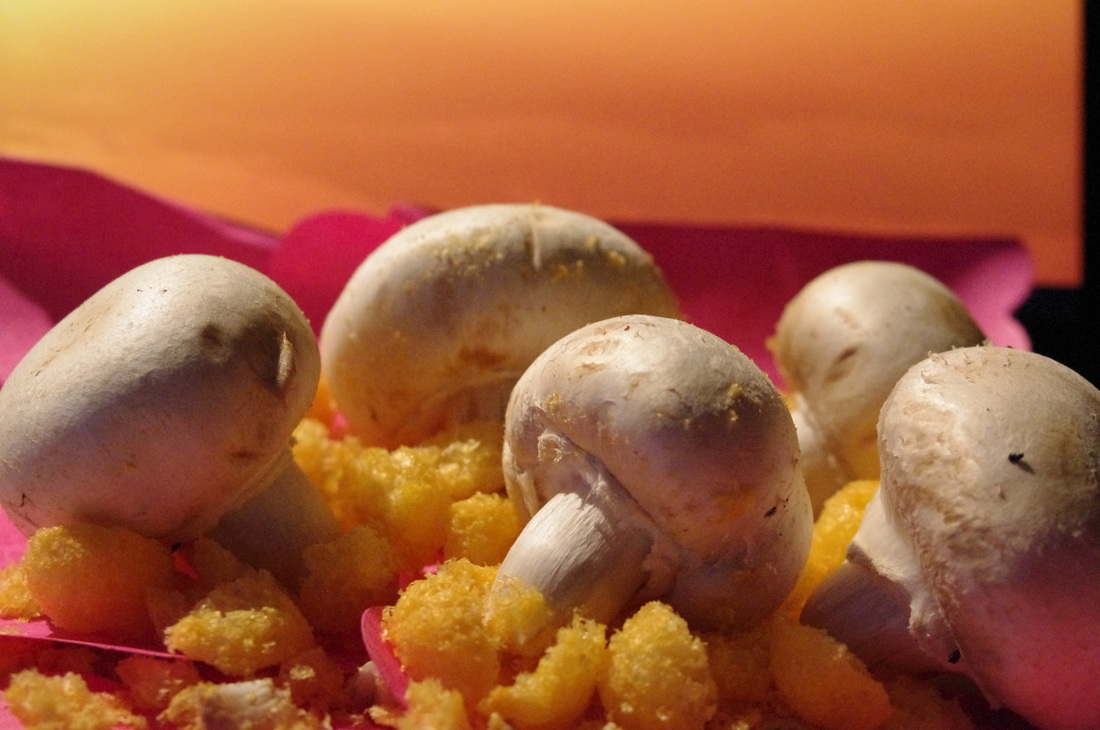
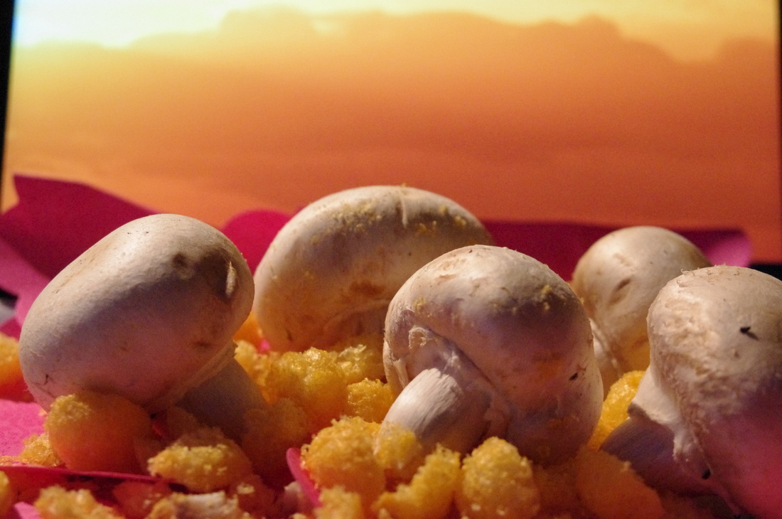
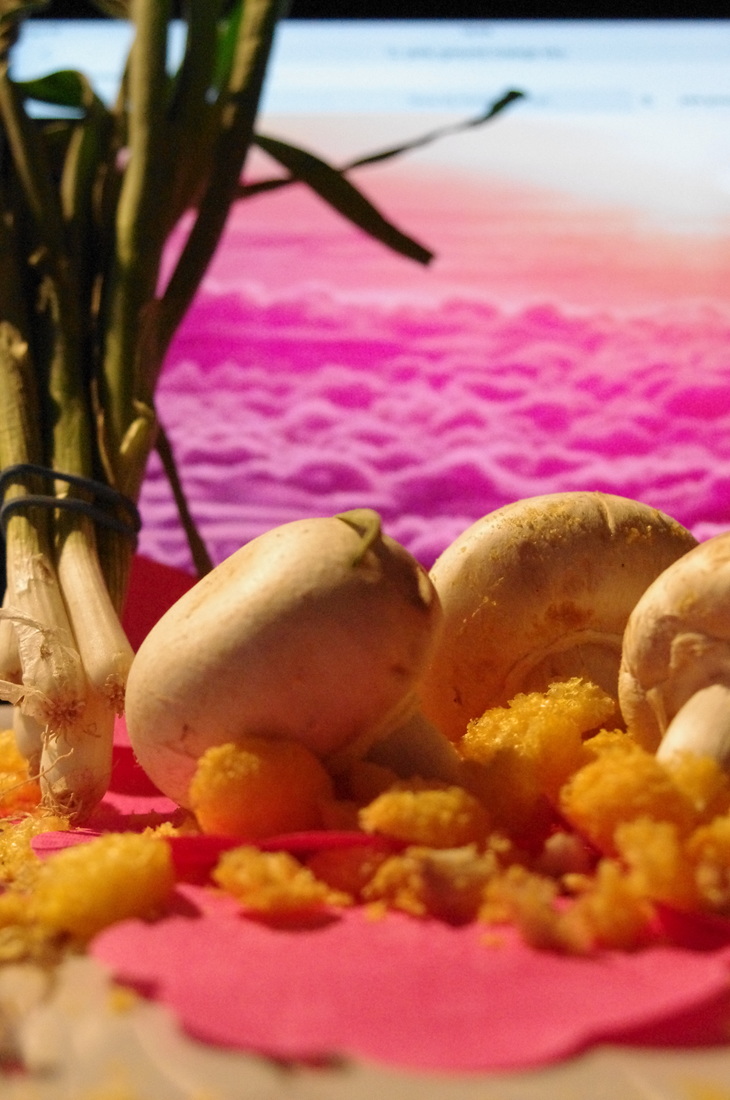
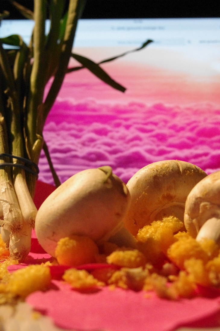

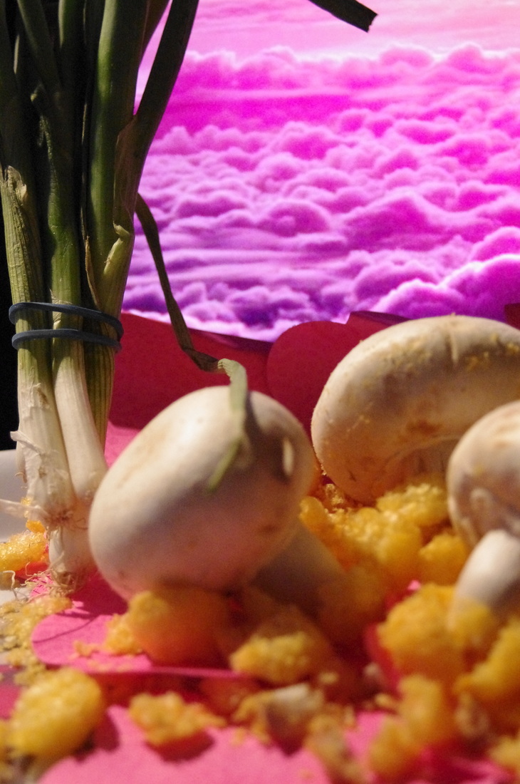
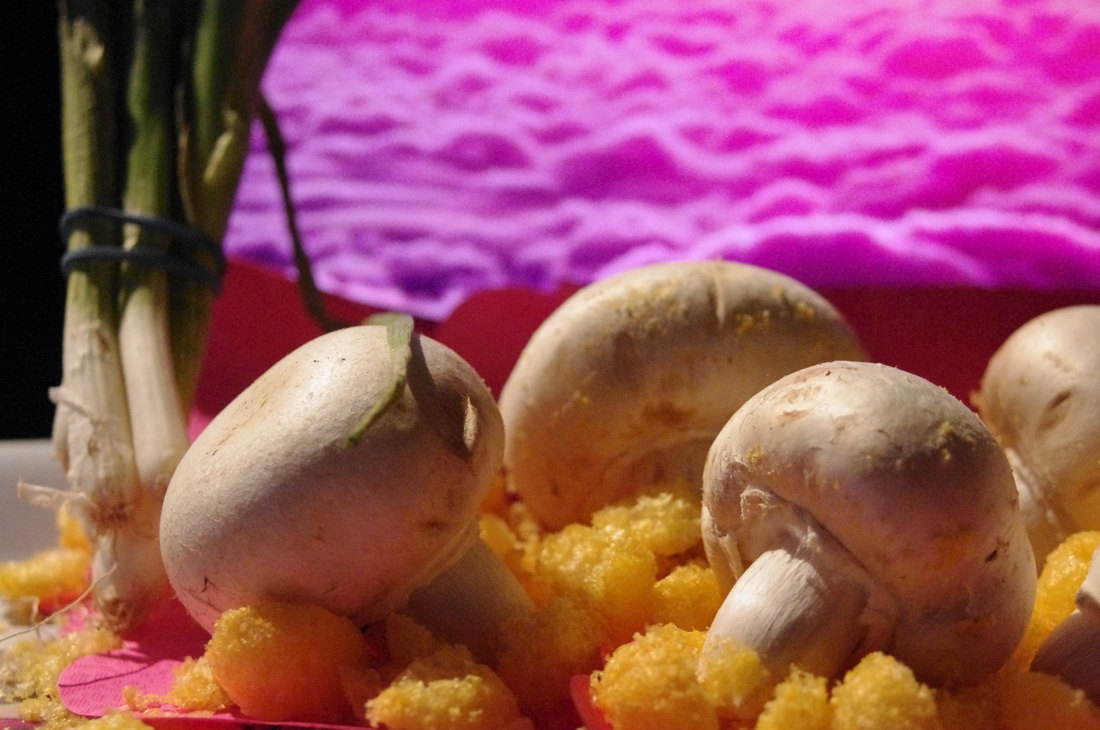
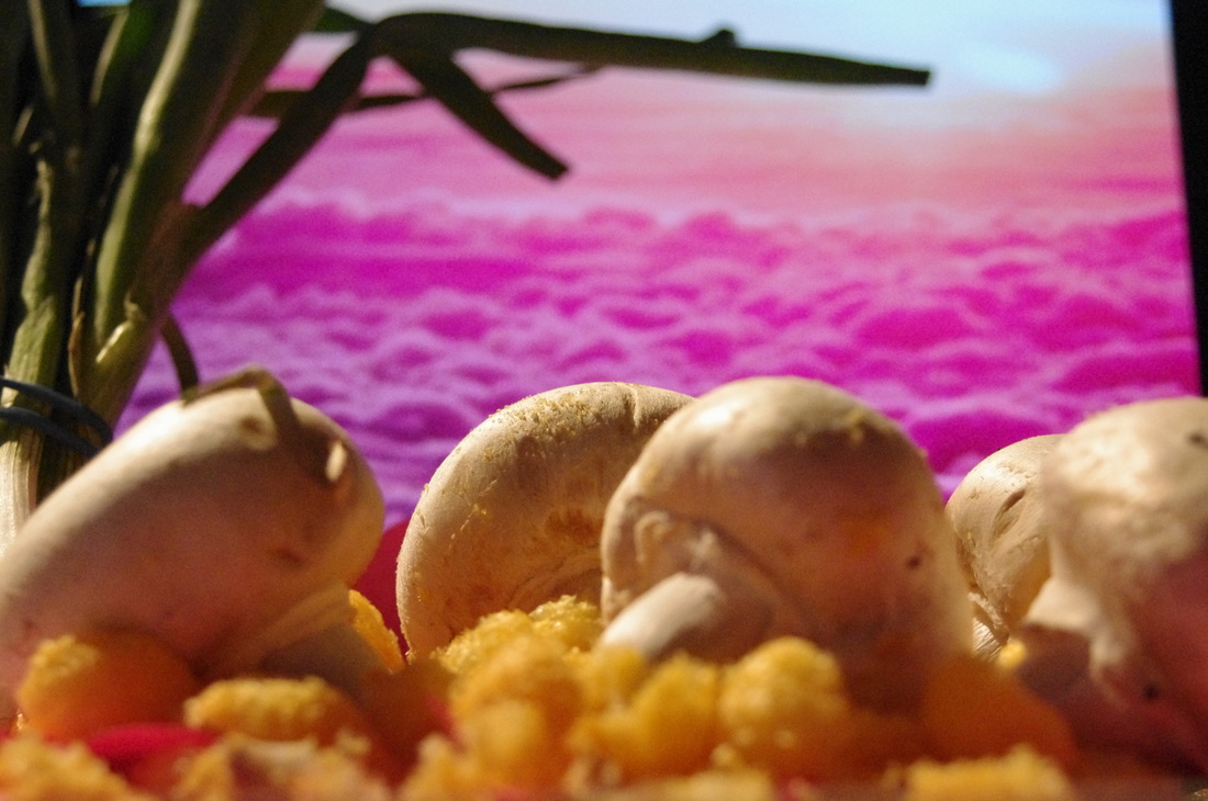
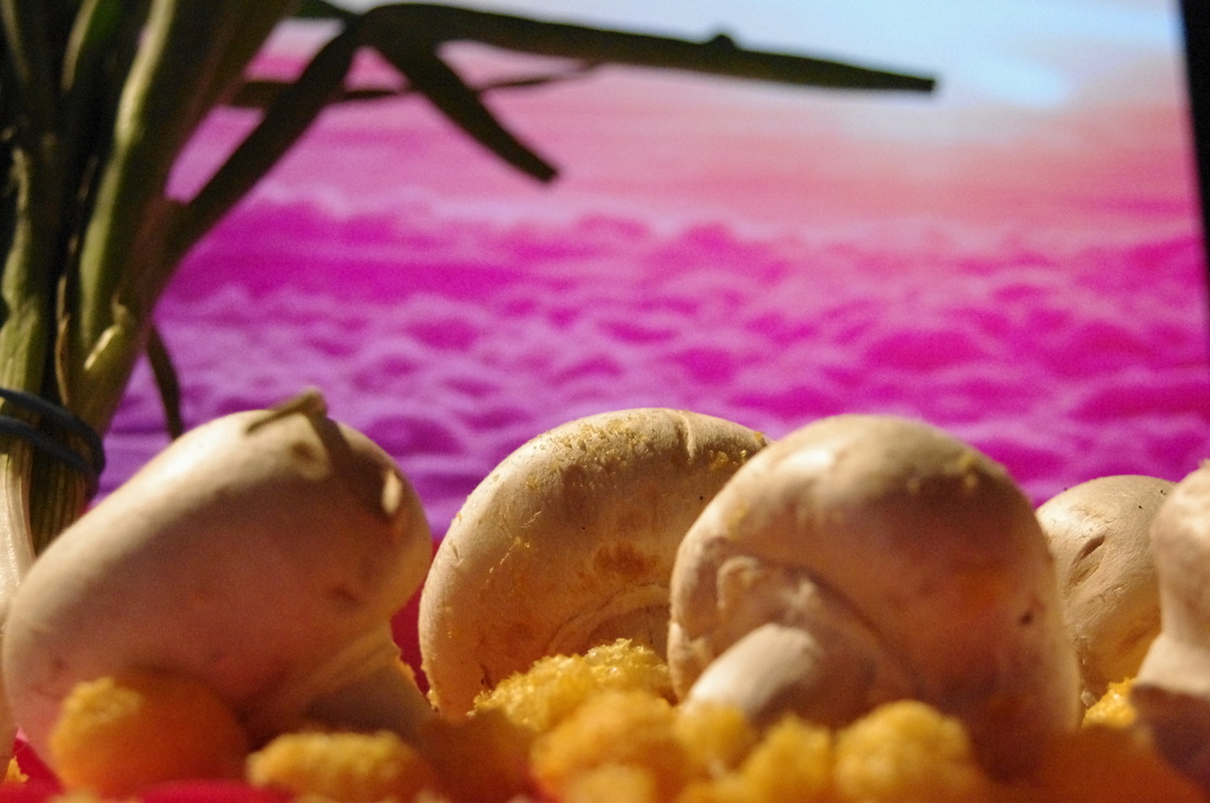

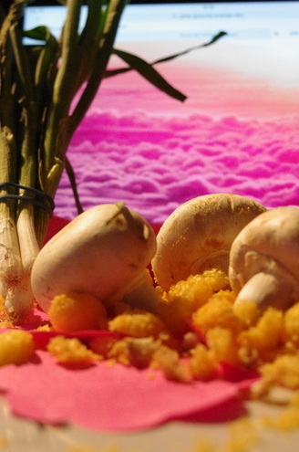
3 Best Images From This Shoot:-
I chose these photographs because they are the most similar to Carl Warner's work. I also liked how there is more shadow and texture shown demonstrated in the images.

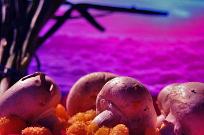
Photoshop Edit
I edited a photograph above using Photoshop. First I clicked Image -> Adjustments -> Brightness/Contrast and changed the brightness to -19 and the contrast to 100. Next I clicked Image -> Adjustments -> Colour Balance and changed the colour levels to -79, -100 and +29. After that, I clicked Image -> Adjustments -> Shadows/Highlights and changed shadows to 43% and highlights to 100%.
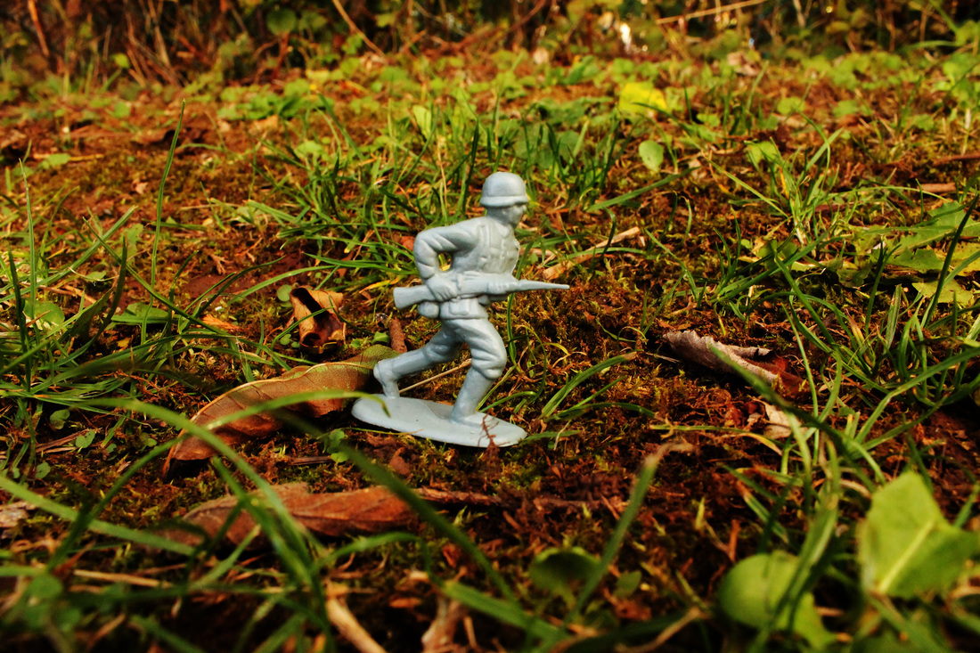
Experimental Shoots:-
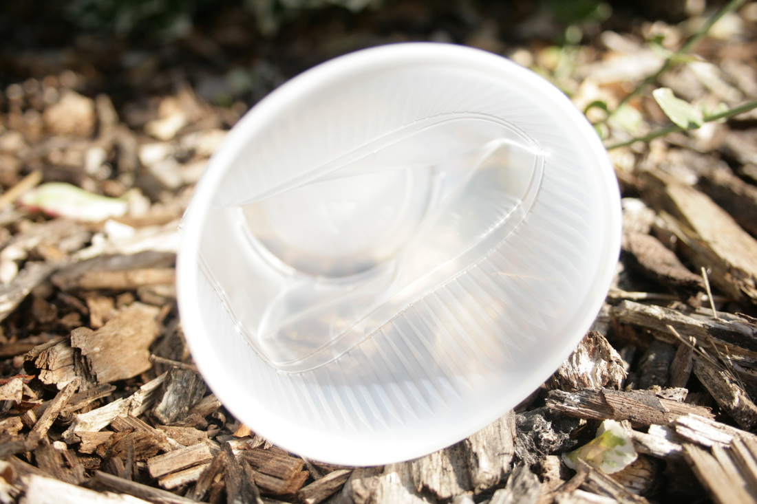
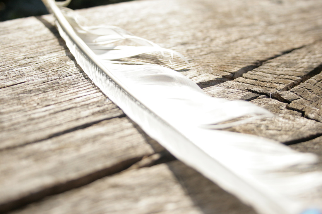
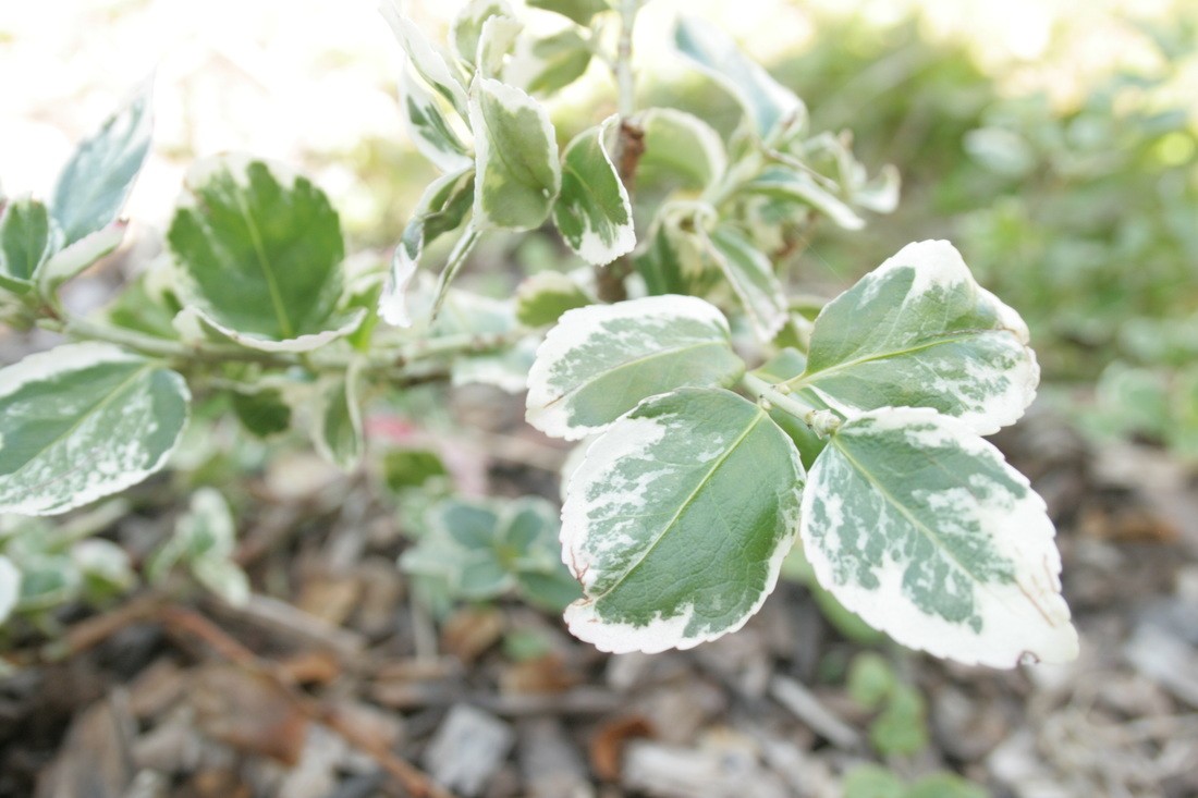
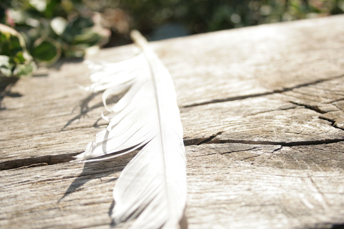
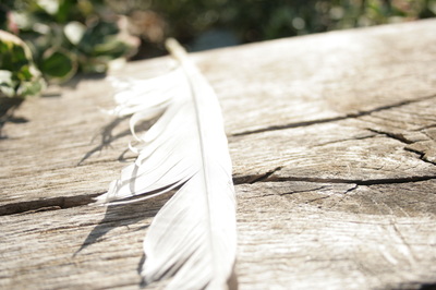
SHOOT 5
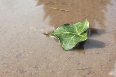
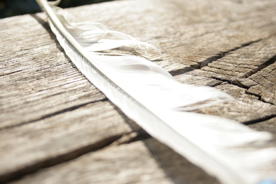
By looking at ideas of previous student who had completed this project I wanted to re-create miniature people in natural environments by using Photoshop. Below are some photographs of items you can commonly find while outside, I struggled with Photoshop though and so I am going to use these outdoor images to inspire me to take photographs linking to the same concept. These were all taken at school.
WWW:- All the photographs are focused and clear.
EBI:- If I had taken more images.
WWW:- All the photographs are focused and clear.
EBI:- If I had taken more images.

P.e.e.a Sheet
| _peea_sheet.docx |
3 Best Images From This Shoot:-
I chose these photographs because they demonstrate texture and shadow the most effectively. They contain more of the formal elements such as colour, shape, and line. They also contain the rule of thirds.
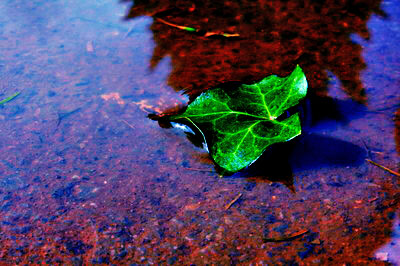
Photoshop Edit
I edited the photograph of the leaf above using Photoshop. First of all I click on Image -> Adjustments -> Brightness/Contrast and changed the brightness to 8 and the contrast to 100. Next I clicked on Image -> Adjustments -> Vibrance and changed the vibrance to +21 and the saturation to +100. Then I clicked on Image -> Adjustments -> Levels and changed them to 0, 0.31 and 255. After that I clicked Image -> Adjustments -> Colour Balance and changed the colour levels to -100, -79 and +100. I also changed the shadow colour levels to -100, -17 and -4. Then I changed the Shadow/Highlights to shadows - 22% and kept the highlights at 0%.
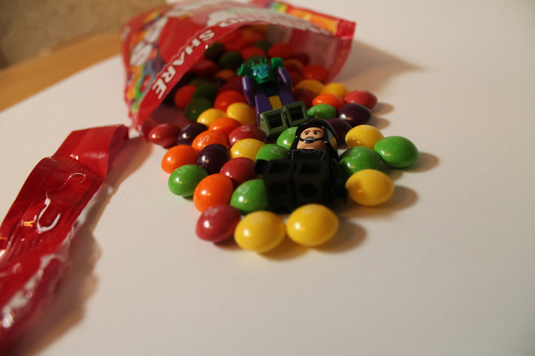
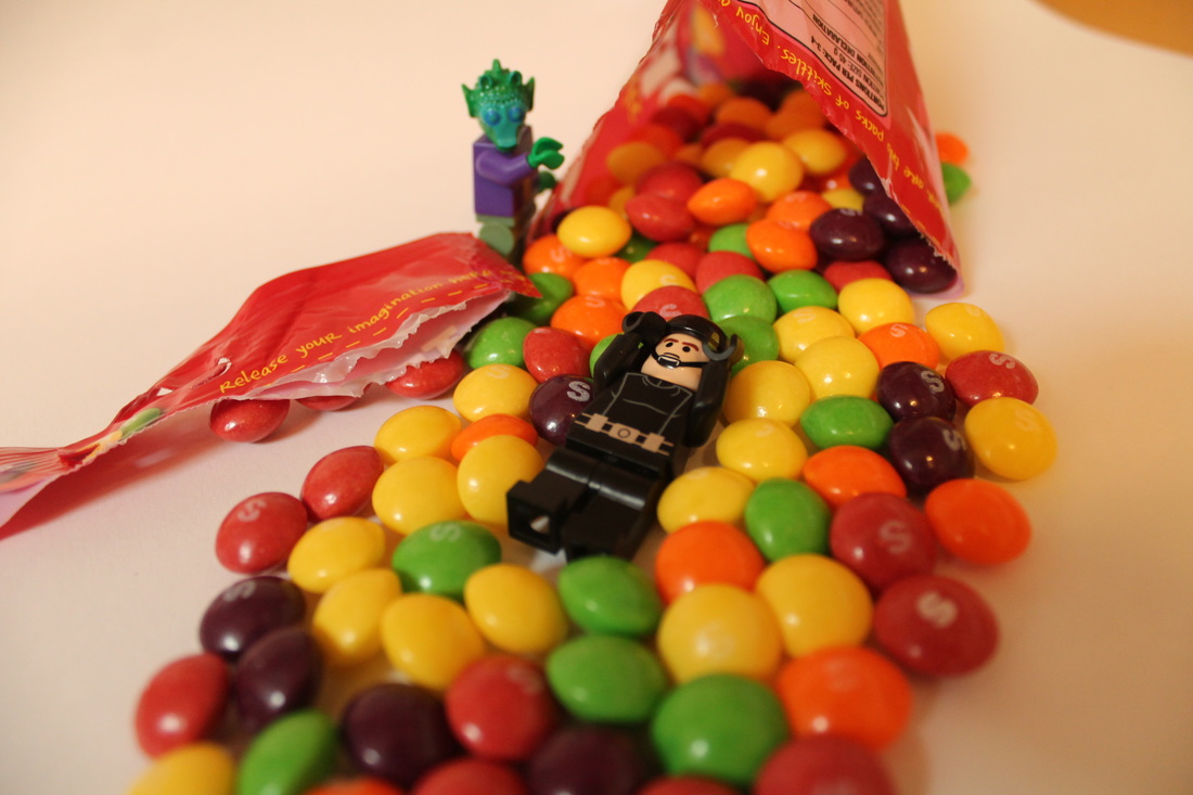
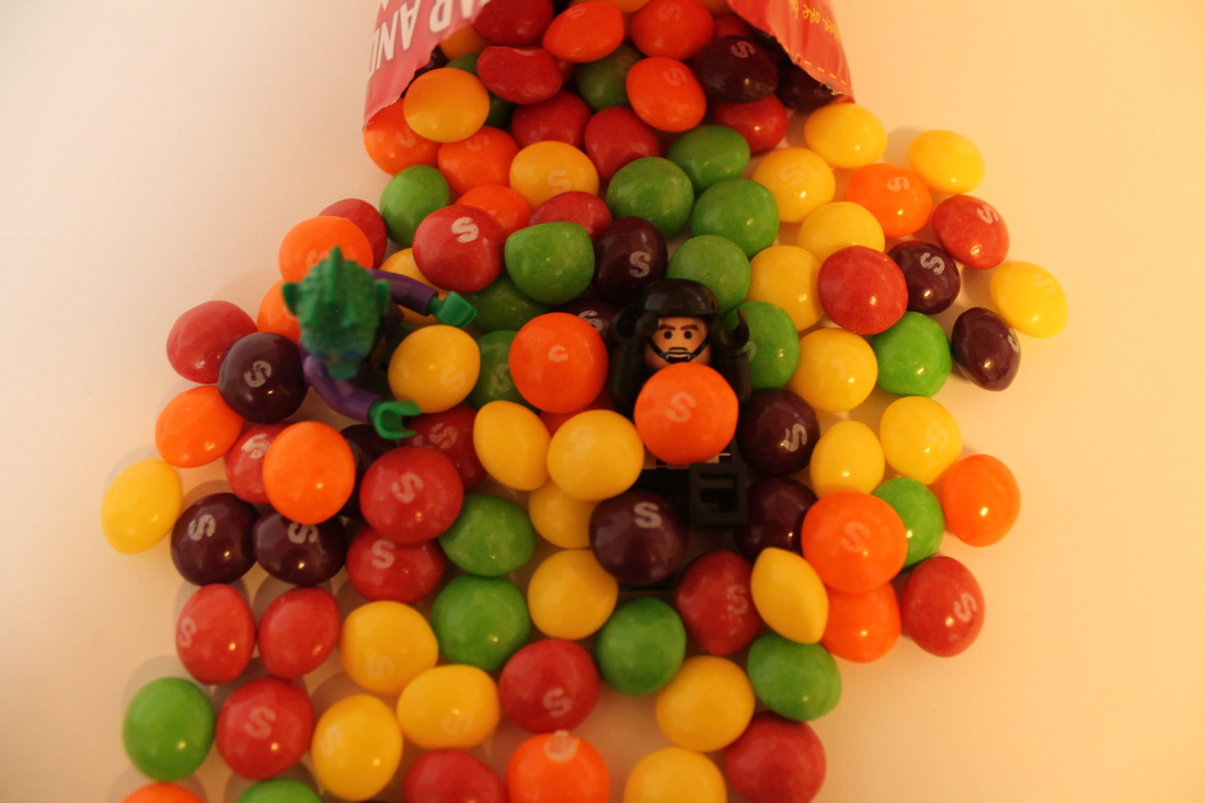
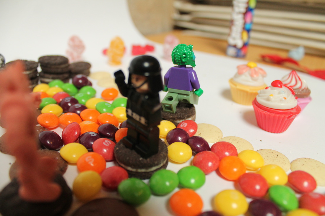
SHOOT 6
Here I am experimenting with food and using lego people to act as small humans against objects that are bigger than themselves. This was inspired by Carl Warner. By using well-known sweets the viewer can compare the size of the lego people to the sweets.
WWW:- They are all colourful, how I wanted them to be.
EBI:- If I took more images.
WWW:- They are all colourful, how I wanted them to be.
EBI:- If I took more images.
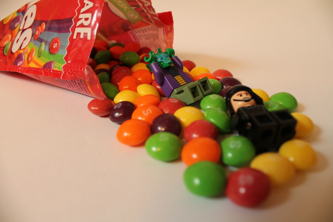


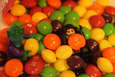
3 Best Images From This Shoot:-
I chose these images because they are all clear and focused. They each have a different perspective and amount of contrast with light and dark.
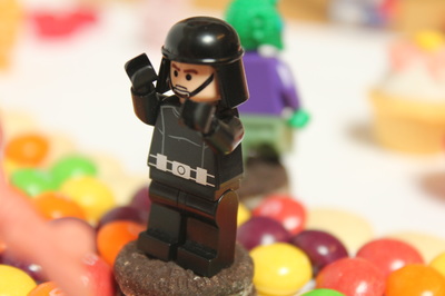

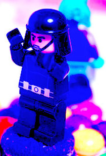
Photoshop Edit
I edited the close up of the lego man above. First of all I clicked on Image -> Adjustments -> Colour Balance and changed it to -100, -100 and +100. Next I clicked on Image -> Adjustments
-> Levels and changed the numbers to 71, 2.67 and 207. After that I clicked Image -> Adjustments -> Vibrance and changed the vibrance to -3 and the saturation to +100. Lastly, I cropped the image.
-> Levels and changed the numbers to 71, 2.67 and 207. After that I clicked Image -> Adjustments -> Vibrance and changed the vibrance to -3 and the saturation to +100. Lastly, I cropped the image.
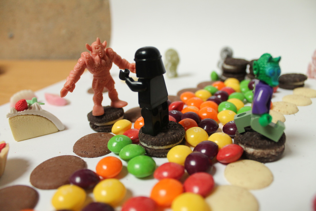
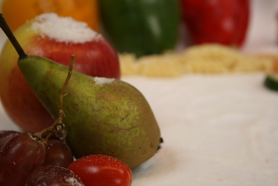
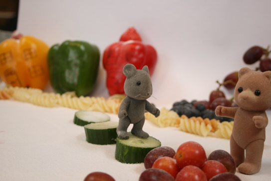
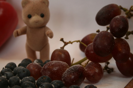
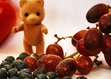
SHOOT 7
In this shoot another student brought in small toy animals and I was able to experiment with miniature animals against food rather than lego people. This was inspired by Carl Warner.
WWW:- I managed to create a scene of houses using the peppers and the salt as snow as I wanted.
EBI:- If I took more images and if a bigger range of food was used, more different colours.
WWW:- I managed to create a scene of houses using the peppers and the salt as snow as I wanted.
EBI:- If I took more images and if a bigger range of food was used, more different colours.
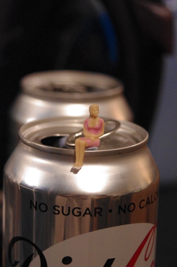
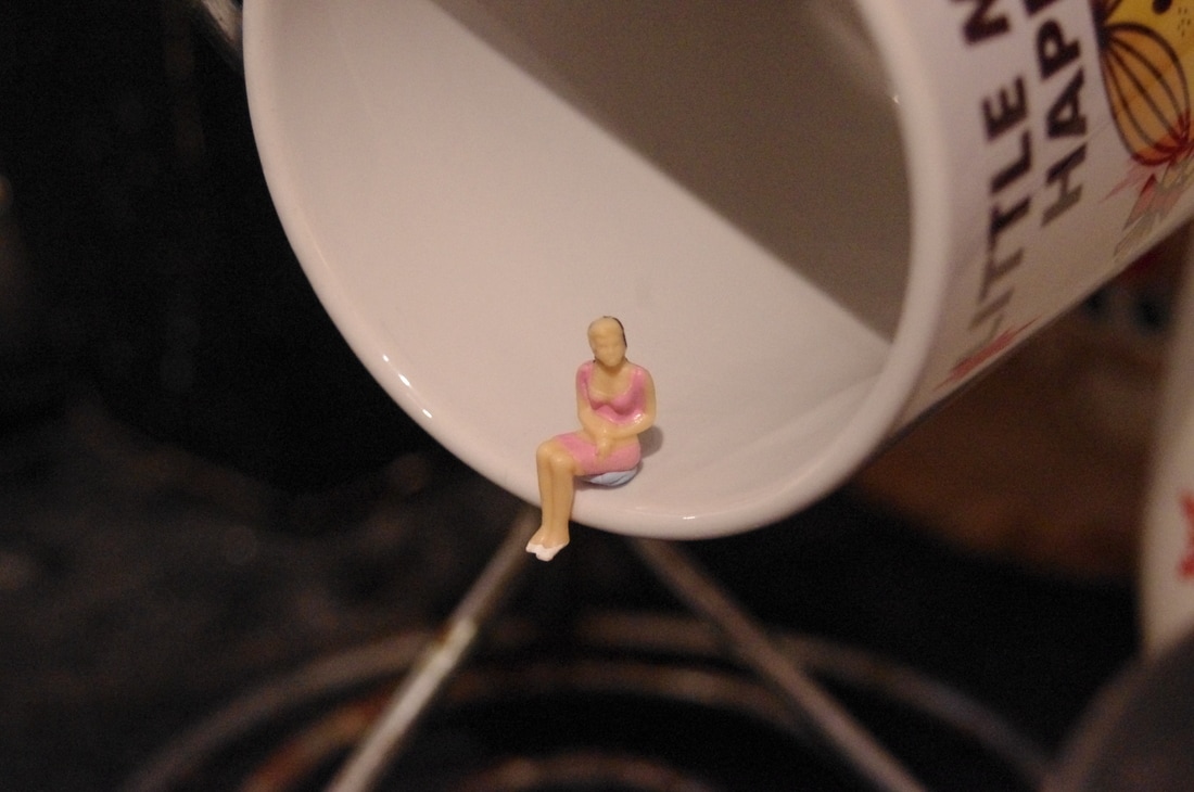
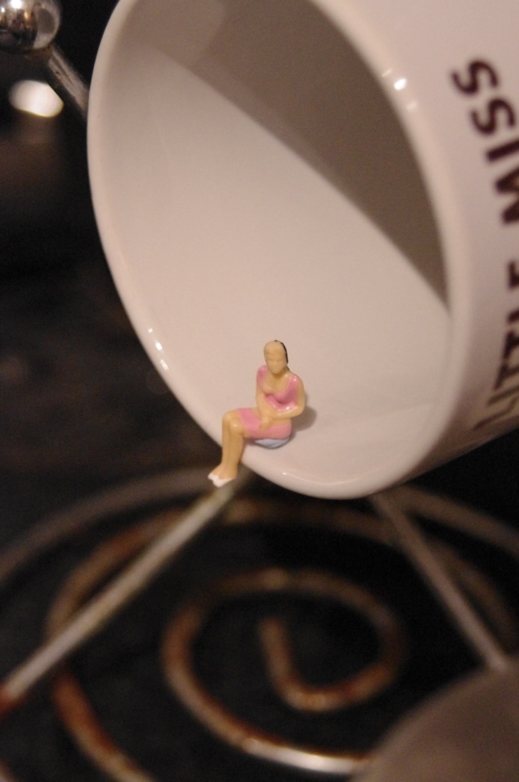
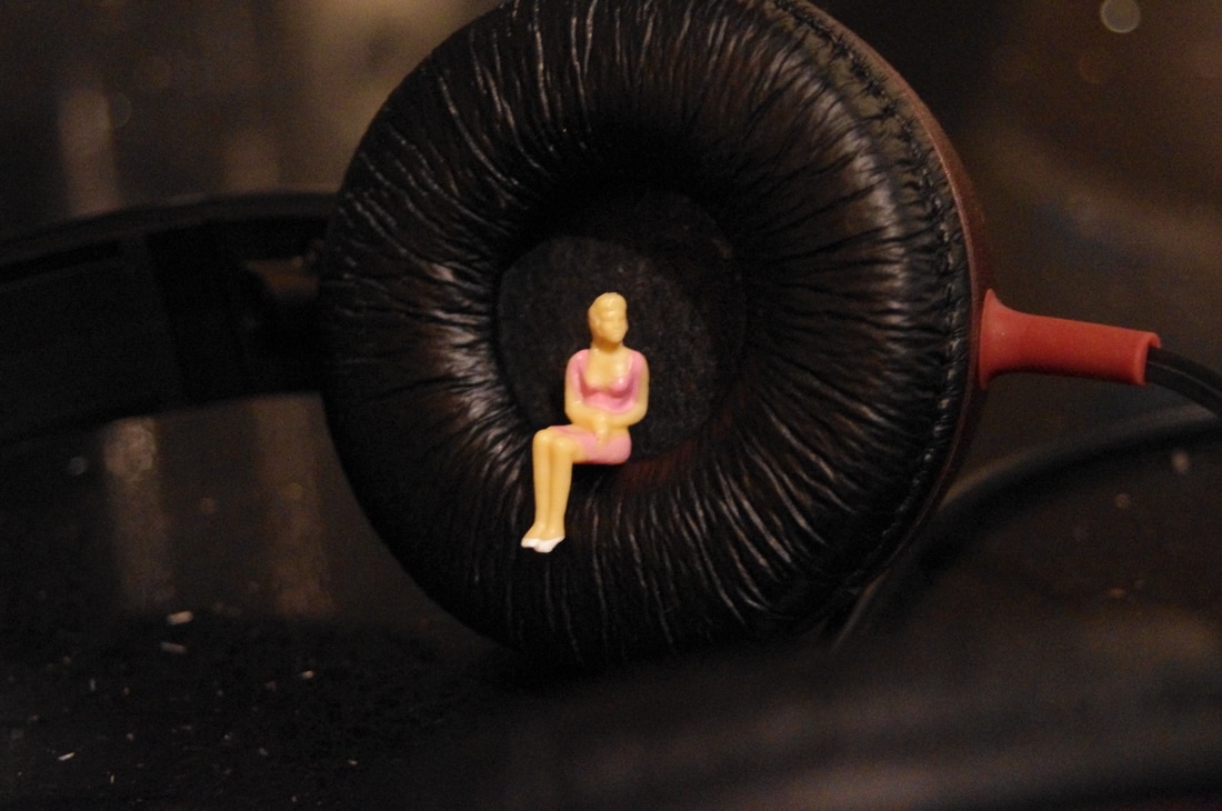
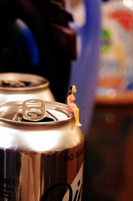
For my final piece I am going to use miniatures figures, following Slinkachu's style to create the images.
Photoshop Edit
I edited the photograph on the right using Photoshop. I increased the brightness to +43 and the contrast to +100. To do this I clicked Image -> Adjustments -> Brightness/Contrast. Next I increased the vibrancy to +100. I then selected Image -> Adjustments -> Shadows/Highlights and changed the shadows to 19%.
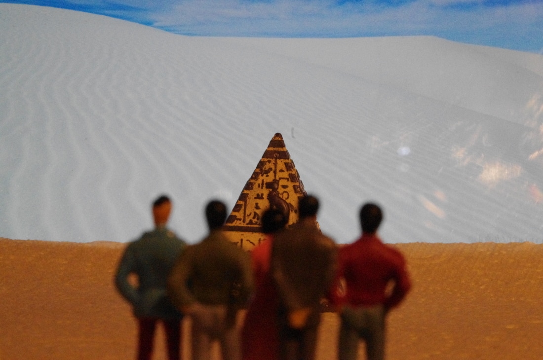
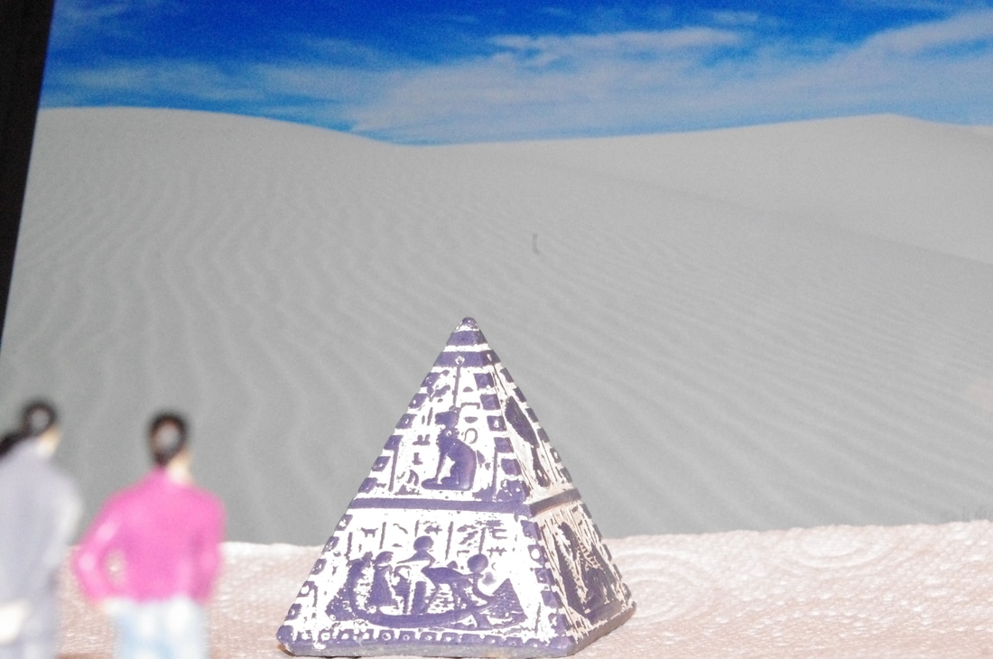
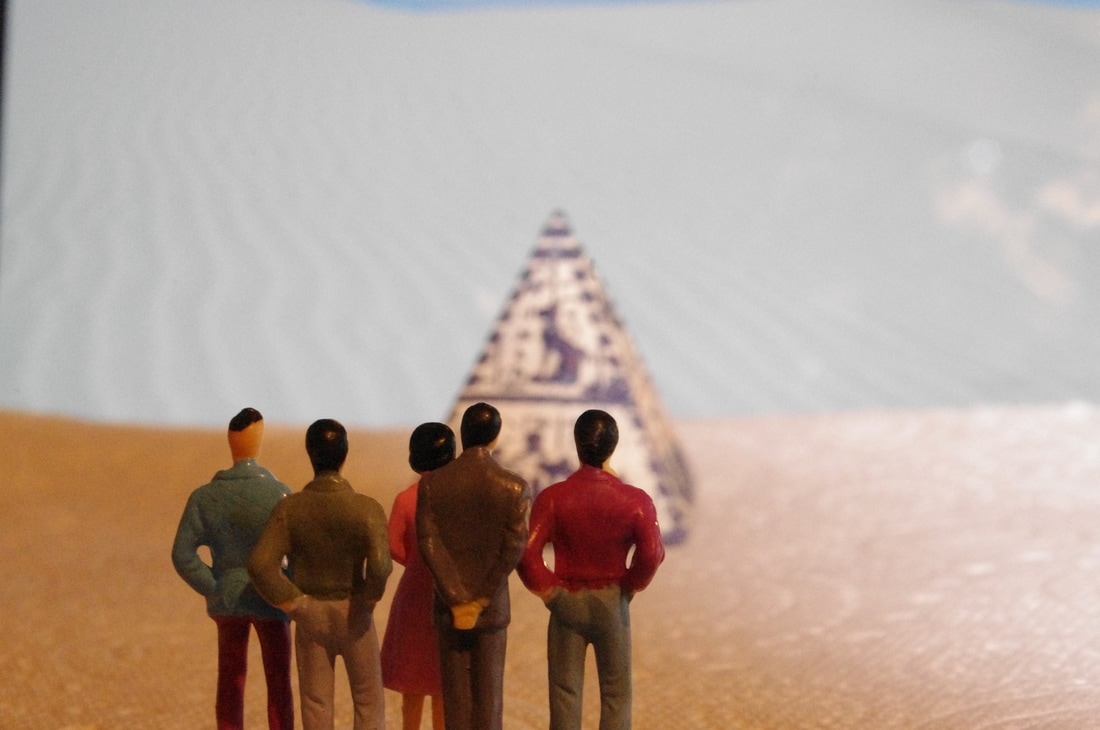
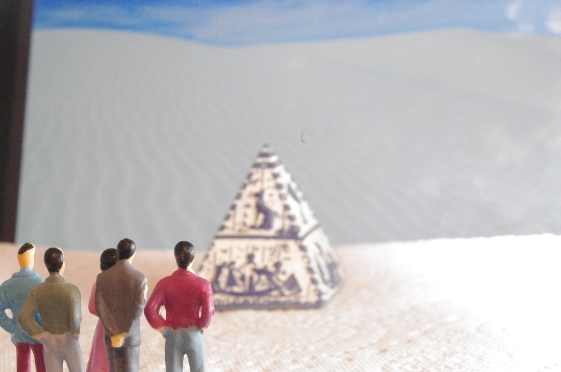
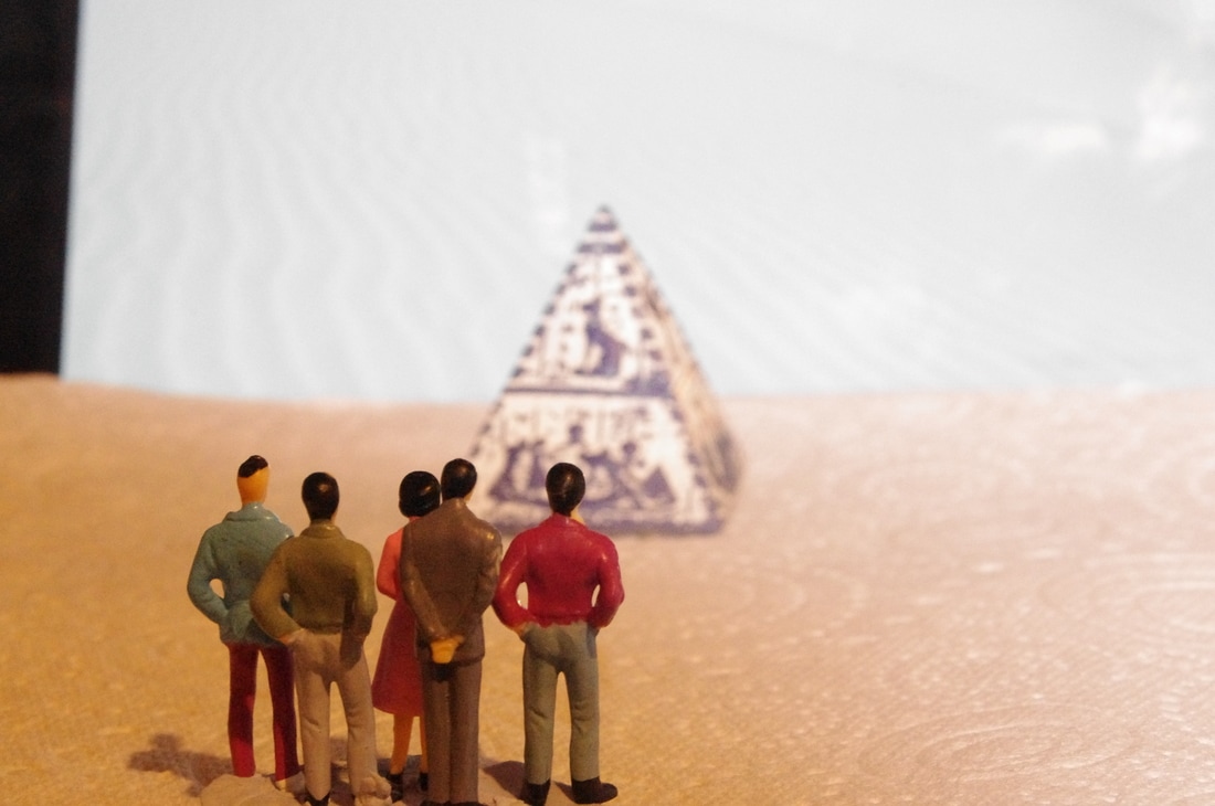
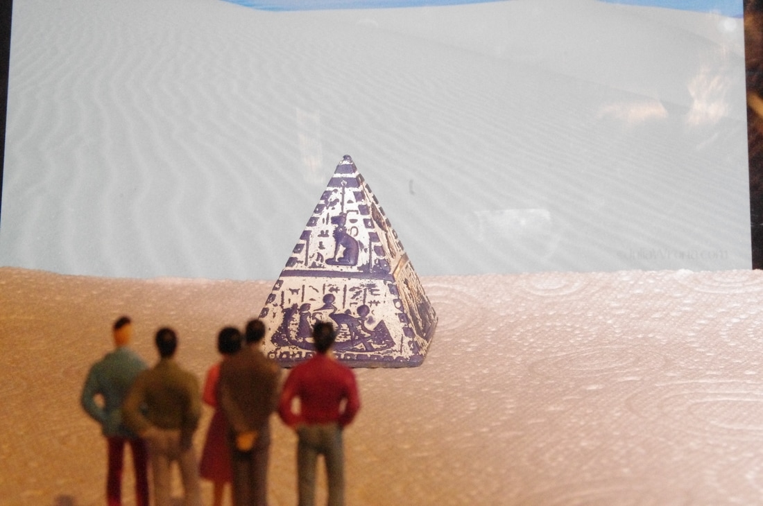
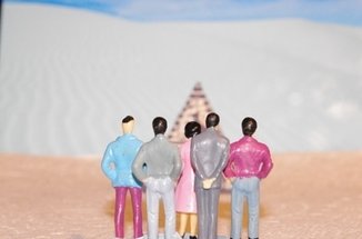
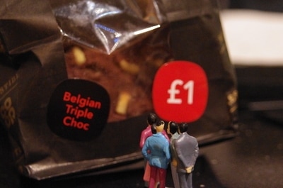
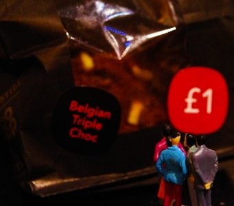
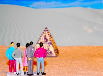
Shoot 8
For this shoot I focused on food and drink to link to Carl Warner. I used my iPad to create a background for the photographs with the pyramid in.
WWW:- I managed to capture clear photographs.
EBI:- Some of the photographs are too dark. I need to experiment with lighting to improve my images.
WWW:- I managed to capture clear photographs.
EBI:- Some of the photographs are too dark. I need to experiment with lighting to improve my images.


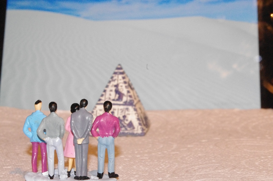
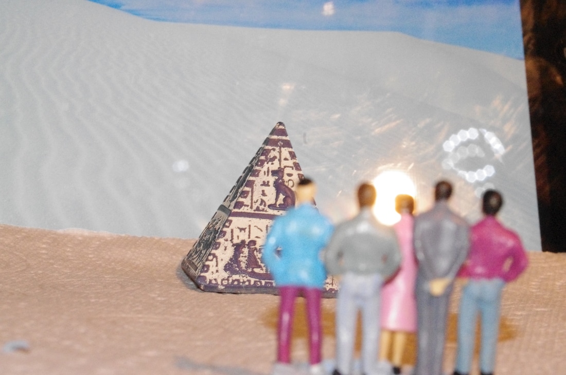
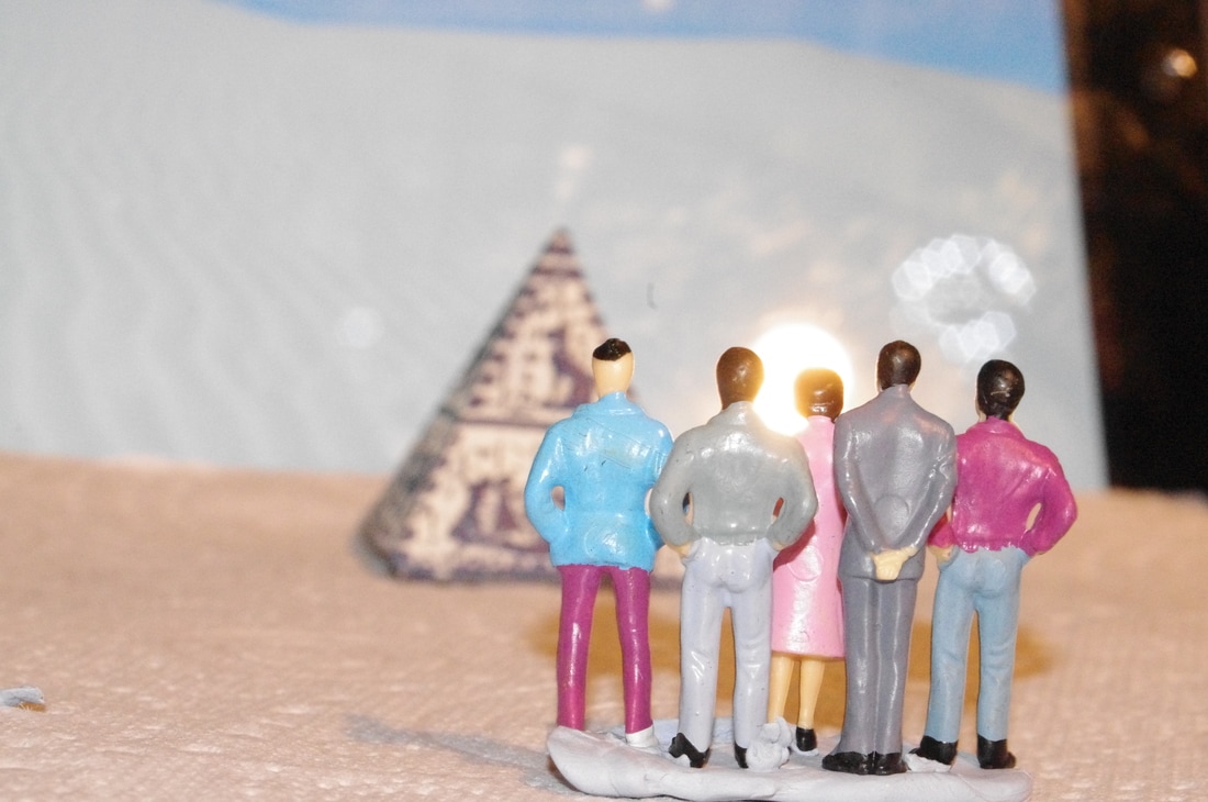
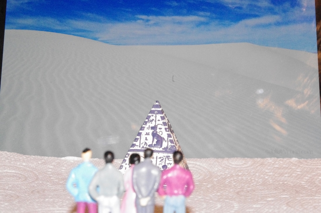
3 Best Images From This Shoot
I chose the following photographs as the best images from my shoot because they are the most clear and focused from the shoo.t I like how each of the images have different perspectives. They all link to Slinkachu. The use of food and drink in the middle and right image link to Carl Warner.
|

|
|
Photoshop Edits
To edit one of the photographs above I used Photoshop. Firstly, I cropped the image. Next, I clicked Image -> Adjustments -> Brightness/Contrast and changed the brightness to -22 and the contrast to 100. After that I clicked Image -> Adjustments -> Vibrance and changed the vibrance to +100 and the saturation to +5.
For the image below I first of all cropped the image. Next I clicked Image -> Adjustments -> Brightness/Contrast and changed the brightness to -19 and the contrast to 100. Then I clicked Image -> Adjustments -> Vibrance and changed the vibrance to +14 and the saturation to +100.
I edited the image below. First of all I clicked Image -> Adjustments -> Brightness/Contrast and changed the brightness to -22 and the contrast to 100. I then clicked Image -> Adjustments -> Levels and decreased them slightly. Next I clicked Image -> Adjustments -> Vibrance and changed the vibrance to +77 and the saturation to -7.
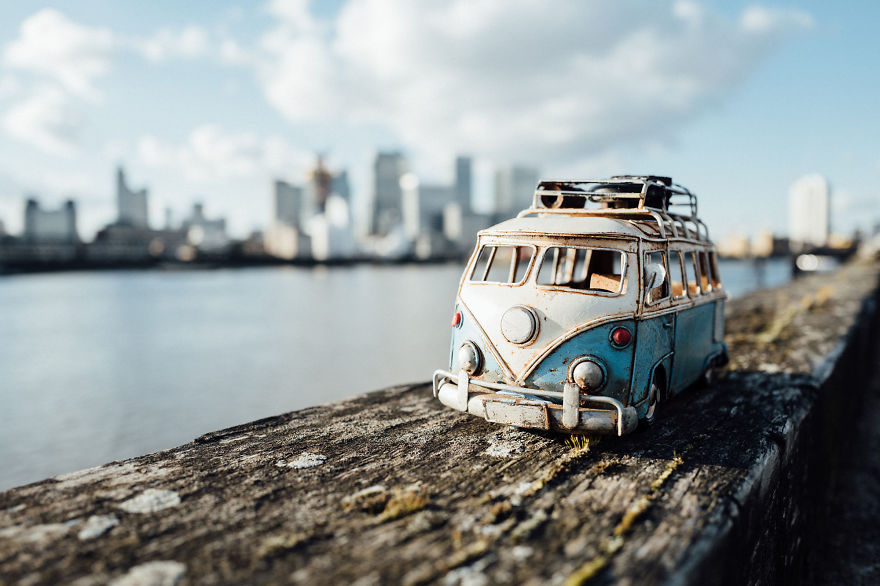
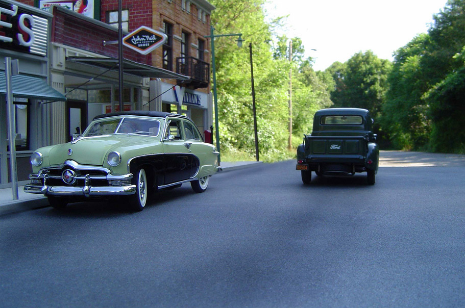
Michael Paul Smith
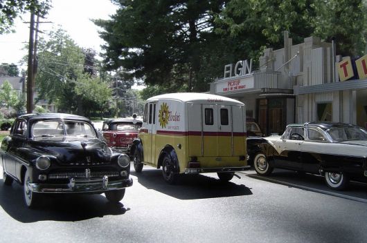
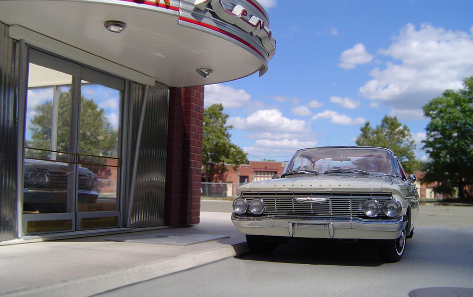
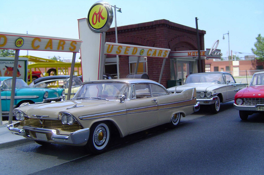
Michael Paul Smith is a photographer and expert model maker. He recreates mid-century America by making scenes, much like Carl Warner does with food. Smith uses small, detailed model cars to achieve this. He also uses miniature buildings too, which add to the scene. The photographer uses real-life landscapes as his background and blends in the model cars and sets into it. He uses a table to place the models onto. However, sometimes Smith builds model sets for the backdrop.
Michael Paul Smith recreates mid-century America of his youth because he wants people to look back on the era. "I'm creating a mood, something familiar in the viewer's mind" he told the New York Times. The mood of his work would encourage people to smile and remember the past so therefore it is positive. The image features cars, trees, roads, signs and snow. The colours used are pastel blues, yellows, oranges, greens, browns and shades of white.
I like the photorapher's work because of how he is recreating a time in history that is partly forgotten, with the lack of photographs. I also like how simple yet effect the models are and how they look so realistic. By looking over MIchael Paul Smith's work I will include a form of travel in my final piece such as a helicopter.
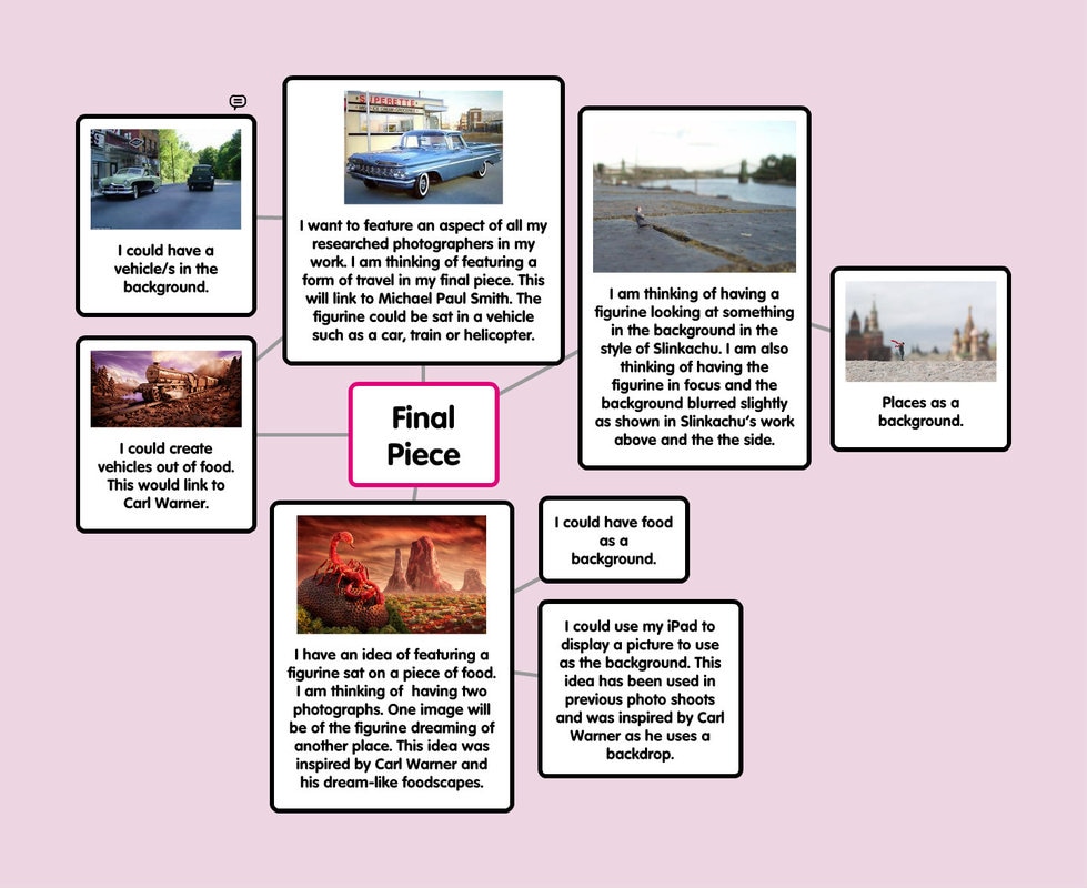
Mind Map Of Ideas For Final Piece
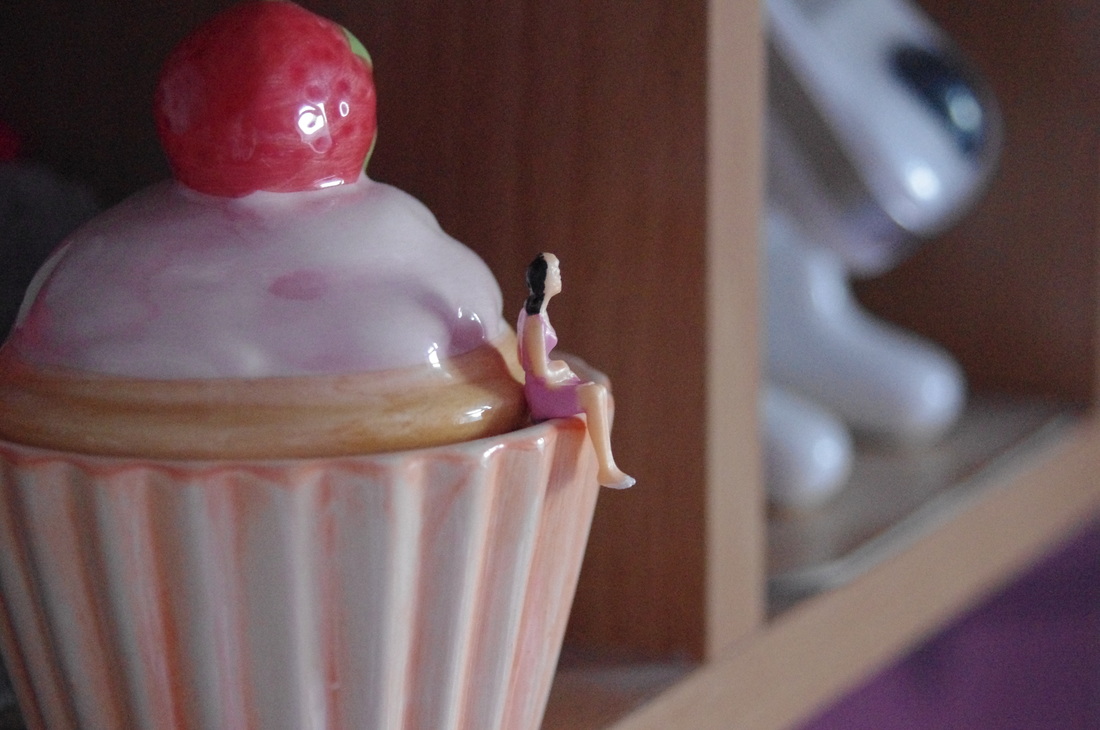
Final Piece
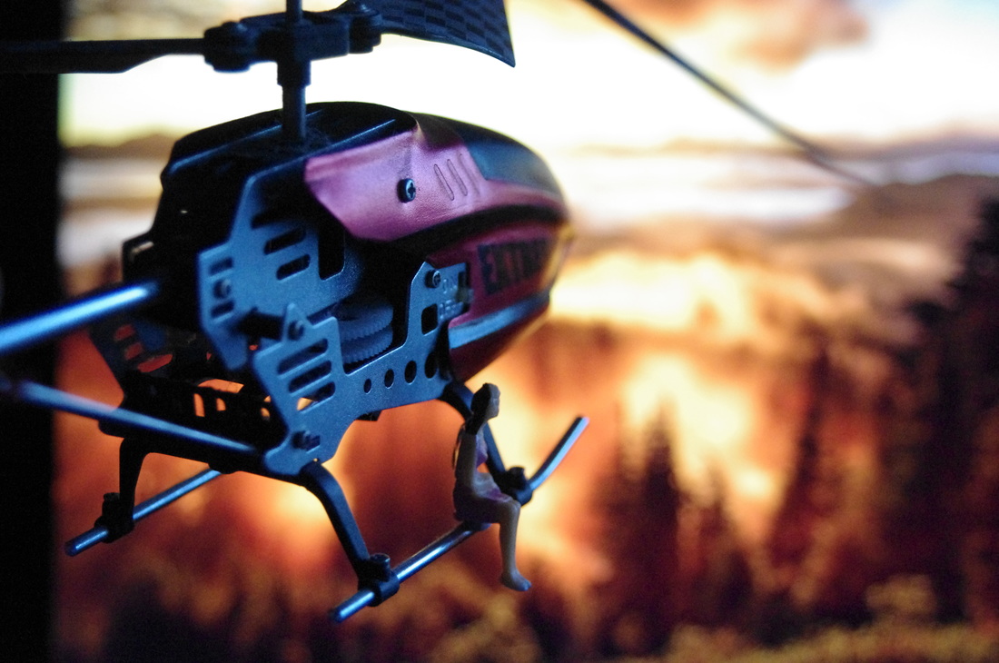
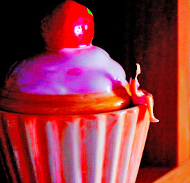
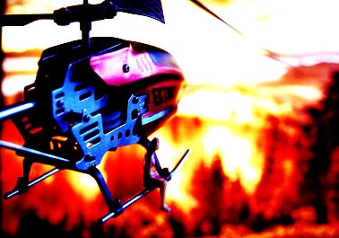
From experimenting with different figures/characters I decided that I preferred using the figures in the Slinkachu shoots. I used a cupcake to link Slinkachu and Carl Warner. I used the small figures, a china cupcake container, double-sided tape,a toy helicopter and an iPad to display a background. Through experimenting before with these figures I managed to disguise the double-sided tape. The following photographs are the result.
WWW:- I included the work of the two photographers researched.
EBI:- If the lighting on the second photograph was more of an orangey colour like the background behind so it would have looked more realistic.
WWW:- I included the work of the two photographers researched.
EBI:- If the lighting on the second photograph was more of an orangey colour like the background behind so it would have looked more realistic.
Photoshop Edit
I decided to edit my final piece as I have with the previous shoots. However, I still prefer the original and so the next following images are just further experimenting with Photoshop.
I edited the two photographs above using Photoshop. First of all I clicked on Image -> Adjustments -> Brightness/Contrast and changed the brightness to 46 and the contrast to 100 on the first photograph. I then changed the vibrance to +100 and the saturation to +100 too. After that I clicked on Image -> Adjustments -> Levels and changed it to 86, 0.64 and 255. I then changed the shadows to 100% and kept the highlights at 0%. I then cropped the image.
With the second image I clicked on Image -> Adjustments -> Brightness/Contrast and changed the brightness to 87 and the contrast to 100. Next I clicked on Image -> Adjustments -> Levels and changed it 24, 0.70 and 241. I then clicked on Image -> Adjustments -> Colour Balance and changed the numbers to +100, -100 and -100. I then cropped it.
|
|
