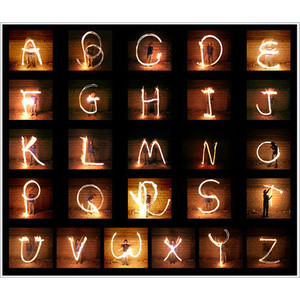
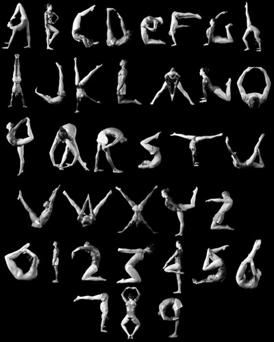
Alphabet Photography
Below shows my favourite versions of letters found online by different photographers.
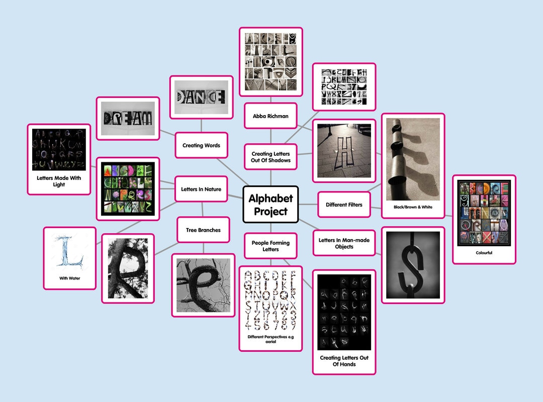
Mindmap of Ideas
Mood Board
Abba Richman
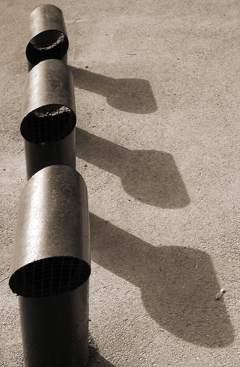
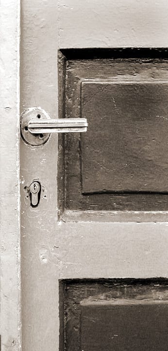
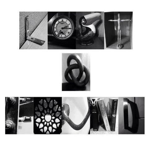
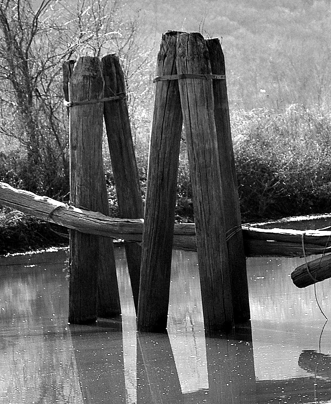
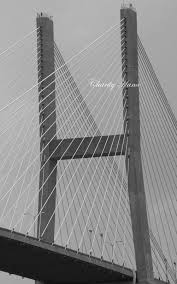
'K' - January 2003 'E' - May 2003 'F' - December 2002 'L' - April 2003
Critical Analysis
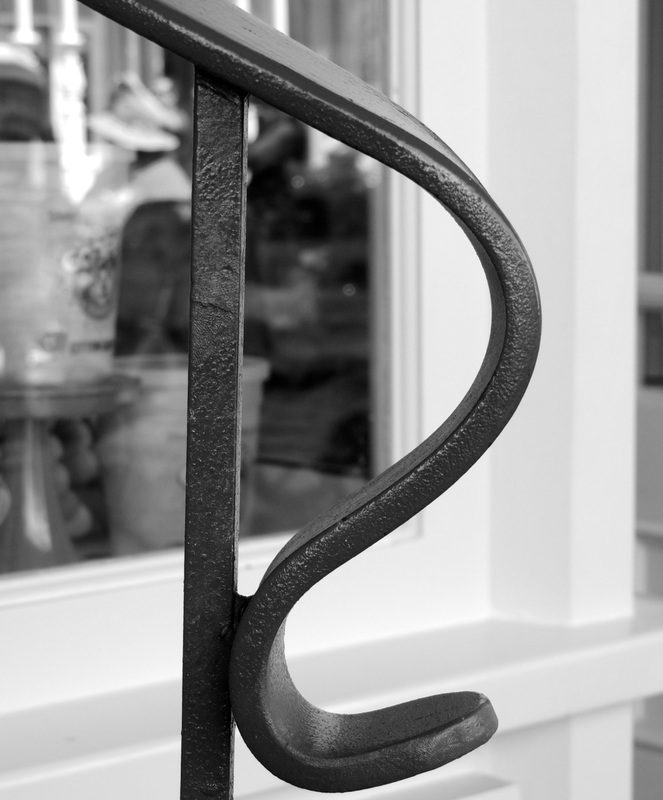
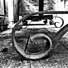
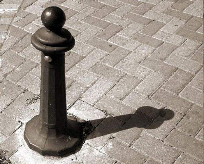
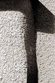
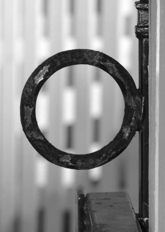
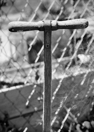
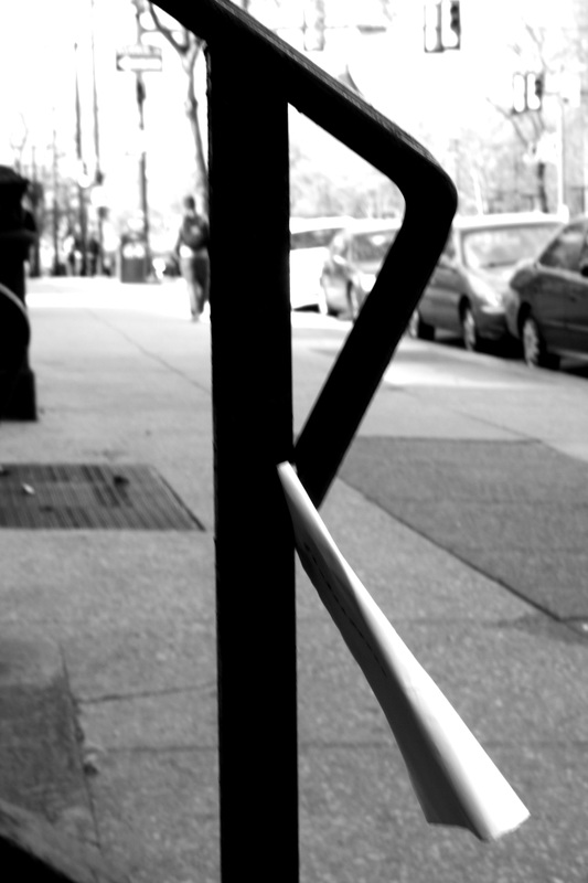
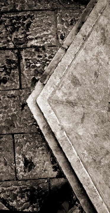
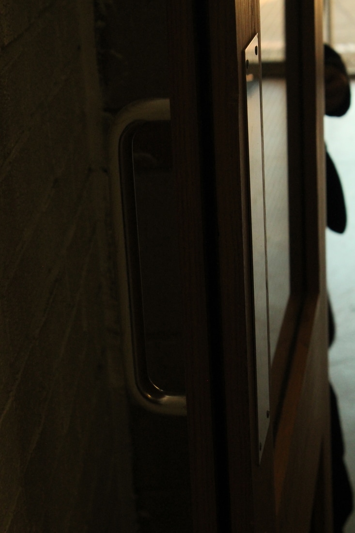
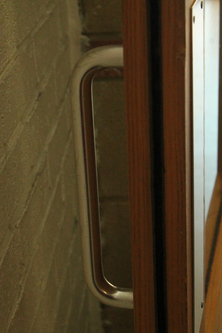
Abba Richman was born in 1948 in London, England. In 1967 Richman and his family moved to Israel and have been living there ever since. The photographer studied Graphic Design and Photography at the Bezalel Academy of Art and Design in Jerusalem. Richman takes photographs of ordinary objects that we come across in detail. To the viewers Richman's work appears to look like letters, either through their shadows or their form.
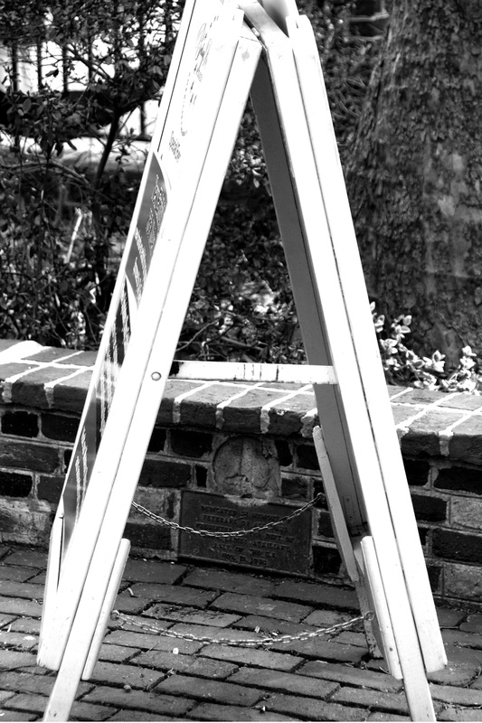
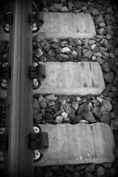
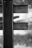
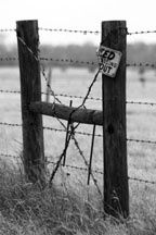
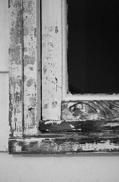
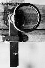
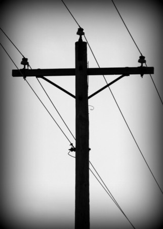
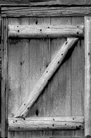
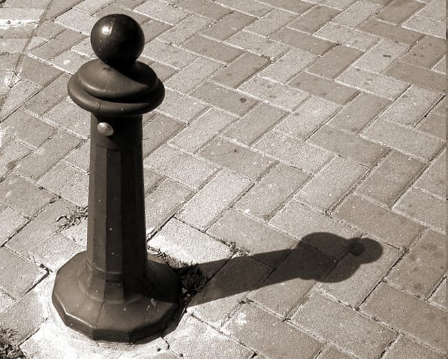
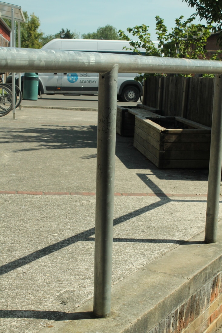
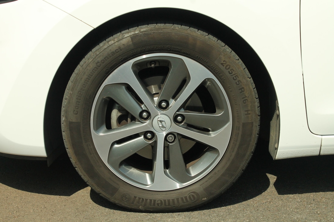
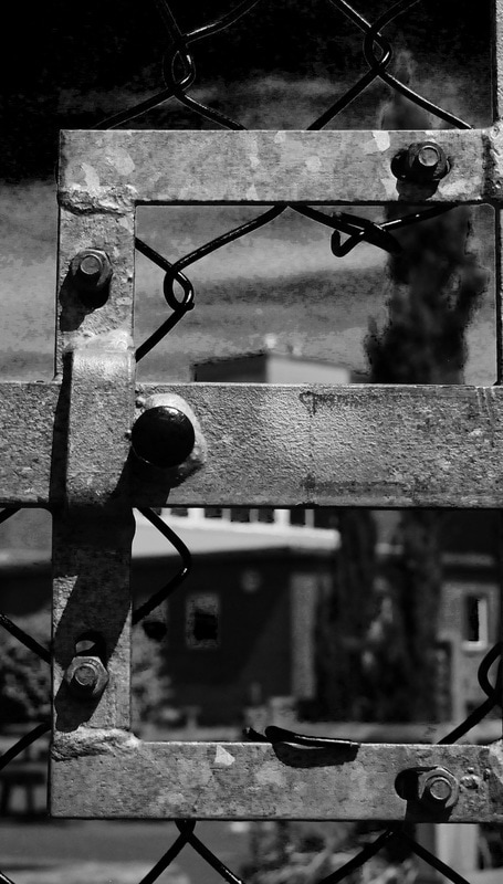
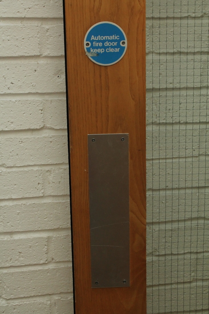
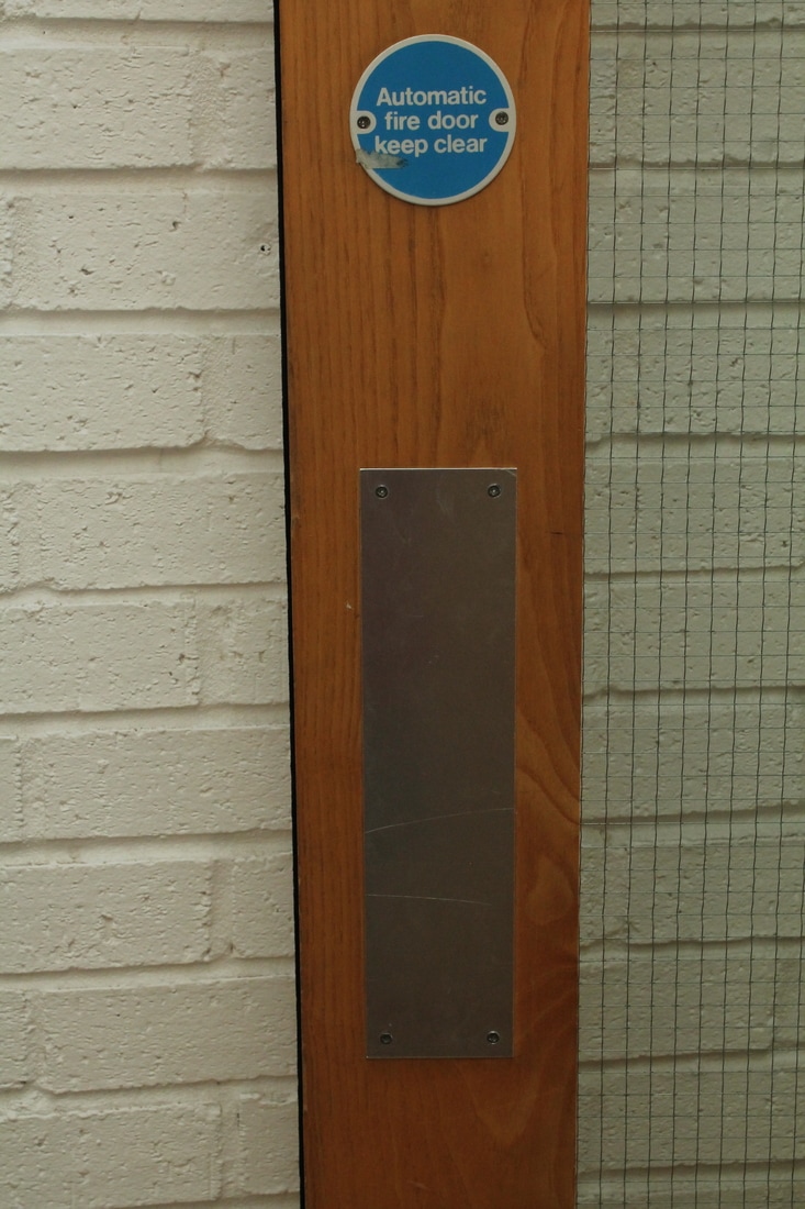
The objects featured in the photograph are a post and a brick pavement. The colours used are dark due to the image being in a brown and white filter. The filter creates a bigger contrast between light and dark, highlighting the textures of the object. The formal elements of the object are form, shape, line and composition.
I like Richman's work because it is unusual and clever with the idea of shadows creating letters. To improve the photographer could have experimented with images in colour. I will use Abba Richman's work to inspire me to experiment with objects and their shadows. I would like to look at organising objects to form a letter out of their shadows.
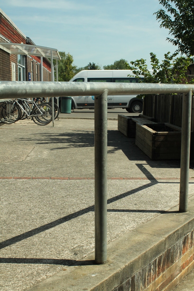
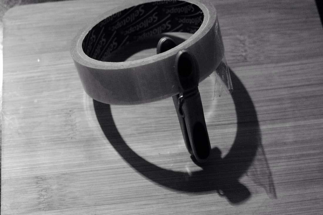
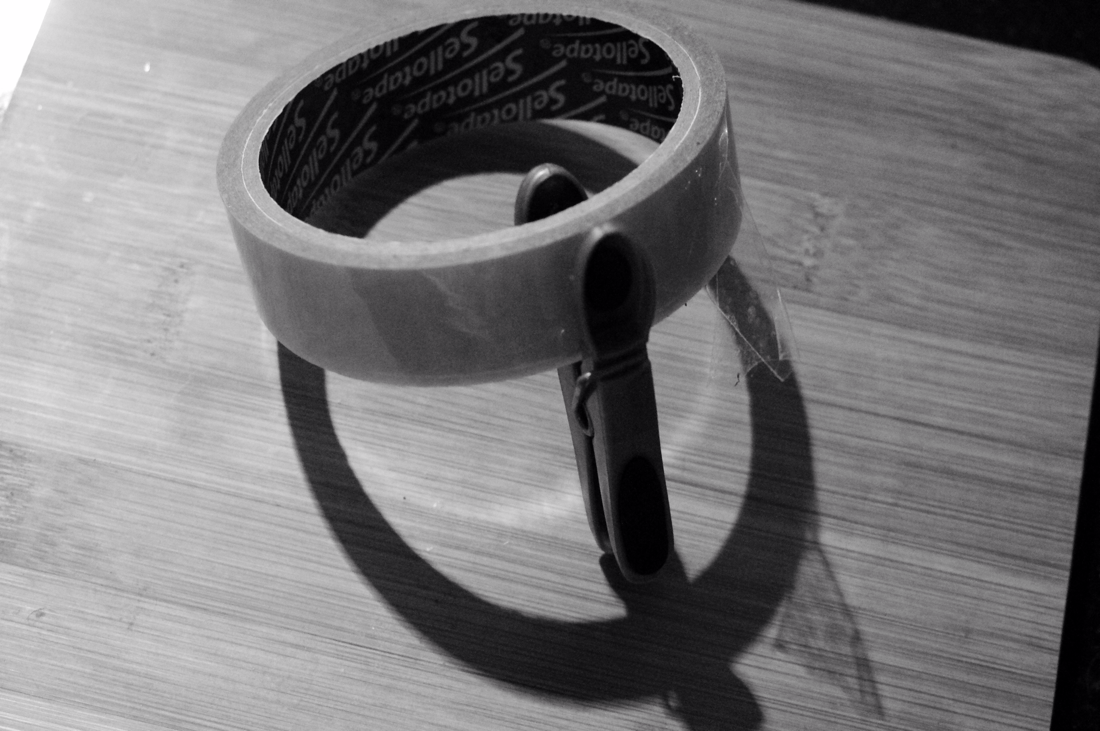
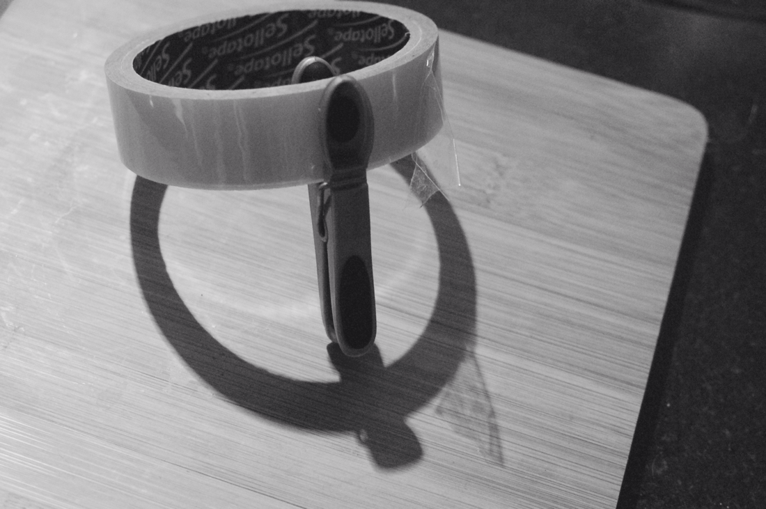
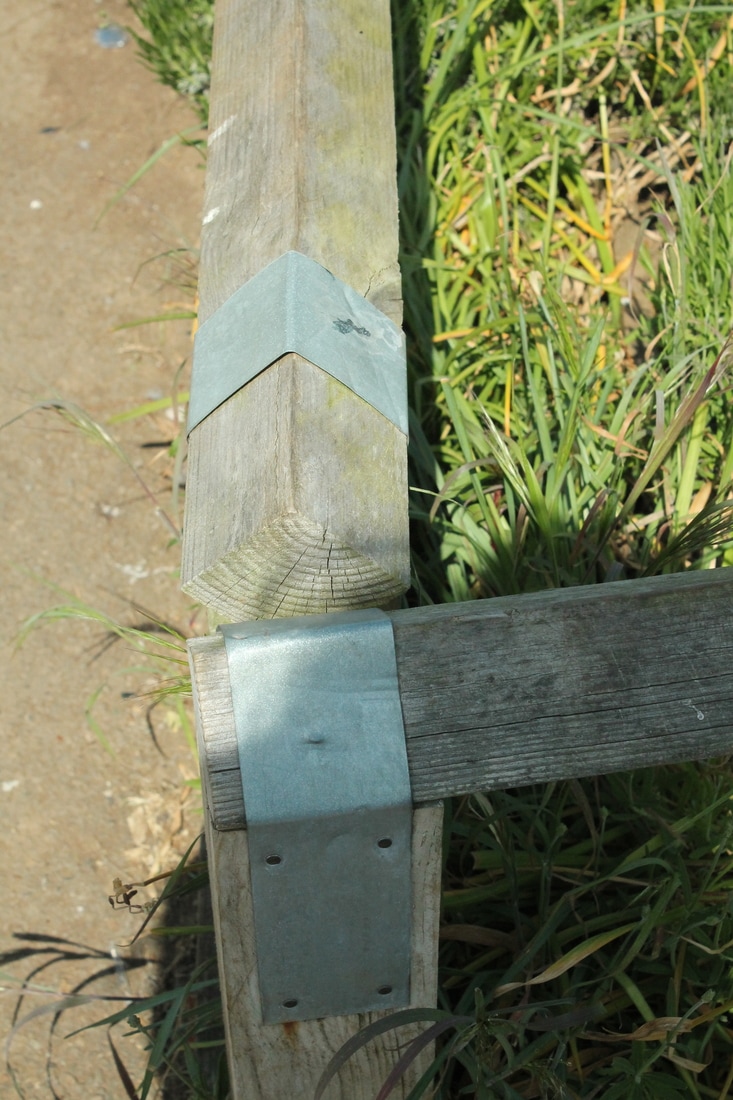
Shoot 1 (Letters Made From Shadows)
For my first shoot I used objects found around the house to assemble them and create letters from their shadows. I used sellotape and a washing line peg to form the letter Q from their shadow. I used a black and white filter to link my work to Abba Richman's brown/black and white style.
WWW:- I managed to create a shadow out of objects which links to Abba Richman's work. I now understand the angles that objects need to be to create certain shadows.
EBI:- To experiment with taking photo graphs of ordinary objects rather than having to assemble them as shown in Richman's images.
WWW:- I managed to create a shadow out of objects which links to Abba Richman's work. I now understand the angles that objects need to be to create certain shadows.
EBI:- To experiment with taking photo graphs of ordinary objects rather than having to assemble them as shown in Richman's images.
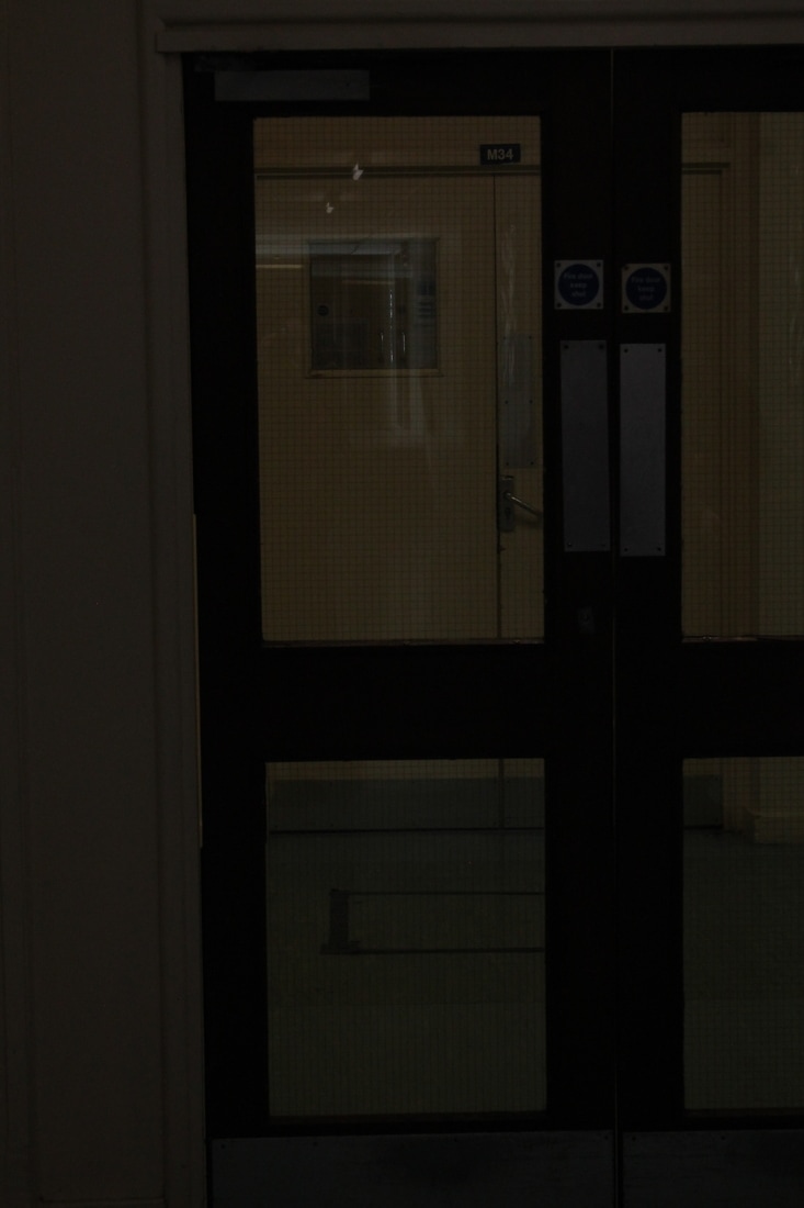
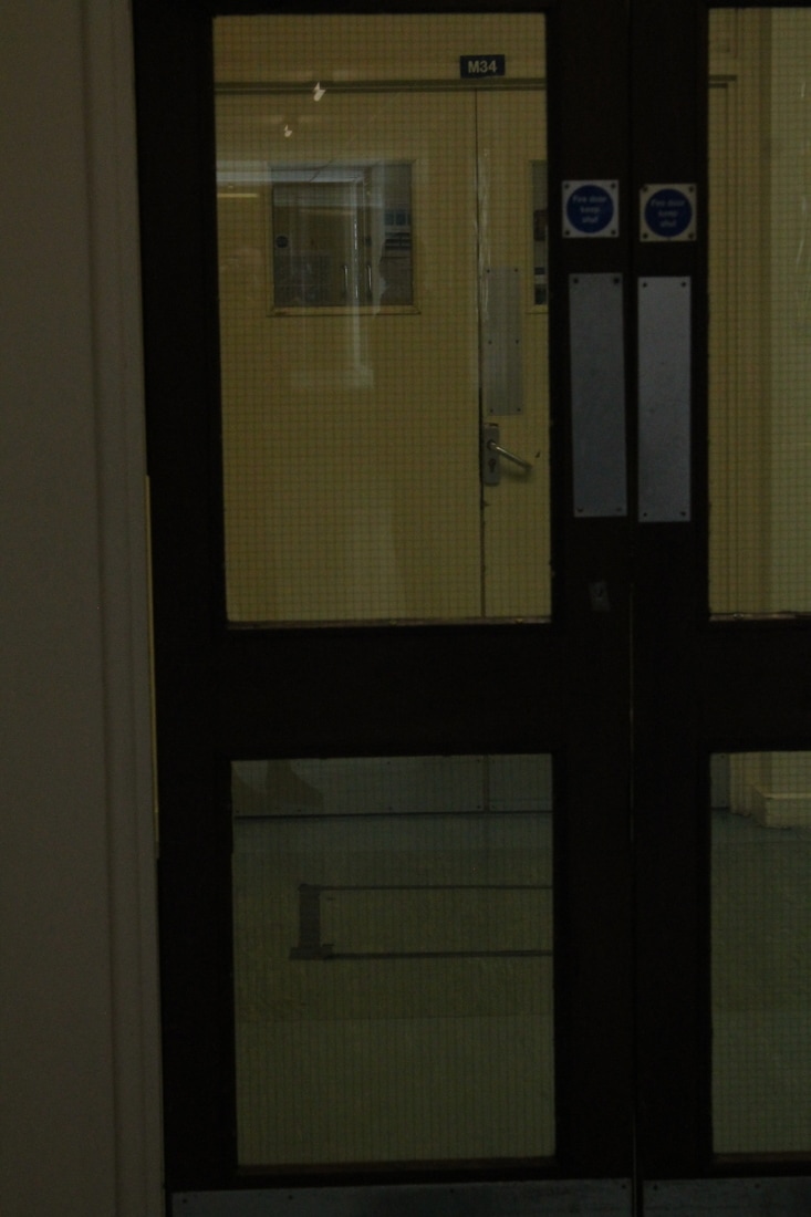
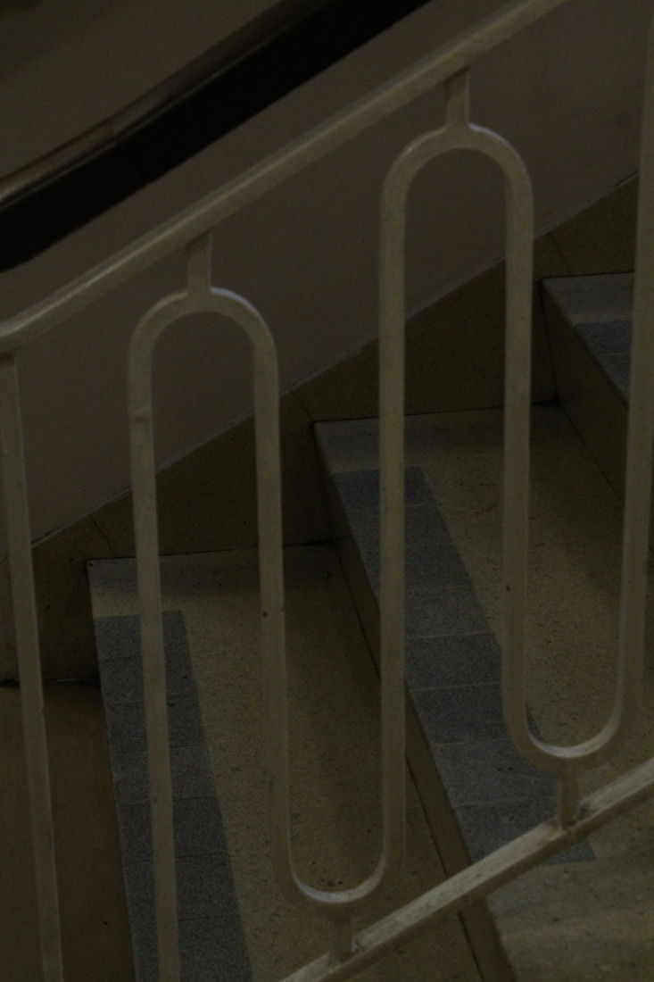
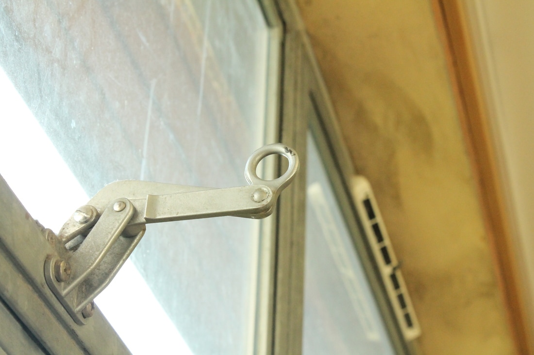
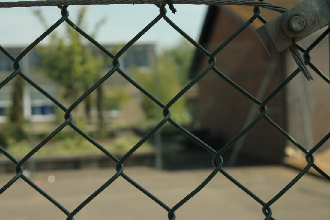
Shoot 2
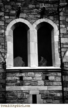
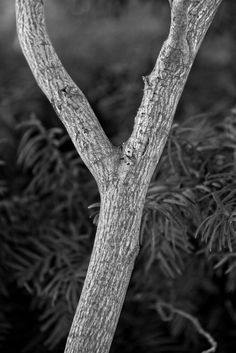
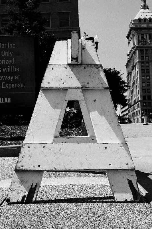
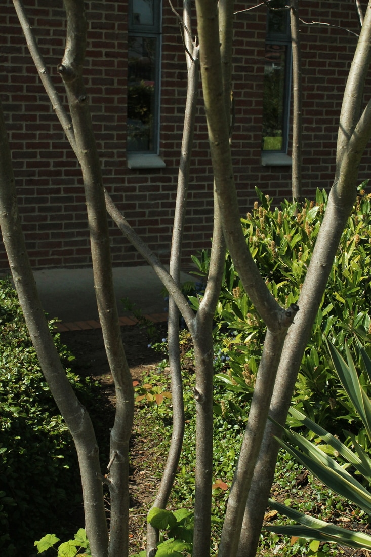
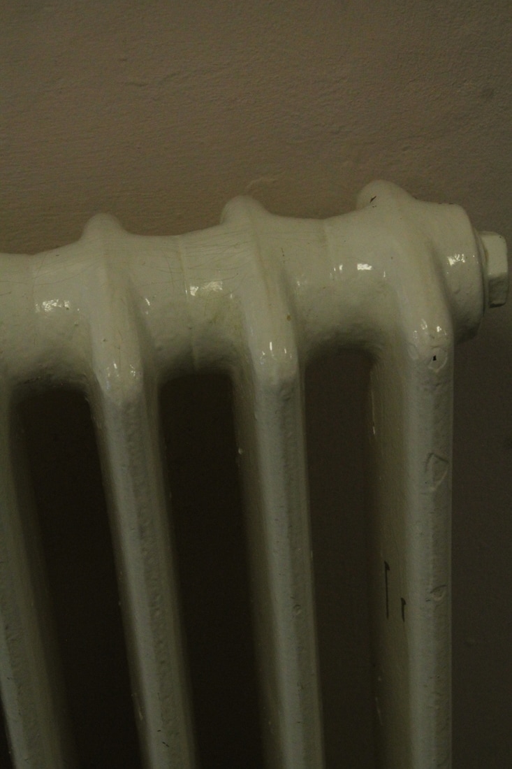
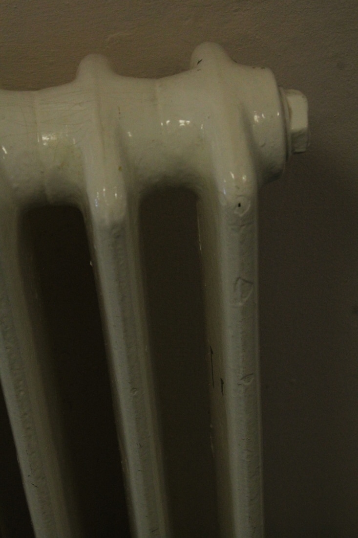
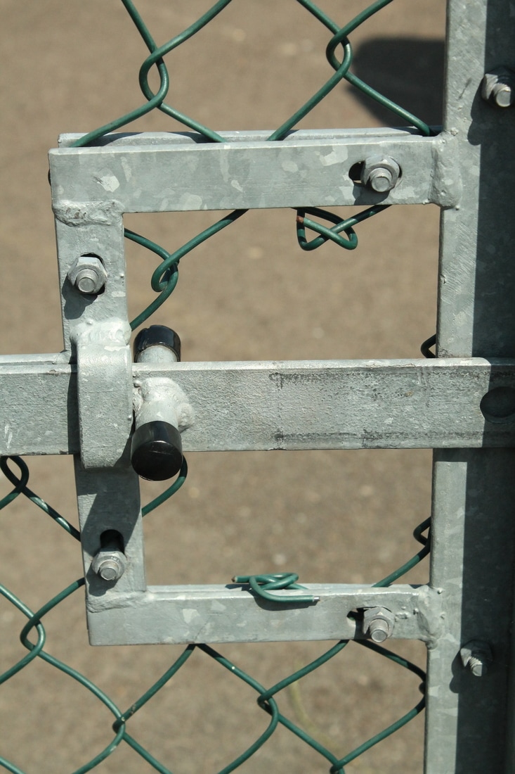
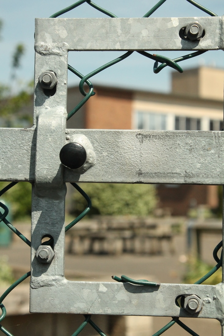
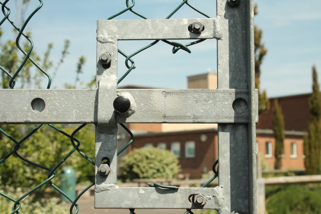
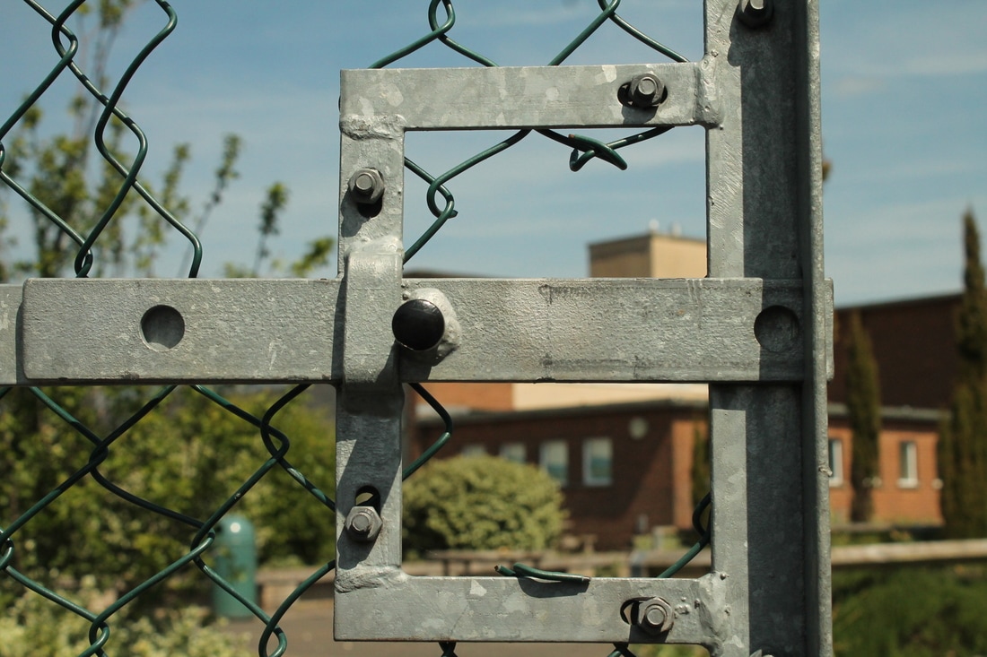
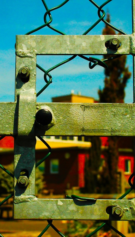
For this shoot I wanted to experiment with finding letters in everyday objects rather than shadows. I took photographs around my school. I looked at composition and taking images at different angles/perspectives.
WWW:- I managed to take over 20 photographs that resemble letters.
EBI:- Some of the photographs are too dark therefore I will need to look at changing the camera settings to make my images clearer.
WWW:- I managed to take over 20 photographs that resemble letters.
EBI:- Some of the photographs are too dark therefore I will need to look at changing the camera settings to make my images clearer.

Photoshop Edits
I used Photoshop to edit an image of the letter E from my photo shoot above.. For the image on the left I clicked Image -> Adjustments -> Brightness/Contrast and increased the contrast to 100 and the brightness to -46. I then clicked Image -> Adjustments -> Vibrance and increased the vibrance to +18 and the saturation to +20. I also cropped the image to make the photograph more level. For the second image I used the photograph on the left but clicked Image -> Adjustments -> Black & White. I then decreased the amount of blue to create a greater contrast between the sky and the handle.
|
|
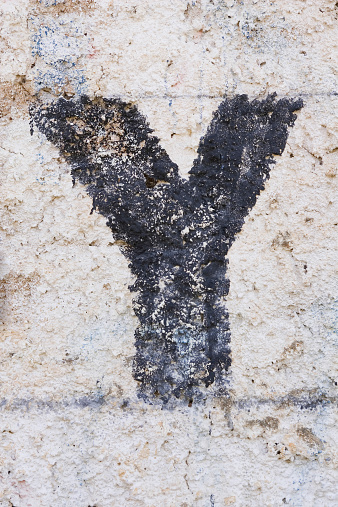
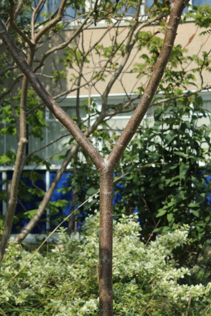
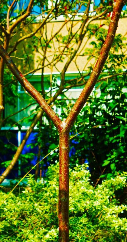
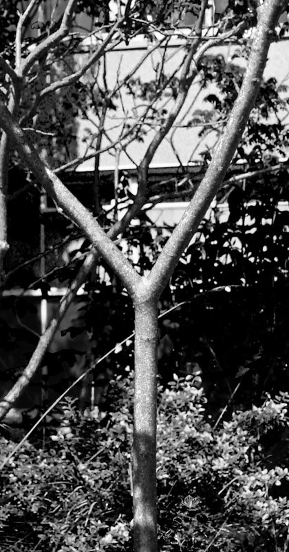
I edited an image of the letter Y from my previous photo shoot. For the image on the left I cropped it to make the branches slightly smaller. Next I clicked Image -> Adjustments -> Brightness/Contrast and decreased the brightness to -32 and increased the contrast to 100. Then I clicked Image -> Adjustments -> Vibrance and increased the vibrance and saturation. After that I clicked Image -> Adjustments -> Shadows/Highlights and increased the highlights to 10%. For the second image I used the edited photograph on the left and clicked Image -> Adjustments -> Black & White. I then set red to 135%, yellow to 71%, green to -20%, cyan to 60%, blue to 20% and magenta to -200%.
|
|
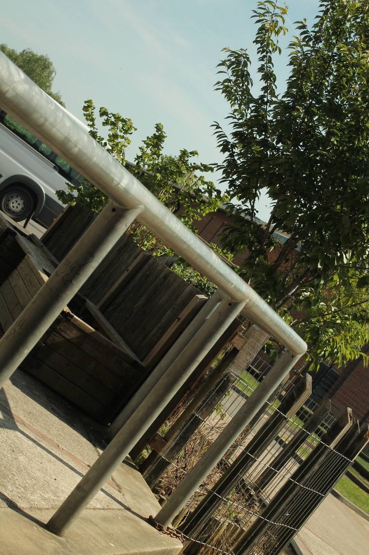
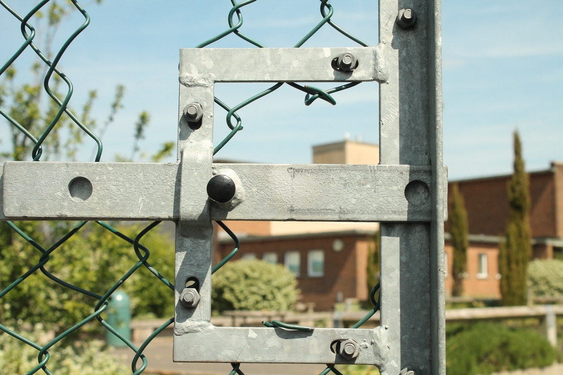
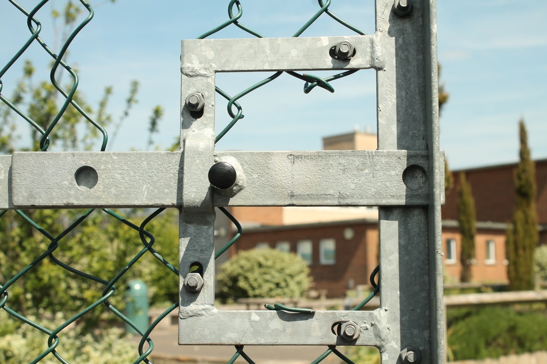
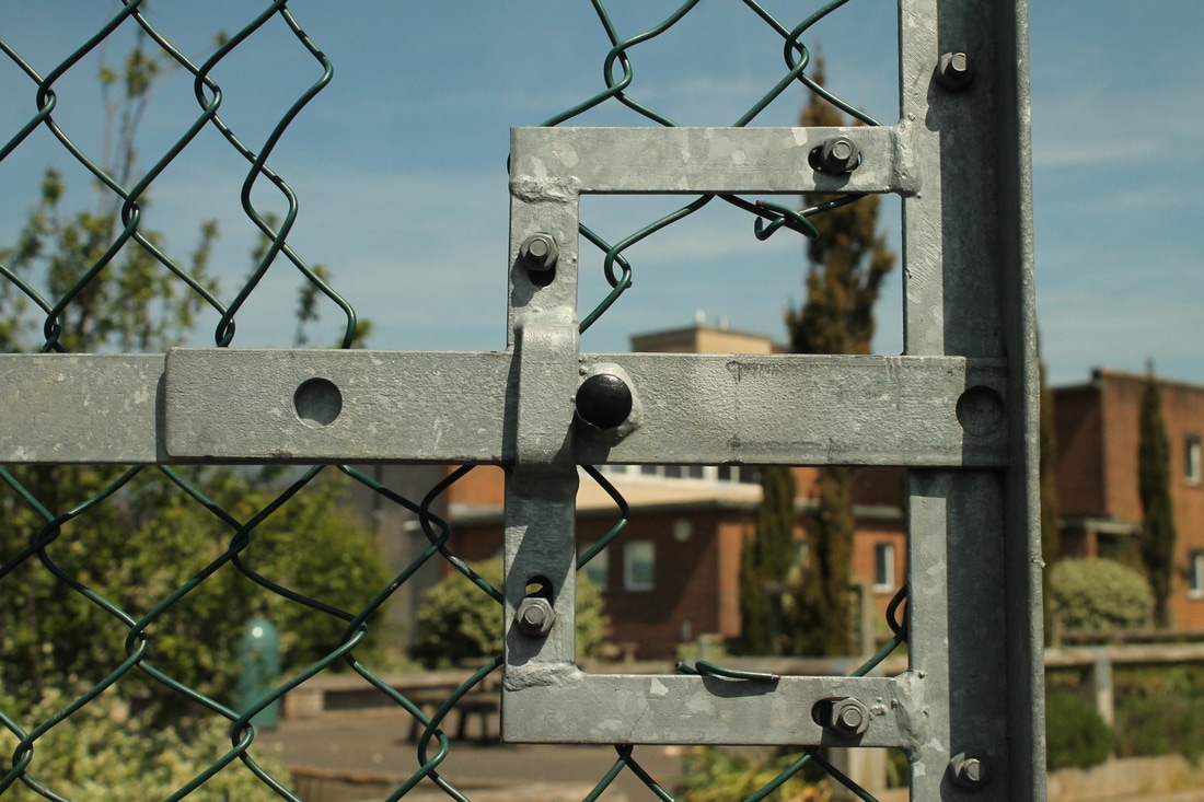
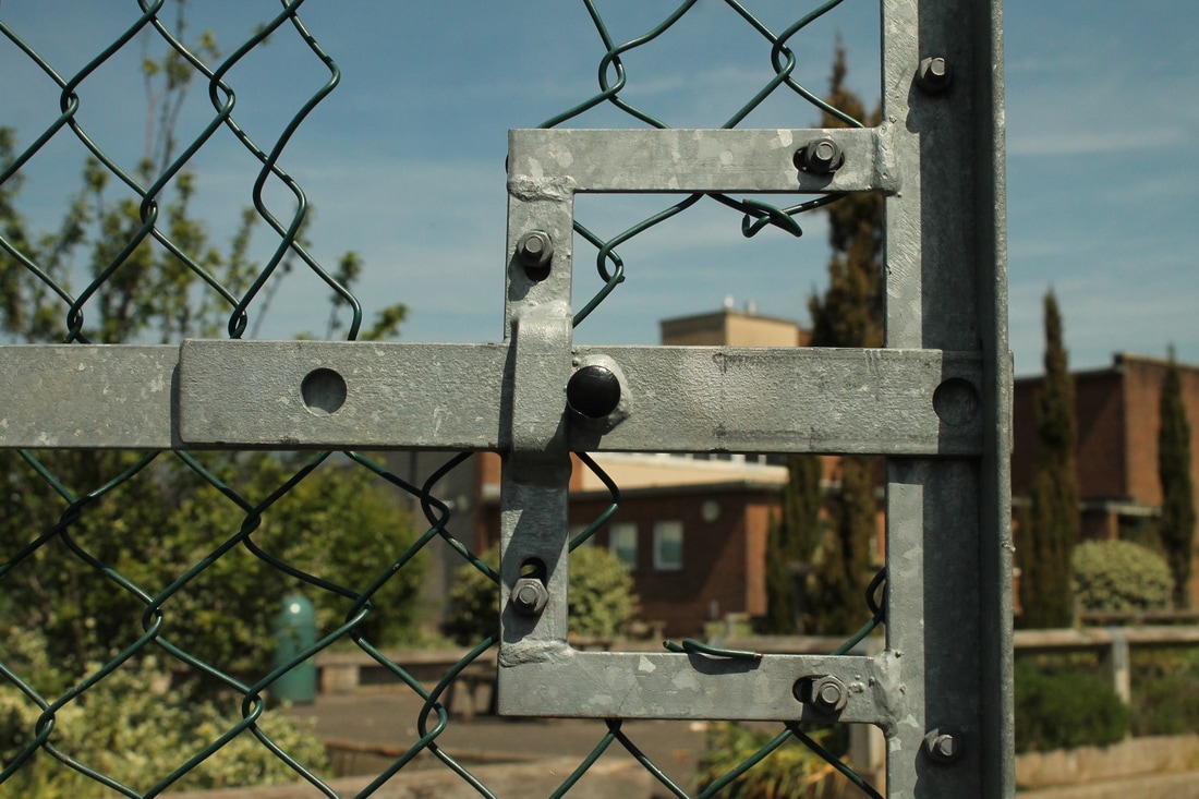
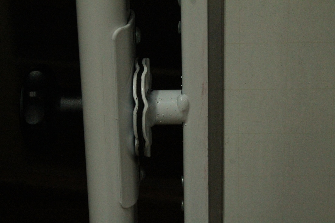
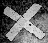
Shoot 3
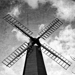
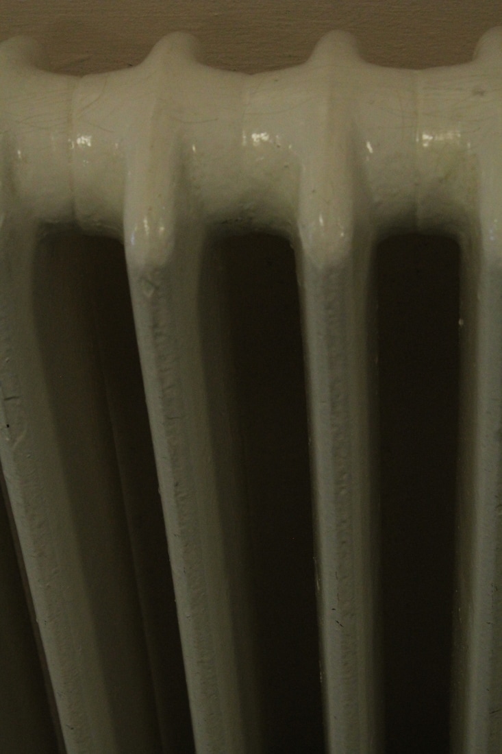
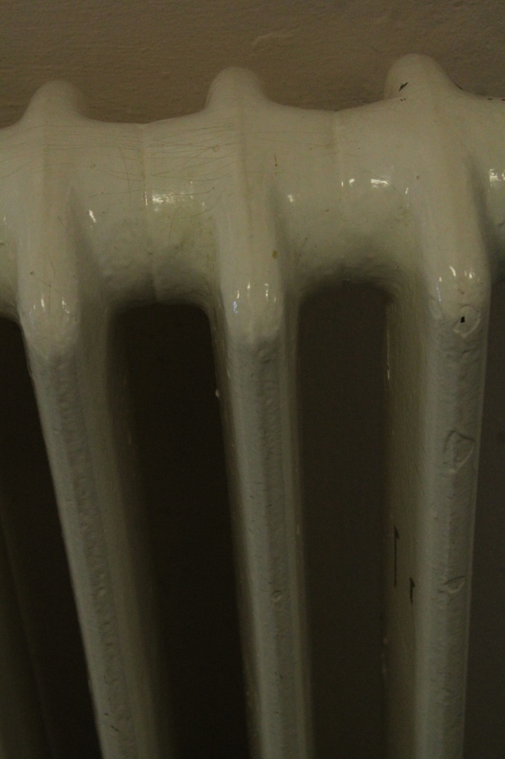
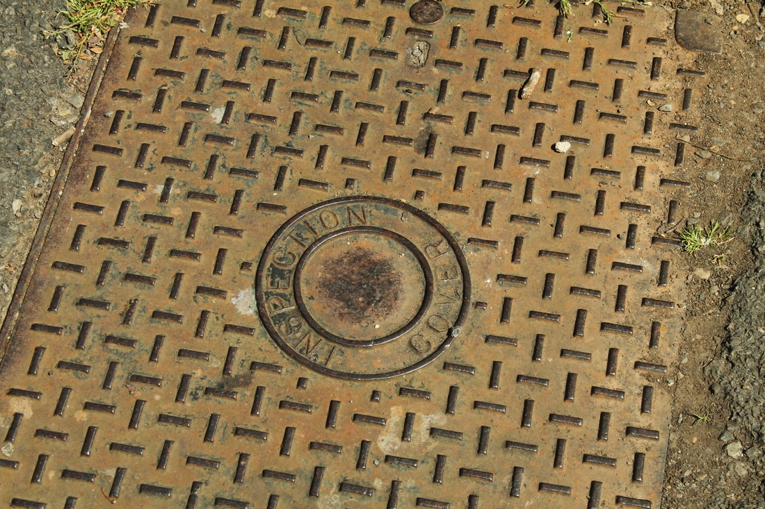
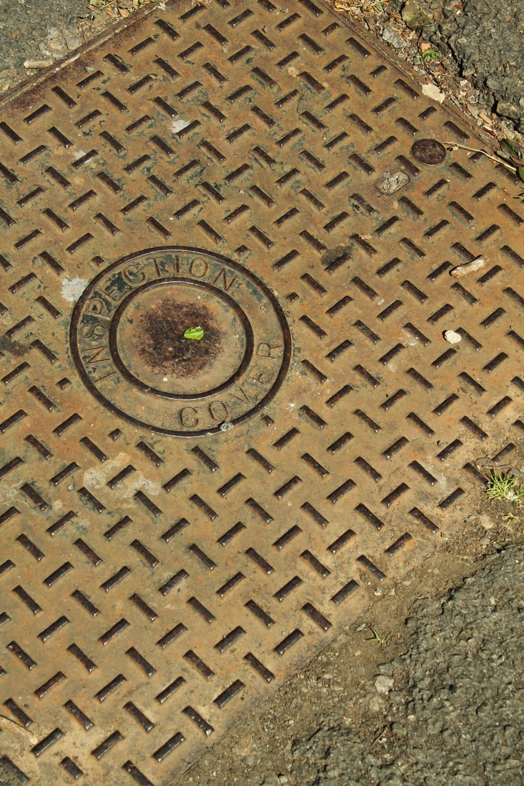
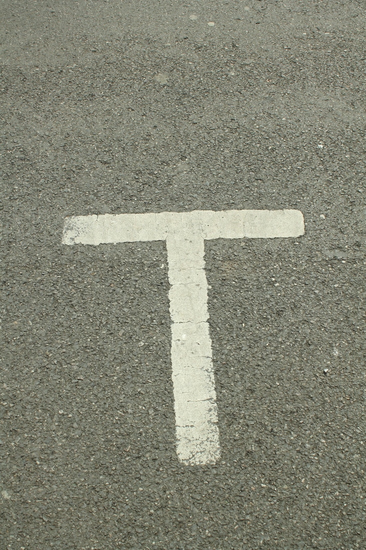
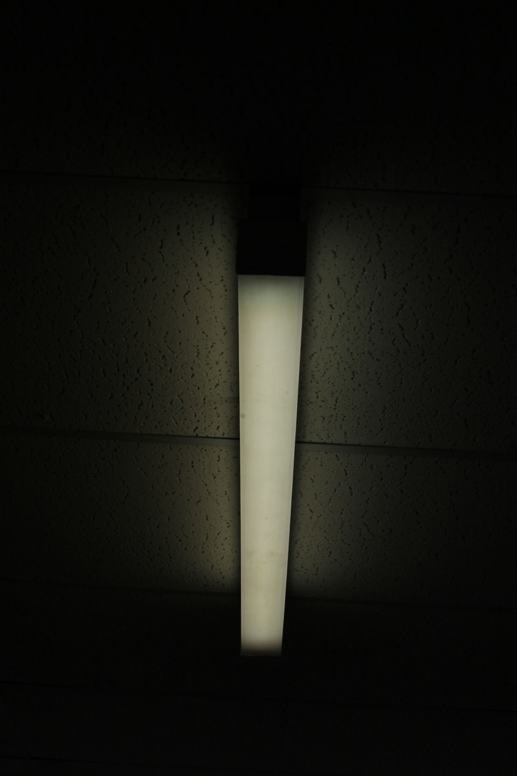
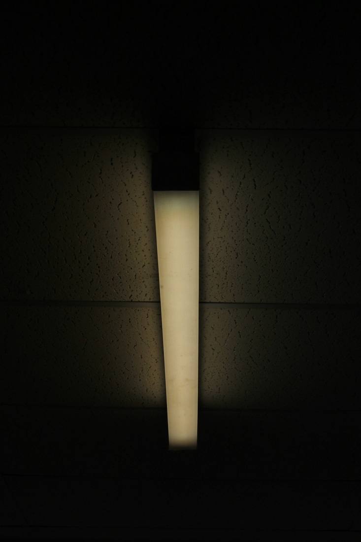
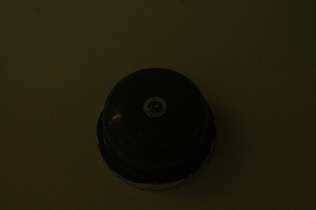
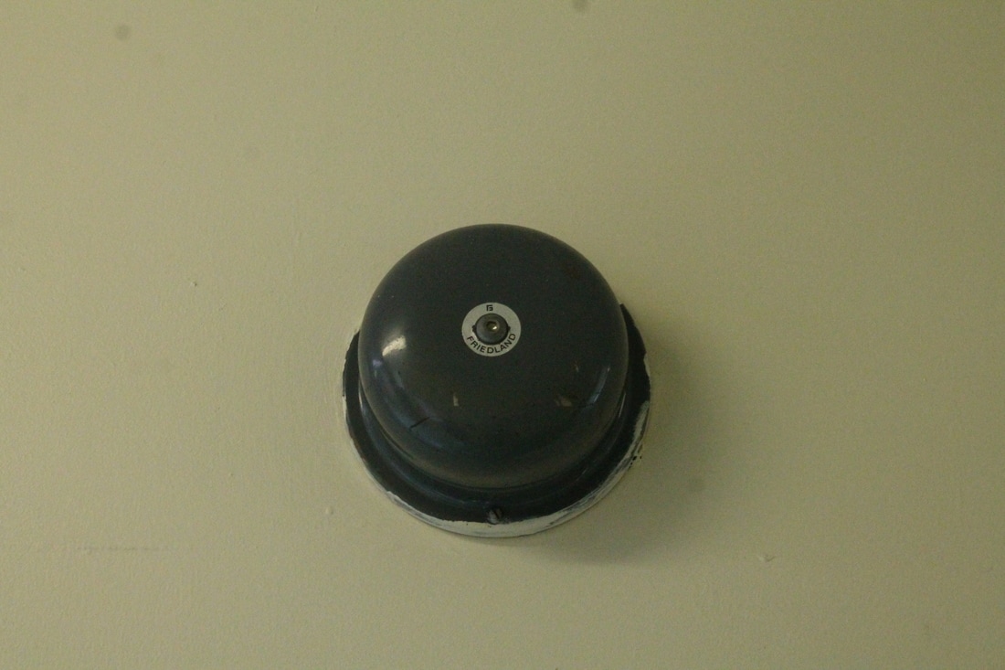
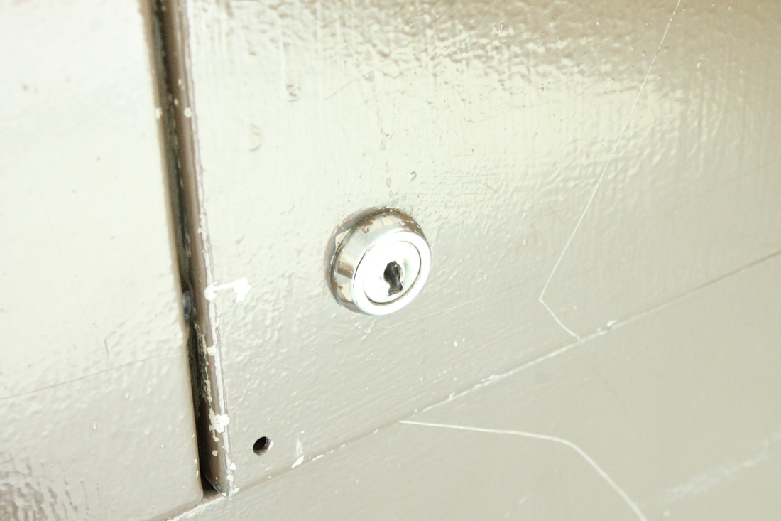
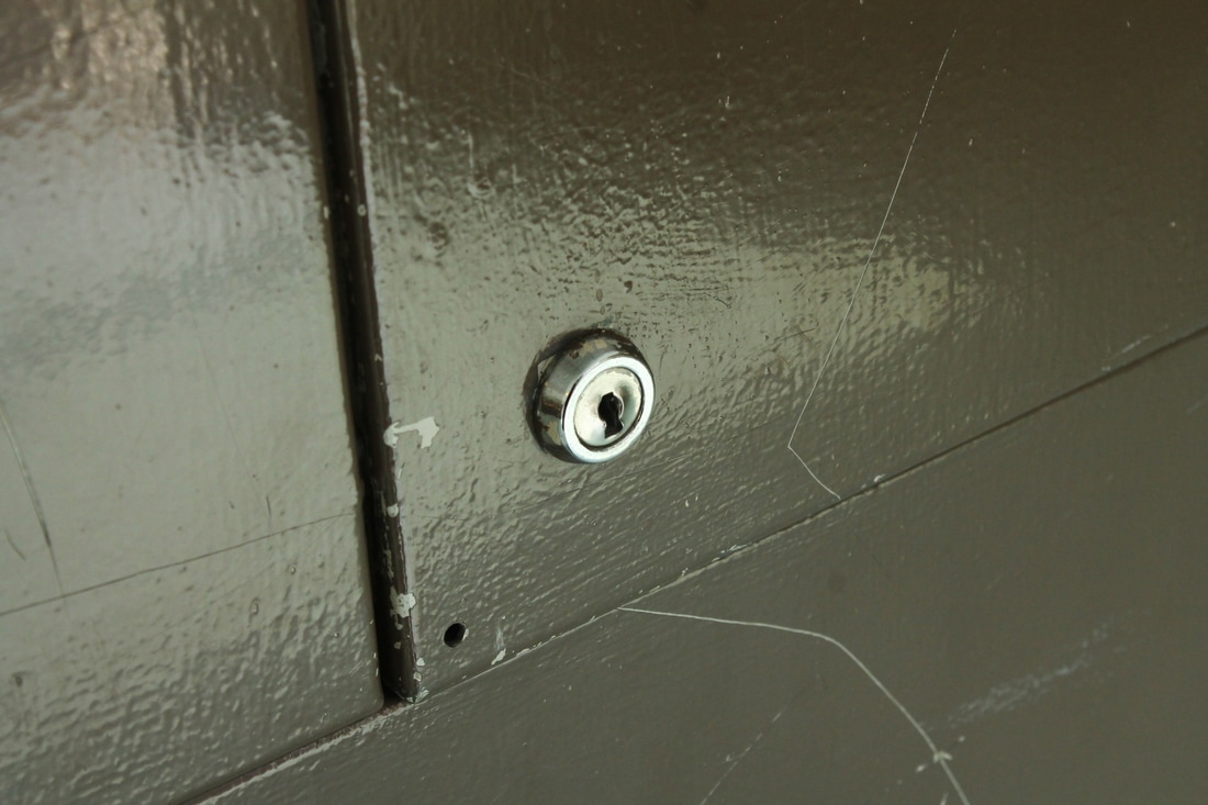
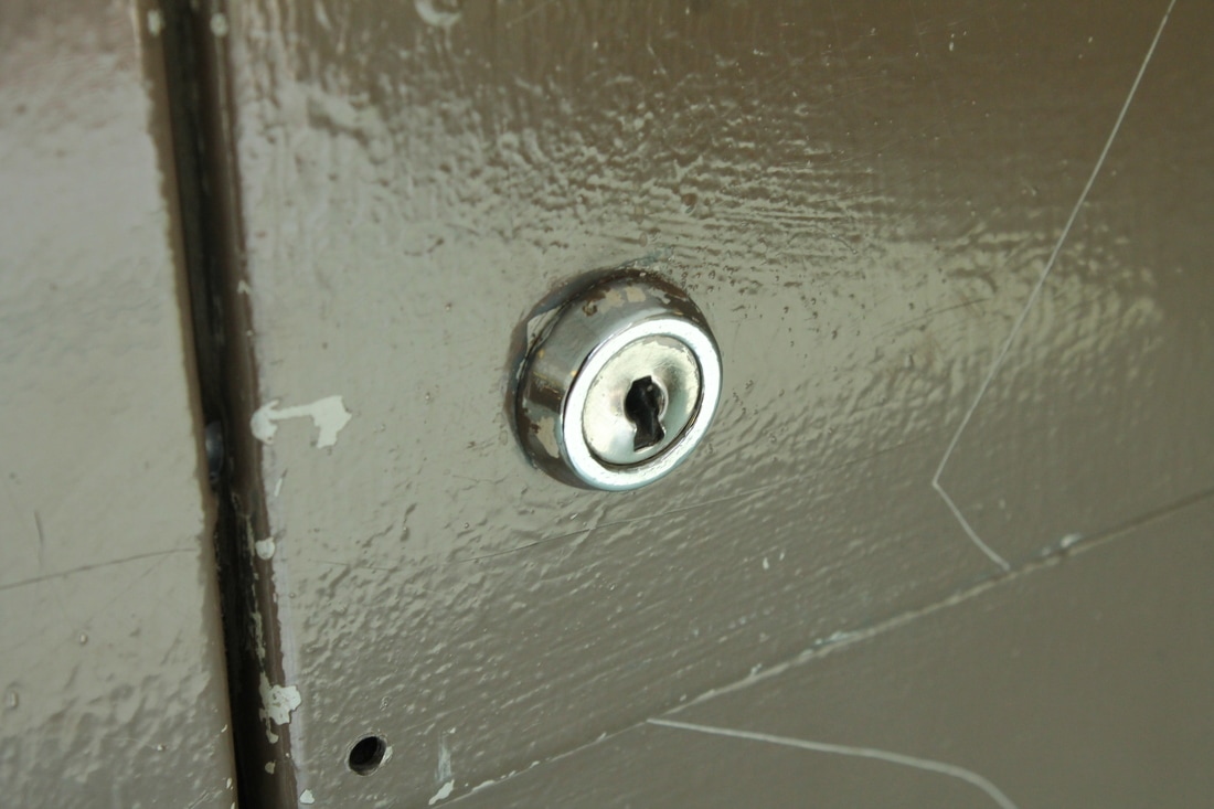
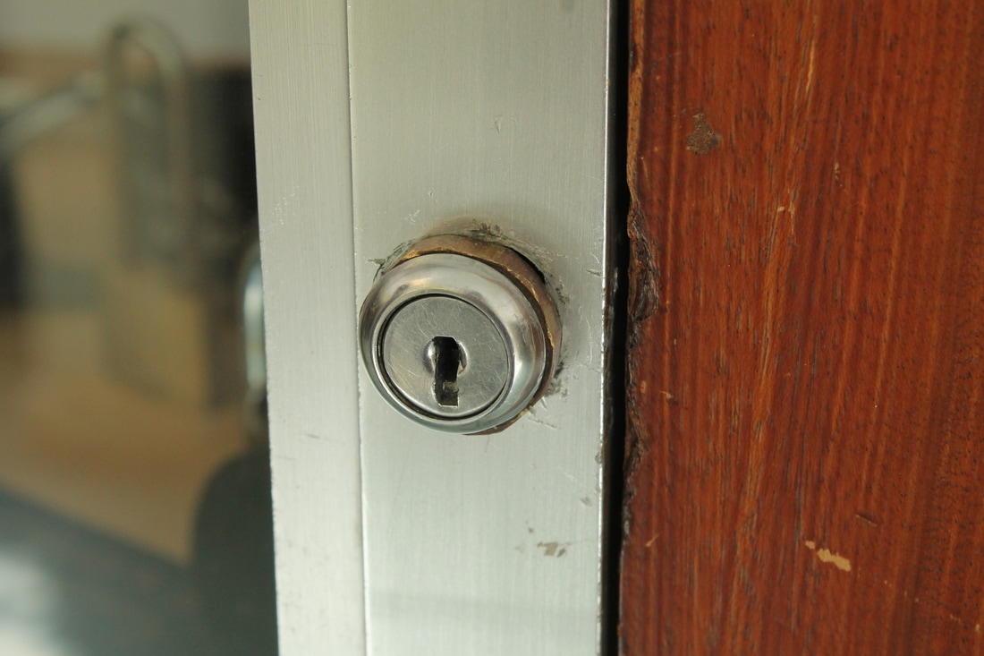
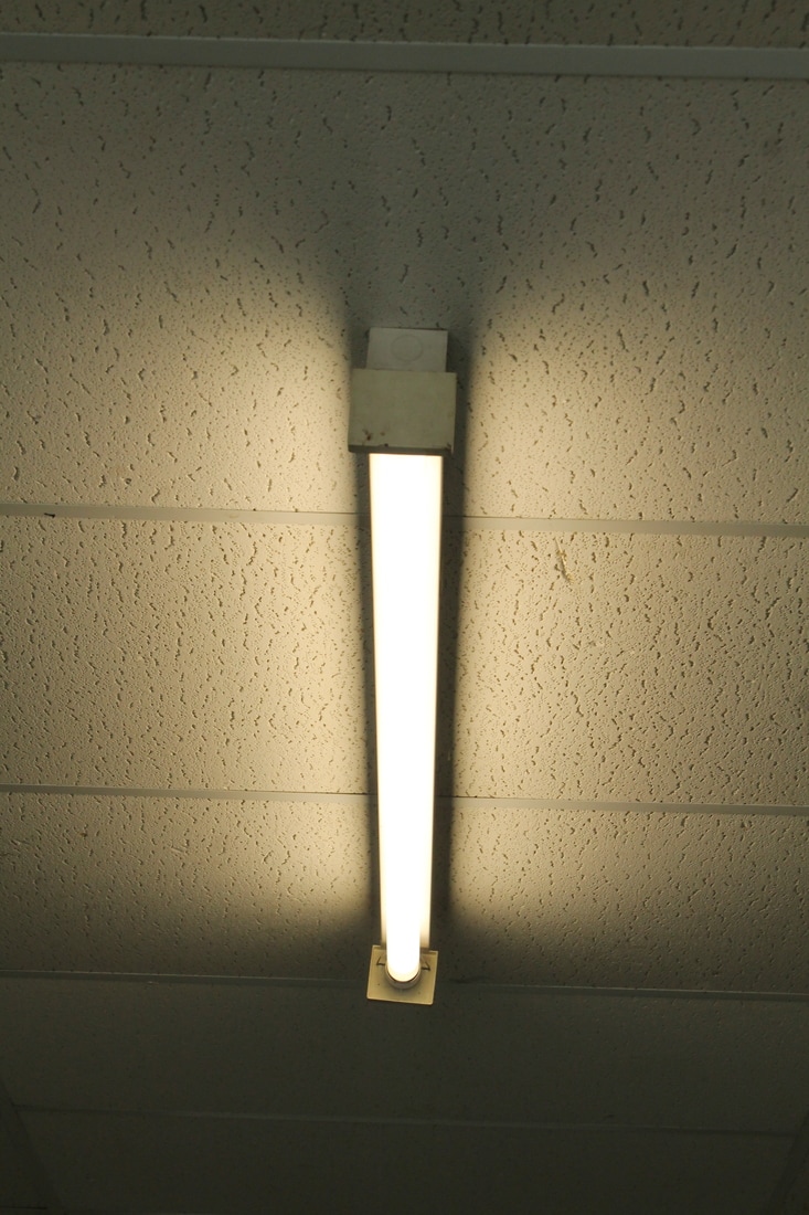
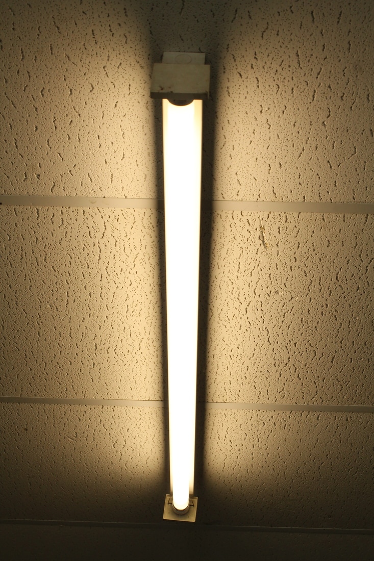
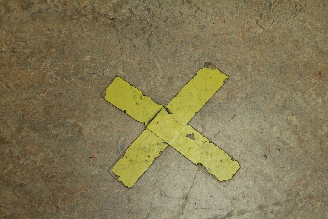
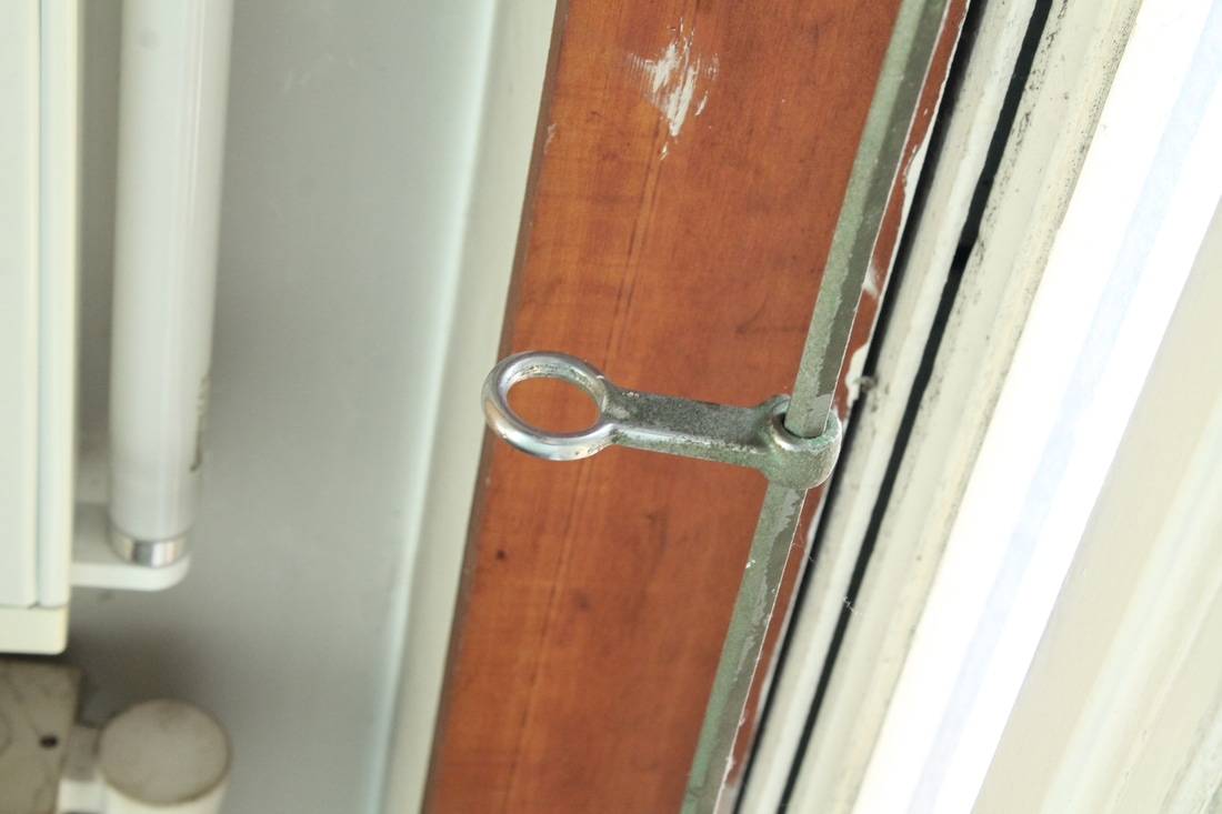
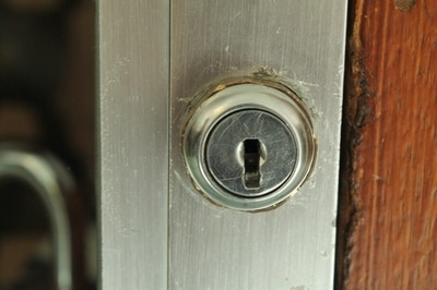
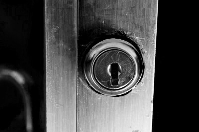
For this shoot I took photographs at my school again. I looked at ways light could display letters such as I and O. I captured images of letters such as T and X as well.
WWW:- Most of my photographs are clear.
EBI:- If I had found more objects that resembled letters.
To develop my work I am going to take photographs in my home as I know I will find more objects that look like letters.
WWW:- Most of my photographs are clear.
EBI:- If I had found more objects that resembled letters.
To develop my work I am going to take photographs in my home as I know I will find more objects that look like letters.

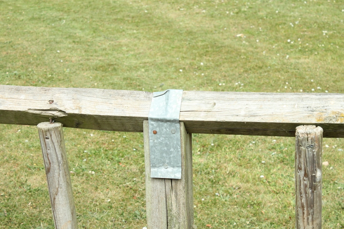
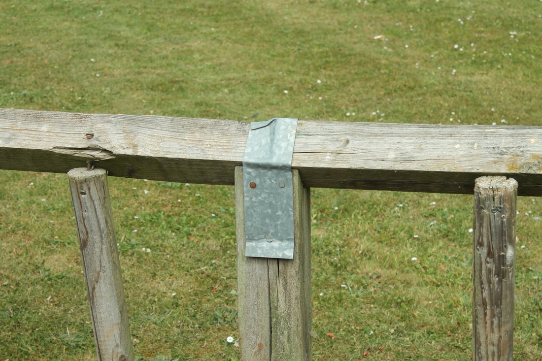
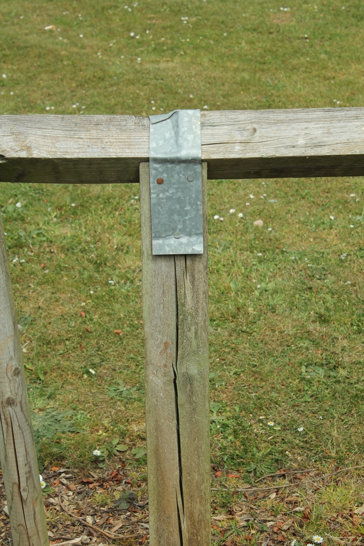
3 Best Images From This Shoot
|
|
Photoshop Edits
I used Photoshop to edit some images above. For the edit below I first of all I clicked Image -> Adjustments -> Brightness/Contrast and changed the brightness to 3 and the contrast to 100. Next I clicked Image -> Adjustments -> Vibrance and changed the vibrance to +74 and the saturation to +15. I then clicked Image -> Adjustments -> Black and White and changed the photograph to black and white. I decreased the red, cyan and blue colours.
For the next edit I cropped the photograph. Then I clicked Image -> Adjustments -> Brightness/Contrast and changed the brightness to 9 and the contrast to 100. After that I clicked Image -> Adjustments -> Vibrance and changed the vibrance and saturation to 100. I then changed it to black and white on the second image.
|
|
For the edit below I increased the brightness and contrast. I then used colour balance to change the colour to pink.
Final Piece
With the first experimental shoot, I decided to change my idea. While taking pictures around the school, I decided to do my final draft inside, at home. Below is my final daft, 'Lost & Found'. I created this shoot using interesting objects in my house that looked like letters. I changed the photographs to black and white to reflect Abba Richman's work.